Team Behind the Design
Agency: DsignSpot
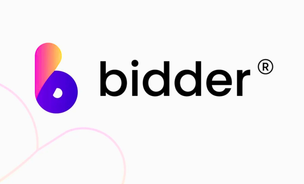
Client: bidder
Category: Logo Design (Technology)
Location: Johannesburg, South Africa
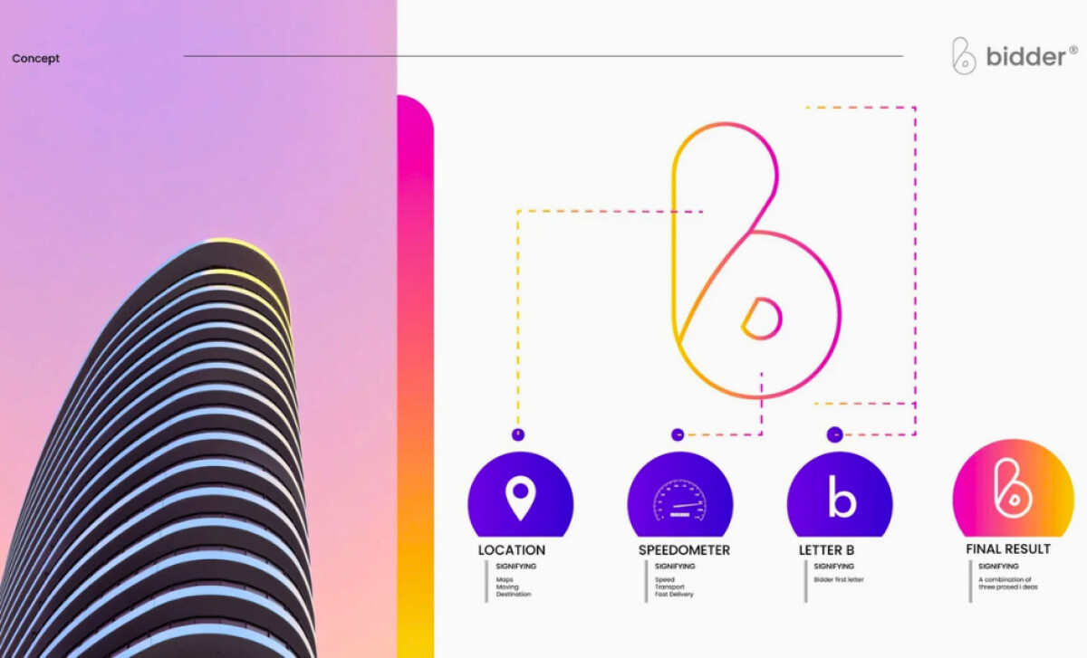
Project Brief: Create a modern logo for a ride service app that balances clarity, trust, and innovation while symbolizing movement and destination.
Logo Design Analysis
Related Articles:
Logos are often judged by concept, typography, scalability, and application. That’s the lens I use here.
- Concept: I like how the logo merges multiple ideas into a single, clean form. The location pin, speedometer, and letter “B” work together to symbolize movement, speed, and brand identity.
- Typography: The modern sans-serif typography balances the playful gradient mark with a professional tone, helping bidder appeal to both tech-savvy users and corporate partners.
- Scalability: The logo’s simplicity and bold geometry make it adaptable across screens, signage, and app icons without losing clarity.
- Applications: Strong gradients and rounded forms may help the logo stand out in digital contexts, particularly technology app marketplaces where first impressions matter.
Get connected with the right web design agency for your project.
GET STARTED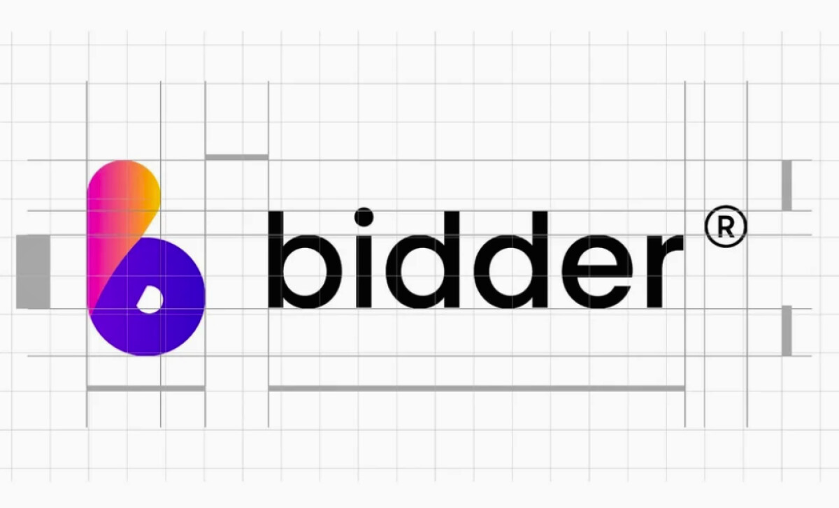
About DesignRush Featured Designs
At DesignRush, we review hundreds of agency projects every month. The featured designs are among the most compelling, standing out for their creativity, execution, and brand relevance.
The most impactful entries often advance to our Monthly Design Awards, recognized as industry benchmarks of excellence.
Looking for inspiration in technology logo designs? Check these categories:
- Best Logo Designs
- Best Website Designs
- Best App Designs
- Best Print Designs
- Best Packaging Designs
- Best Video Designs
For a full list of design agencies and related services, see our Agency Directory.
Get a chance to become the next Design Awards winner.
SUBMIT YOUR DESIGN

