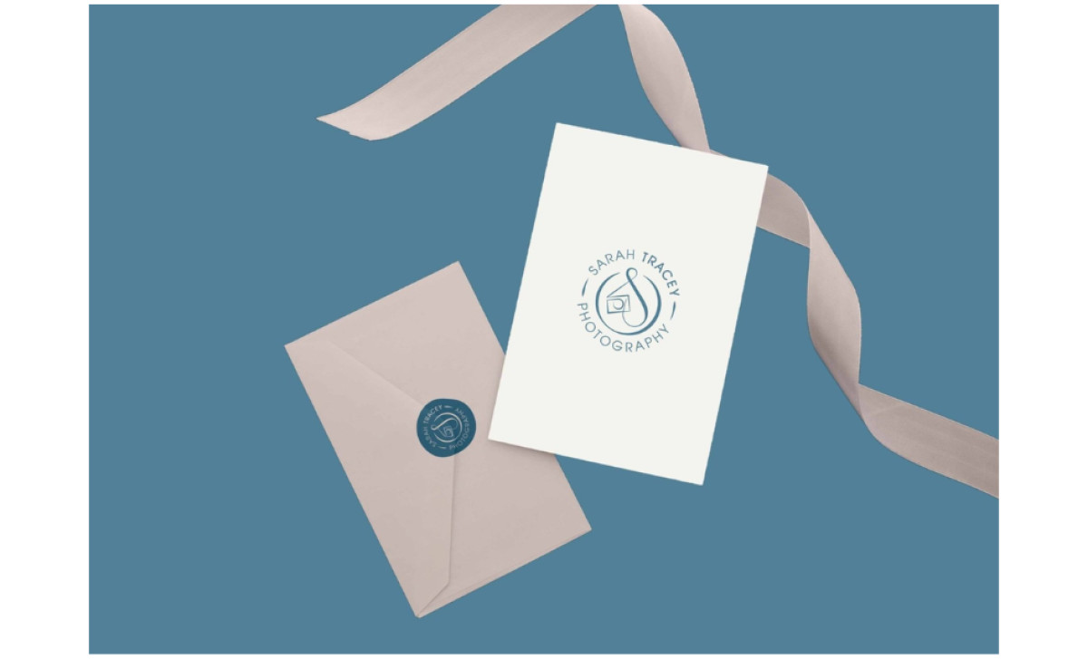
Standout Features:
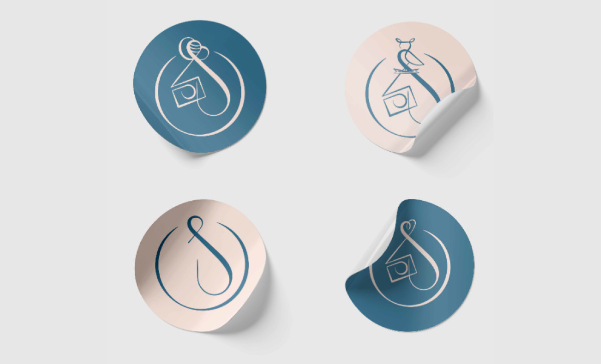
- Lettermark that integrates a camera
- Clean circular lockup and approachable typography
- Muted teal and cream palette
It's always a design challenge to create a logo for an artistic service provider that references the craft itself without resorting to the same tired, generic clichés. Luuuby Creative's treatment for Sarah Tracey’s logo involved designing a symbol that incorporates a camera, then pairing it beautifully with clean type and soft colors for a friendly overall feel that, at the same time, would still feel refreshingly new.
Encased in a circular frame is a flowing, 'S' initial wrought in cursive that cleverly integrates a camera form within its line — referencing the profession and the photographer’s name quite uniquely. The organic style hints at a human, hand-crafted feel to the brand too. This core graphic works well in the main circular lockup and makes it innately adaptable.
In the main logo version, the name "Sarah Tracey Photography" curves neatly around the outside of a circle, framing that central symbol. It uses a clean, readable, all-caps sans-serif font. This circular badge style feels nicely balanced, contained, and quite friendly overall. The modern font complements the softer graphic well.
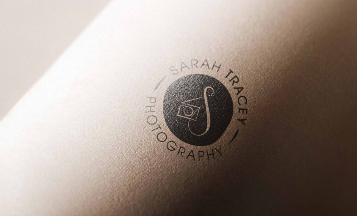
Additionally, the colors are kept muted and classy here: a deep teal combined with a neutral off-white or cream, used consistently across different items. These colors often switch roles between background and foreground, making the whole system feel unified. The soft palette helps make the professional services logo feel calm and professional too.
The overall blend achieved here works together to create a strong feeling that Sarah Tracey delivers photographs that are elegant and artsy. But most importantly, it achieves the goal of presenting her as a more differentiated photographer — successfully positioning her personal brand as both current and inherently high-quality in the eyes of potential clients.