When you think of NBA legacy, few names resonate as powerfully as the Boston Celtics. But this franchise isn’t just known for titles and talent. The Boston Celtics logo stands as a visual beacon of tradition, culture, and evolution ... and yes, swagger.
Since 1946, the Celtics have told their story through a series of logos, each iteration sharpening the brand's identity while staying rooted in Irish-American symbolism. From minimalist beginnings to today’s richly illustrated leprechaun, the logo is deliberate as it is decorative.
Let’s break down how the Boston Celtics emblem grew from a humble shamrock into a globally recognized symbol.
Boston Celtics Logo Design Details
The current Boston Celtics logo is character-driven and unapologetically detailed. A leprechaun spins a basketball on one finger while leaning casually on a cane. His vest is covered in shamrocks, his bowler hat is tilted with flair, and his smirk? Pure Boston confidence.
Then, encased in a vibrant green ring, the leprechaun is surrounded by "BOSTON CELTICS" in clean, white, uppercase sans-serif type font. This circular frame provides structure and anchors the character, making it equally effective on uniforms, merchandise, and digital platforms. It’s the kind of branding that carries effortlessly from hardwood to headline.
The Boston Celtics symbol blends green, brown, white, black, and red-orange. Each hue is carefully considered: green for legacy, orange for action, and earthy neutrals for balance. The richness in detail aligns with Boston’s cultural depth and longstanding influence within the NBA.
Boston Celtics Logo History
The Boston Celtics logo history reflects a series of purposeful logo trend shifts; not just in aesthetics, but in how the team has positioned itself within the evolving landscape of sports and culture.
1946–1950: The Shamrock Debut
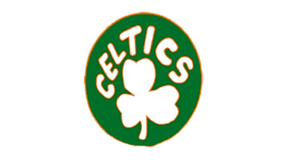
The Celtics’ inaugural logo was a green circle featuring a bold white shamrock, a universal Irish symbol, with the word “CELTICS” arched overhead in blocky lettering. Designed for simplicity and cultural connection, this badge aligned the team’s identity with Boston’s Irish-American roots. As the first chapter in Celtics logo history, it carried quiet strength and became an instant identifier on early team merchandise.
1950–1960: The Crowned Leprechaun
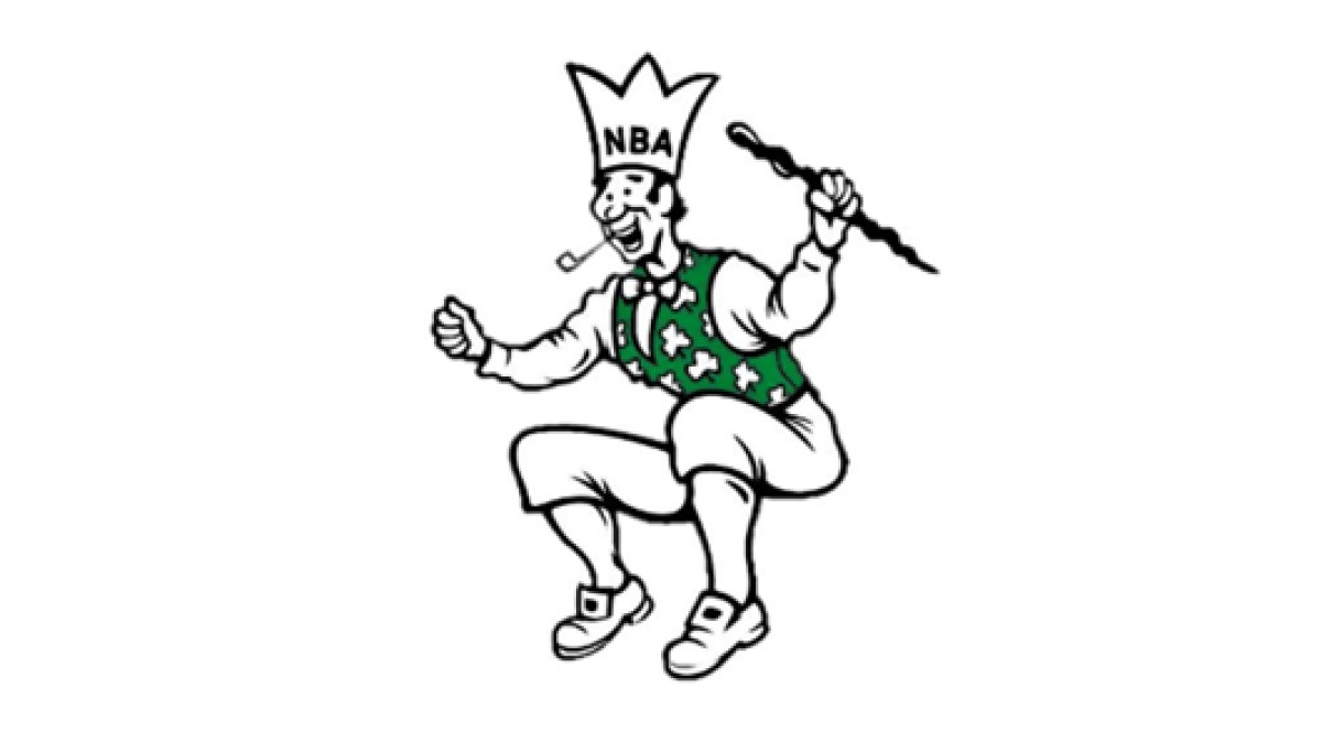
With the team growing in popularity, Zang Auerbach (brother of Red Auerbach, who was head coach at the time) introduced the Celtics’ first illustrated mascot. This version featured a leaping leprechaun complete with a top hat adorned with the letters “NBA,” a pipe, and a cane.
The figure was jovial and animated, bringing a more personal, character-based touch to the team’s visual identity. The crown on the hat was both a tongue-in-cheek nod to the NBA and a subtle proclamation of the team’s rising ambition.
1960–1968: On an Orange Stage
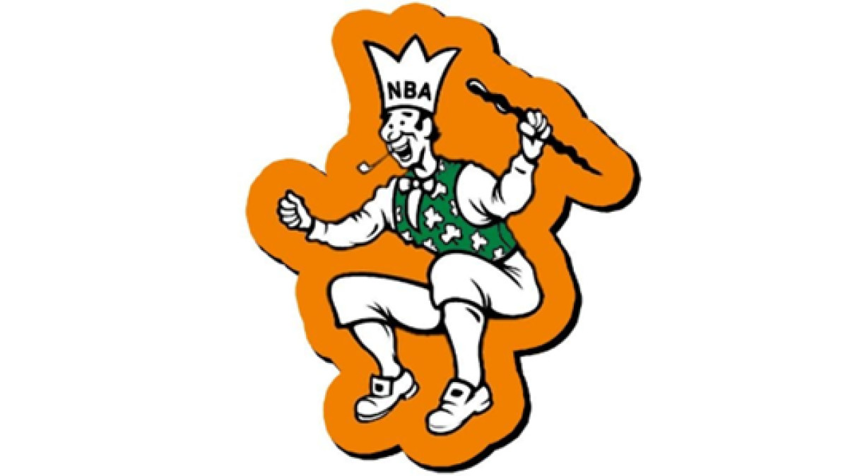
In the early ’60s, the Boston Celtic emblem of a leprechaun was placed against an orange background. This might seem like an odd departure from the team’s signature green, but it served a practical and stylistic purpose: visibility.
The orange gave the leprechaun figure a higher contrast on promotional materials and products, especially print. It’s one of the few eras where the Boston Celtics symbol played with color outside their core palette, signaling a brand in experimentation mode.
1968–1974: Basketball-Spinning Leprechaun
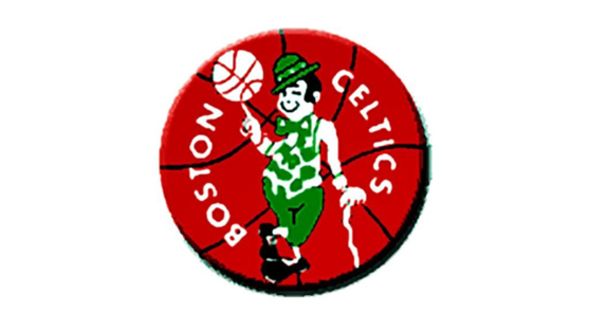
This is when the logo’s modern foundation took shape. Auerbach revised his design into a leprechaun leaning on a cane and spinning a basketball on his index finger — a timeless pose that shows off athleticism and charm.
The character was placed on a red basketball background, with “Boston Celtics” framing the design in a full-circle badge. It introduced a strong sense of completeness and balance while enhancing its usability across media and team gear.
Understand how responsive logos keep your branding cohesive and modern across all mediums.
1974–1996: Sharpening the Persona
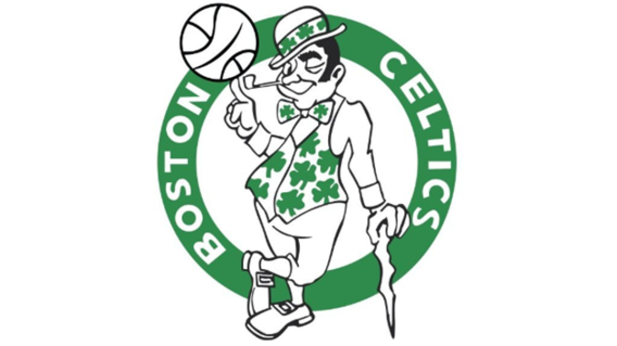
In 1974, the Celtics doubled down on their iconography, refining the leprechaun’s form for sharper reproduction and consistency. The updated version introduced more defined features: facial structure, clothing details, and a slightly altered stance to enhance the design’s symmetry.
The basketball’s contours were tweaked for clarity, and the leprechaun’s vest became more detailed with visible shamrock motifs. This was the golden age of the logo: a visual signature of the team’s dominance during the Larry Bird era.
Discover the essential principles of logo design that separate forgettable logos from unforgettable brands.
1996–Present: Full-Color Refinement
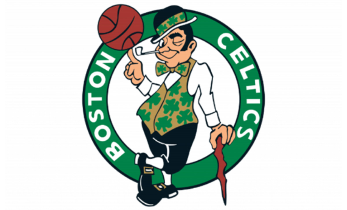
In celebration of the franchise’s 50th anniversary, the logo Boston Celtics created was given a full-color overhaul. Skin tone was added to the leprechaun, his vest turned a deeper moss green, and his cane, trousers, and shoes were shaded in natural tones. Not to mention the red-orange basketball that now popped with colored intensity.
This update resulted in a highly polished, digital-era-ready version of the original Auerbach design. It’s one of the few NBA logos that’s remained largely unchanged in structure while improving in precision and personality over decades.
Boston Celtics Logo: A Story in Every Detail
The Boston Celtics logo is legacy made visible. It began with a humble shamrock and grew into one of the most distinct identities in professional sports. Every iteration marks the team’s climb from local grit to global recognition.
What sets it apart? It doesn’t follow trends, nor does it try to look like every other basketball logo. It defines its own lane. The Celtics logo leans into character, heritage, and storytelling. And that makes it not just iconic, but unforgettable.