The Texas Rangers, a cornerstone of Major League Baseball's American League West Division, have a storied history that is mirrored in the evolution of their logo. From their origins as the Washington Senators to their rebranding as the Texas Rangers, the team's visual identity has undergone several transformations.
Let’s explore how the Texas Rangers' logo has evolved, reflecting the franchise’s growth, identity shifts, and deep connection to Texas baseball.
Texas Rangers Logo Design Details
At the heart of the current Texas Rangers logo design lies a striking red 'T,' set against a white baseball adorned with blue stitching. This central element signifies Texas and serves as a bold emblem of the team's home state pride.
Encircling the baseball is a blue ring featuring the words "Texas Rangers" in white, separated by two white stars. This circular design lends a classic and timeless feel, reinforcing the team's established legacy.
The integration of red, white, and blue within the logo also reflects the team's colors while paying homage to the Texas state flag, underscoring a deep sense of local pride and patriotism.
Texas Rangers Logo History
The evolution of the Texas Rangers' logo is a visual narrative of the team's history and branding shifts.
1961–1971: The Washington Senators Era
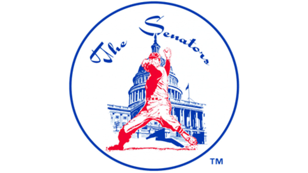
Before Texas, there was Washington. The team’s first logo, used during its decade as the Washington Senators, was a literal representation of the nation’s capital.
Inside a white circle, a baseball player (outlined in red) stood in front of the White House, depicted in blue. The words "The Senators" hovered above. It was classic, straightforward, and politically appropriate for a team based in D.C.
But there was a problem. The Senators weren’t just a baseball team — they were the other Washington Senators. The franchise was a second attempt at a baseball team in the capital after the original Senators moved to Minnesota to become the Twins. The new iteration struggled with identity, performance, and attendance, and in 1972, the franchise packed its bags and moved to Texas.
1972–1980: The Texas Rangers and Introduction of the Cowboy Hat
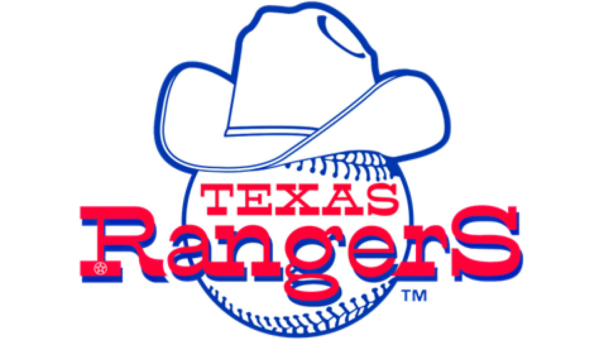
With a fresh start in Texas, the team needed a logo that captured the rugged, independent spirit of its new home. What better way to depict that than with a cowboy hat?
The first Texas Rangers symbol featured a white baseball with "Texas Rangers" written in red. Sitting atop the ball was a blue-outlined cowboy hat; an instant nod to the state’s Western heritage.
From a branding perspective, this logo redesign was a smart move. The cowboy image helped establish an immediate connection with Texas, reinforcing the idea that this wasn’t just a relocated franchise; it was a Texan team now.
1981: Refining the Cowboy Identity
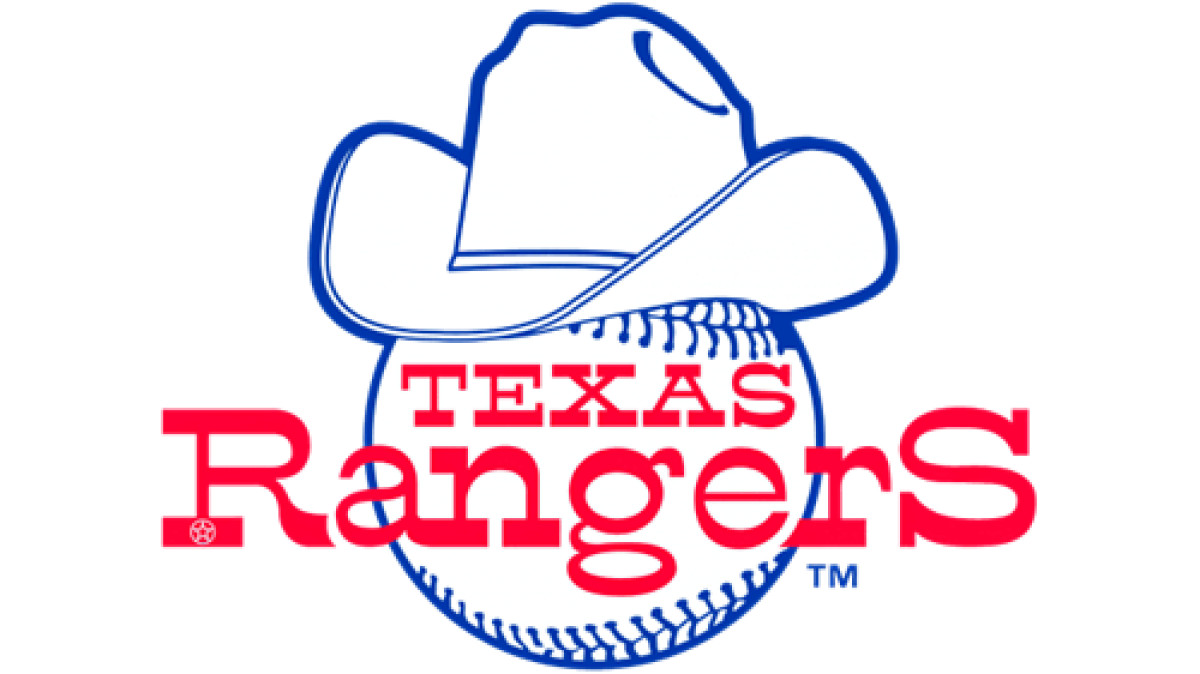
A minor update saw slight refinements in color and detailing, but the core elements remained: baseball, cowboy hat, Texas pride. The TX Rangers logo still leaned heavily into Western imagery, cementing the Rangers as a team with a distinct regional identity.
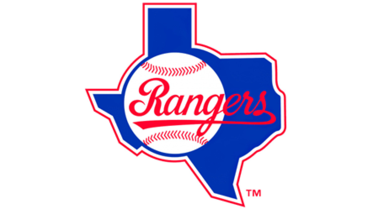
1982–1983: Incorporating the Texas Silhouette
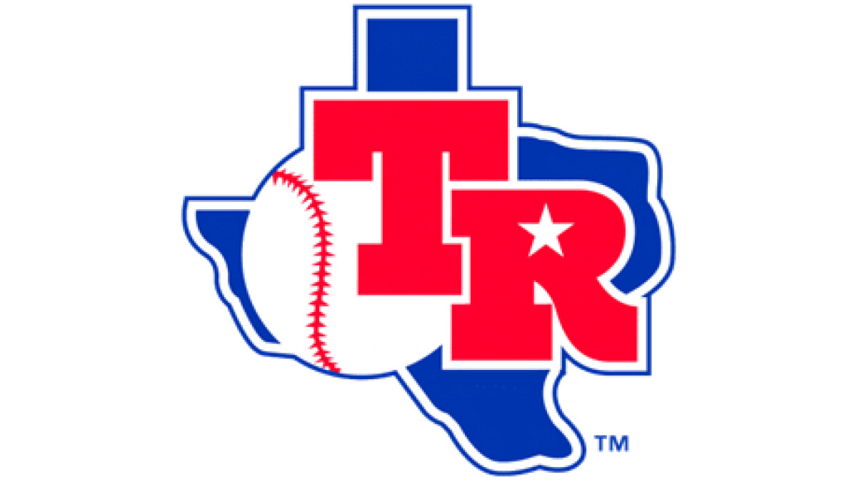
The Rangers took their branding a step further, embracing a state-first mentality. The new Texas Rangers symbol dropped the cowboy hat and instead incorporated the outline of Texas with a baseball over it. The letters "TR" were written in red script, with a star marking Arlington’s location, reminding fans exactly where the team belonged.
This move mirrored a broader shift in sports branding during the ‘80s and ‘90s, where teams began emphasizing location over mascots or abstract symbols. The Rangers weren’t just a baseball team in Texas anymore — they were Texas.
Discover the best fonts for logos and create a brand identity that stands out.
1984–1993: Emphasizing the “Rangers” Script
By 1984, the Texas Rangers had a decade of baseball experience under their belt, but their branding was still finding its footing. The previous logo (a simple blue outline of Texas with "TR" stamped on it) was effective but lacked personality.
So, in 1984, the Rangers made a strategic pivot. They kept the Texas silhouette, reinforcing the team's deep connection to the state, but they refined it with red and white outlines, making the shape bolder and more distinct. The "TR" initials were replaced with "Rangers," now displayed in italicized script. The baseball remained inside the design.
This change reflected a broader shift in the team's branding: moving away from generic insignias and toward a clear, confident identity. The Rangers weren’t just another MLB team anymore — they were Texas's team. This logo was a declaration: We are here, we belong, and we are embracing what makes us unique.
1994–2002: The Diamond Emblem Logo
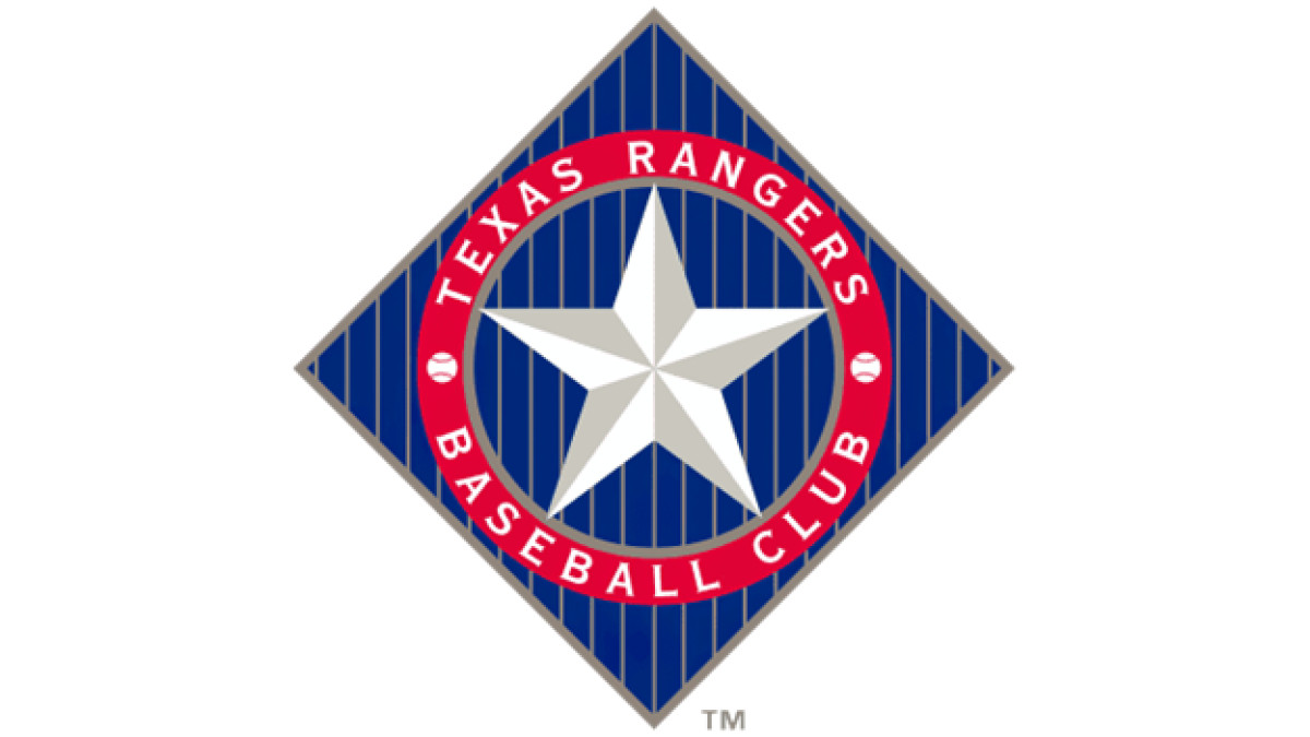
By the mid-1990s, the Texas Rangers were no longer just another team in Major League Baseball. They were building an identity, making playoff appearances, and proving they belonged. Their logo needed to reflect that shift.
In 1994, the Rangers introduced a diamond-shaped emblem, reinforcing the connection to baseball’s classic playing field. Thin vertical stripes ran through the background, reminiscent of the lines sometimes seen on baseball uniforms.
At the center sat a silver five-pointed star, a nod to Texas itself — the Lone Star State. Surrounding it, a deep red ring framed the design, featuring the words "Texas Rangers" and "Baseball Club" in bold lettering. Two small baseballs flanked the text, ensuring the sport remained front and center.
Explore the best logo design inspirations for startups.
2003–Present: Modern Circular Emblem
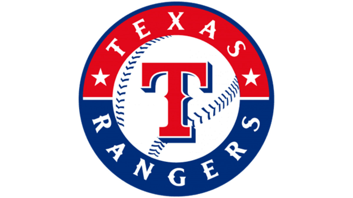
In the early 2000s, sports branding began shifting toward cleaner, classic aesthetics, and the TX Rangers logo followed suit.
The cowboy hat and Texas silhouette were gone, replaced with a bold, single red ‘T’ set inside a white baseball. Surrounding this new Texas Rangers emblem was a blue ring with “Texas Rangers” written in white, flanked by two stars.
At this time, the Rangers were no longer a struggling expansion team — they had become a legitimate force in Major League Baseball. Their branding needed to reflect that confidence. This era coincided with the Rangers’ rise to prominence, including back-to-back World Series appearances in 2010 and 2011.
Texas Rangers Logo: Transformation of a Baseball Icon
From its beginnings as the Washington Senators to its transformation into a Texas institution, the Texas Rangers badge has evolved alongside the team. Each change reflected the franchise’s journey, its ambitions, and how it wanted to be seen.
A great sports logo is more than something you slap on a jersey. It’s a flag, a rallying point for fans, and visual shorthand for everything the team stands for. The Texas Rangers emblem has shifted with the times while staying true to the bold, independent spirit of Texas.
Logos don’t just change. They adapt. The best ones get sharper, stronger, and more unmistakable over time. The Texas Rangers’ logo is proof of that.