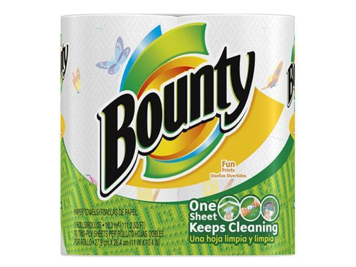
The Bounty Brand Uses Color Gradients To Add Modernity
Bounty is a paper towel brand known for the strength and durability of its paper cleaning products.
It’s a brand that grabs attention thanks to its advertising campaigns, matched with a catchy jingle that you can’t get out of your head — Bounty, the quicker picker-upper.
But it’s not just its identity and years-long legacy that stands out. Its logo is one for the ages too, with a heritage and an impact that has been felt by consumers for decades.
And one reason that this logo design stands out in such a powerful way is its use of color. Primary colors make up the palette in this design, matched with a strong black font in its wordmark to instantly grab attention.
These colors come together in a sweeping, circular design that almost fans out, with each color taking on a layer of this circular motion.
While it has become more challenging to unite it with the ruling minimalist trends, expert logo designers use color gradients to bring focus to essential elements in a design.
The sweeping colors are less stark and more fluid and gradient, playing into modern design trends. The general shape of the illustration is slightly more abstract but still retains its iconic roots, ensuring generations past and present recognize Bounty as a brand they can trust throughout the ages.
These subtle color gradients show that the brand can and will grow over the years, taking on slightly different visual personas in order to stay fresh and relevant with the times. And that’s important for a brand that is so front and center in the market.
Bounty’s Iconic Logo Emphasizes Movement Within Its Shape
The Bounty logo is a fluid and moving symbol, and this dynamic nature works to grab attention and solidify the brand and its identity as one that sticks in people's heads.
This isn’t a boring, static and flat design. It’s one that has depth and personality. The swirling nature of the design promotes positivity and happiness and the movement it invokes gives the brand a more tangible identity for users to interact with.
It reminds users of its products — the paper towels wrapped around the holder, and this design almost wraps around the brand name and its legacy. And the addition of the bright green, textured background makes this movement more apparent, the logo design jumping from the packaging.
Adding a dynamic nature to your logo design can help it stick in viewers' heads. It also shows that you’re a brand that is current and cool — you understand design trends and how to market yourself to your audiences.
And this movement has always been present in the logo — even in its first iteration. So this shaping keeps branding consistent, almost bringing it full circle from when the brand and its products first came into being.

The Bounty Wordmark Grabs Attention
The colors and the moving shape of the Bounty logo stand out, but the wordmark is the mic drop of the whole design.
It’s stamped onto the illustration like a stamp of approval. It’s big and bold and in your face. The black, italicized and slanted font slides in, making its presence known and daring other brands to challenge it.
There’s depth and a three-dimensional nature to this wordmark that comes from the white shading, making it look like this bold wordmark is jumping from the packaging it’s stamped against.
But the best part about this wordmark is that it is one with the symbols it sits on top of. These two elements merge together to create one symbol or trademark that is impossible to ignore and has made its presence known for years — and will continue to for years to come.
The History Of The Bounty Brand
Bounty, The Quicker Picker Upper has more going for it than, well, just picking up things quick. This household staple has an iconic logo that makes it instantly recognizable and ensures any marketing tactics stick in consumers' heads.
Bounty came to life in 1957 when Procter & Gamble acquired the Charmin company. The brand wasn’t introduced, however, until 1965. But when it hit the scene, Bounty quickly became a staple in the market:
In 1957, Procter & Gamble acquired Charmin®, its first consumer-paper products business! One product in particular, Charmin Towels, was a hit! This began a decade of research, experimentation, and ultimately, innovation that helped define Bounty history! While most paper towel brands were promoting their “strength” or their “softness,” P&G discovered that what consumers really cared about was…absorbency! With this new insight, Bounty replaced Charmin Towels in 1965, and introduced a new 2-ply towel that was thicker, softer, and more absorbent than any other on the market! And that’s why we’ve always been...The Quicker Picker Upper!First introduced in 1965, actress Nancy Walker repped the brand as a friendly, accessible waitress who used Bounty for all of her cleaning needs in the diner. Nowadays, the brand uses buzzy celebrities such as Olympic skier Lindsey Vonn to promote the products.
But it was this dedicated advertising campaign that lasted from the 1960s to the 1990s that really solidified the Bounty brand and its prominence in the paper towel product industry. These clever commercials and videos really grabbed consumer attention and aligned the brand as a leader in cleaning up messes thanks to its absorbency, strength, and softness.
Today, Bounty is known for its exceptional paper towels, and for its iconic catchphrase. This has solidified its place in the market where it will likely stay for years to come.

The Bounty Logo Throughout The Years
Any single one from our list of top branding agencies can tell you that no logo, no matter how good it may look, or how well it represents its respective brand, is absolutely perfect. Time changes perspective, and your brand identity should follow. Bounty's certainly did.
The Bounty logo has changed since its conception in the 1960s. It began as a retro, washed-out swirl, and has grown to be a modern, colorful and creative symbol of strength and authority.
But while the logo has changed slightly throughout the years, the general idea has remained the same, providing excellent recognition in an industry with really only one other competitor (looking at you, Brawny man...).
Each iteration uses circular swoops of primary colors, slightly reminiscent of a paper towel soaking up a spill from the center, stretching outwards. The bold black font pops overtop the illustration with the help of a dual outline in both white and black.
The actual swirl has changed — going from a very bubbly and big design with bright pinks and purples to one that has become more tightened and compact.
In each iteration, you can see more modernity and freshness seeping through, with the colors becoming more prominent and eye-catching, the shape becoming more clean and dynamic and the wordmark becoming more strong and bold.
The most recent logo modernizes this overall logo idea of a swirl of colors with the Bounty wordmark stamped on top of it. While the typography is still bold and capitalized, it incorporates subtle serif embellishments and takes a more italicized layout.
This shows the brand’s dedication to staying modern and fresh, with the Bounty organization taking the time to play with its logo and make adjustments when needed. This is a brand that understands what it takes to stay relevant in the eyes of its audience and does so with its stunning and attention-grabbing logo.
Logo redesigns are important for a growing and successful brand. It doesn’t mean that the previous logo looks bad, but shows that the brand is willing to be fluid and flexible in the market to reach out to new and growing audiences.
Bounty’s Logo Comes Together To Create An Identity That Has Lasted Decades
The Bounty logo is made up of a wordmark and a symbol that are one in the same. They flow so fluidly together that it’s hard to imagine the brand without it — when you think Bounty, you think about the flowing circle of colors and the bold brand name.
You think of strong and durable paper towels, of course. And you certainly hear the Bounty catchphrase — the quicker picker upper — in your head. You might even remember the old commercial advertisement.
But it’s this logo that captures the brand and its essence in its entirety, creating an identity that has lasted throughout the years and continues to stand as a symbol of strength and prominence in the industry.
The swirling nature of the logo and its shape reminds you of a roll of paper towels and how they wrap around so fluidly. It also promotes movement, adding a dynamic nature that draws the eyes and lures consumers in.
Primary colors add urgency and grab attention. And the integration of color gradients adds modernity and a fresh take on the logo that has evolved over the years.
And to round it out, the bold, slightly italicized and slanted wordmark drives the branding home, promoting the products and their expertise in the industry.
This is a logo design that is immediately recognizable and iconic. And it sells.