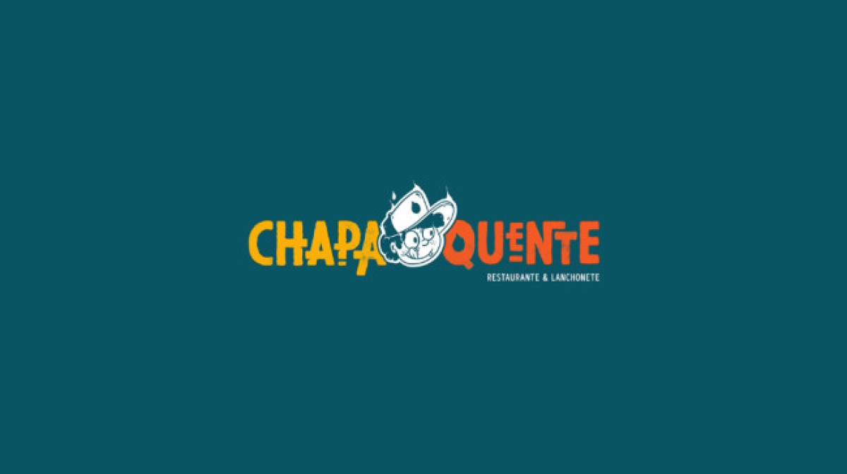
Standout Features:
- A bold and vibrant color story
- Outlined logo icon
- Textured wordmark
Chapa Quente is the go-to place when you’re looking for a local fast-food restaurant.
The snack bar opens its doors to customers from all backgrounds, so it’s nice to see that this funky and friendly logo design by Aawma Estudio Creativo fits right into their branding strategy!
The project was part of the Design, Por Favor (Please, Design) initiative, created at the beginning of the global pandemic with the goal of offering design works for a low cost to those deeply impacted by the lockdown in Brazil. Aawma Estudio Creativo worked closely with Carolina Campos and Gustavo Estevão to deliver this mouthwatering design come to life.
Chapa Quente is sure to attract a hungry crowd with its complementary color palette of blue, orange, and yellow. These colors are also commonly associated with food brands and restaurants, especially the big fast-food players. No need to reinvent the wheel! It's a foolproof design move.
To bring out Chapa Quente’s friendly and approachable character, the designers stamped an outlined illustration of the brand’s mascot onto the logo, then paired it with a textured wordmark layout.
-preview.jpg)
-preview.jpg)