Team Behind the Design
Logo Design Analysis
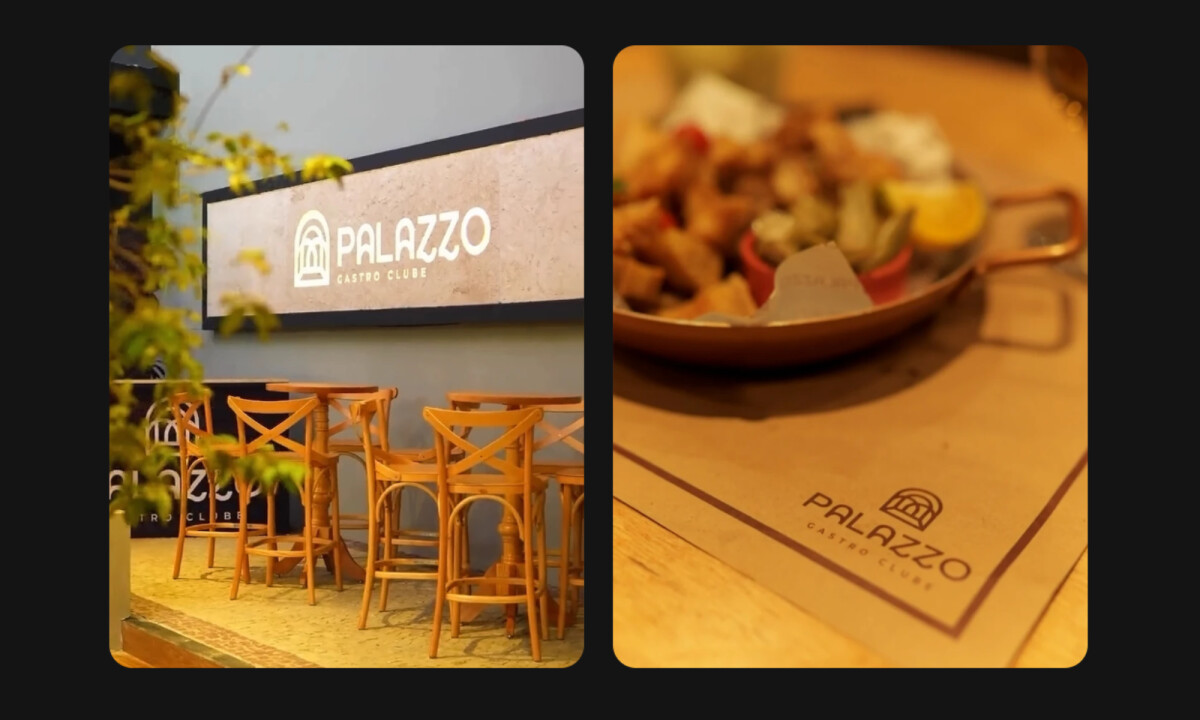
In evaluating hospitality logo projects like this, I focus on how architectural references, symbolism, and proportion translate into a mark that works across physical spaces and printed materials.
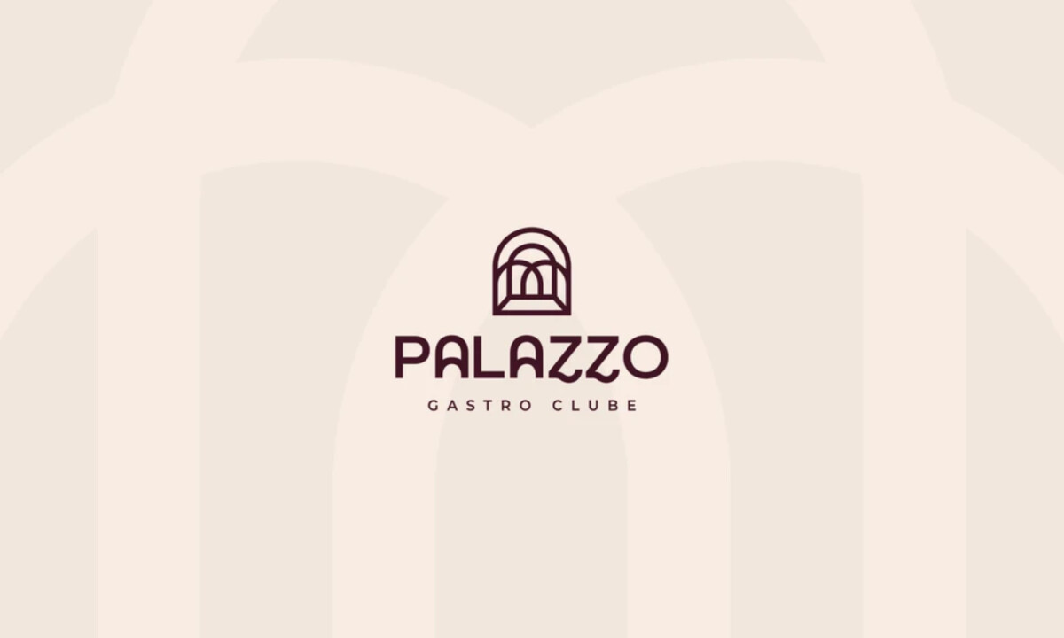
Palazzo’s logo demonstrates a clear relationship between place, structure, and brand meaning.
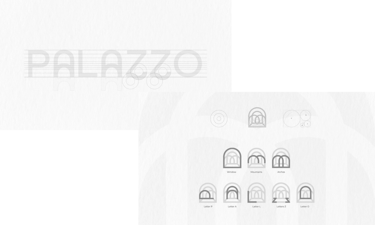
- Architectural Symbolism: I notice how the arch motif directly references the building’s windows, reinforcing the restaurant’s physical space within the mark. This approach grounds the logo in its environment rather than relying on abstract decoration.
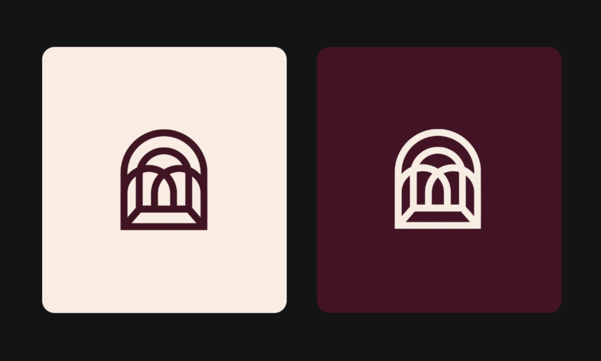
- Form & Construction: The icon’s geometry is carefully balanced, using consistent curves and spacing to maintain clarity at both large signage scale and small applications. The structure avoids unnecessary complexity while still rewarding closer inspection.
- Typography Integration: I appreciate how the internal forms subtly echo the letter shapes from the name Palazzo, turning the symbol into a layered visual system rather than a standalone icon. This integration strengthens recognition without being overt.
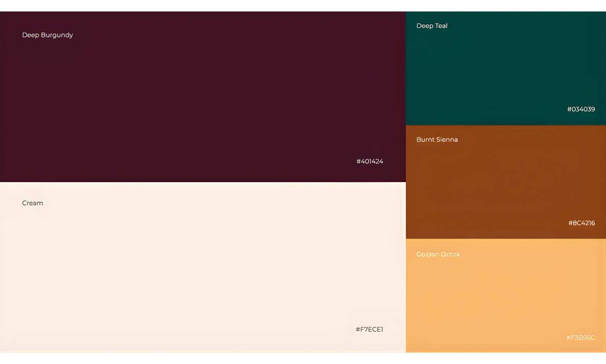
- Color Palette & Application: The deep burgundy, cream, and warm accent tones support a sense of refinement and warmth across menus, signage, and interiors. These colors translate well between print, environmental graphics, and digital touchpoints.
Client Testimonial
“With our new visual branding and language in place, the new Palazzo brand clearly captures the essence of our current and target customer base, our space, and our values.”— Raphael Araujo, Co-founder, Palazzo
What Brands & Designers Can Learn from Palazzo
Here are three key lessons from the Palazzo logo design:
1. Ground the Identity in Place
Referencing the restaurant’s architectural arches ties the logo directly to its physical environment. This connection makes the brand feel authentic and rooted rather than abstract.
2. Practice Symbolic Restraint
The logo uses balanced geometry and minimal elements to convey elegance without visual excess. Subtle symbolism allows the mark to feel timeless and refined.
3. Design as a Unified System
The icon and typography echo each other through shared forms and proportions. This cohesion strengthens recognition across signage, menus, and interiors.
About DesignRush Featured Designs
At DesignRush, we evaluate hundreds of projects each month. Featured selections stand out for clarity, craftsmanship, conceptual depth, and execution across digital and brand experiences.
The strongest examples move on to our Monthly Design Awards, highlighting best-in-class creative work.
Check out more standout work across categories:
- Best Logo Designs
- Best Website Designs
- Best App Designs
- Best Print Designs
- Best Packaging Designs
- Best Video Designs
For a full list of design agencies and related services, see our Agency Directory.
-preview.jpg)
-preview.jpg)
-preview.jpg)
