Standout Features:
- Pixelated silhouette of the Clérigos Tower
- Elegant serif typography
- Adaptive, multicolor identity system
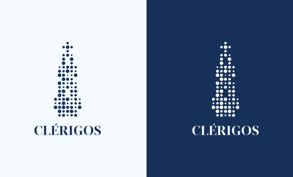
This new professional services logo for Clérigos reconstructs a historic monument through minimalist geometry and digital symbolism. It distills Porto’s architectural pride into a scalable and unmistakably modern emblem.
Translating a centuries-old icon into a modular and scalable graphic is a smart move.
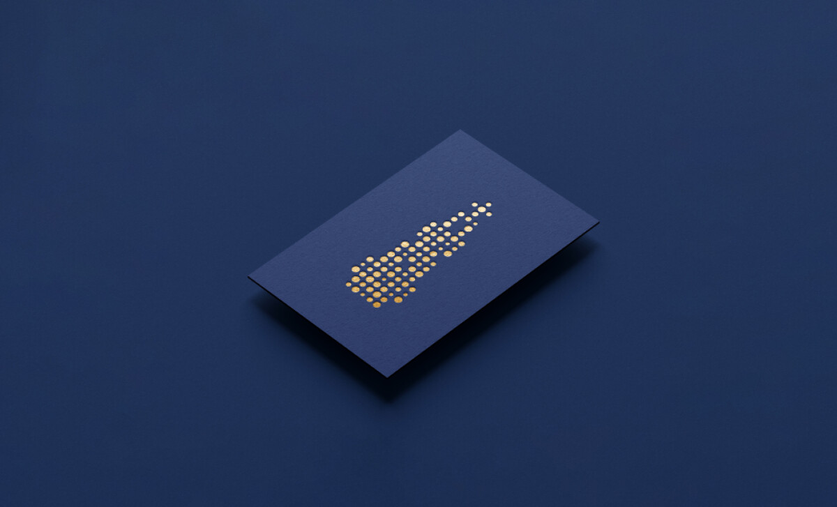
This design allows for amazing flexibility across both physical and digital touchpoints. It can be used anywhere, from tickets to social media icons.
The wordmark “CLÉRIGOS” is set in an all-caps serif typeface. It features a high contrast between its thick and thin strokes and has slightly flared terminals.
The choice of a serif is highly effective for a heritage brand, as research shows this font style leads to a significantly higher perception of authority and refinement. Additionally, the carefully preserved accent on the "E" reinforces its linguistic authenticity.
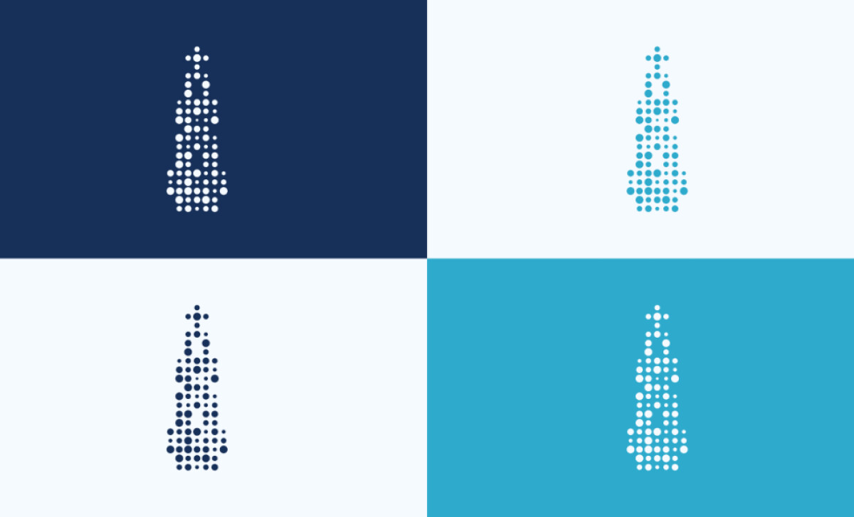
The logo appears across multiple color pairings. These include a deep navy, a bright sky blue, and a clean white.
The variations are presented in contrasting combinations that offer great flexibility in application, used on everything from tickets and signage to digital assets and high-end merchandise.
Estúdio Ricardo Daniel's design for Clérigos is a triumph. It proves that even a centuries-old icon can be given a fresh, exciting, and beautiful new life.
Rebranding a beloved historical landmark is a huge responsibility — the design must respect its past while making it feel relevant and exciting for today.
That's why brands turn to expert partners, and our team has ranked the best agencies worldwide to make finding them simple.
Visit our Agency Directory for the Top Logo Design Companies, as well as:
Our design experts also recognize the most innovative design projects across the globe. Visit our Awards section to see the best & latest in logo design.