-desktop.jpg)
The Detroit Lions, one of the NFL’s oldest franchises, have built a legacy of resilience, grit, and determination. Over the decades, its logo has mirrored this journey — transforming from a playful, cartoonish design into a fierce, modern emblem of power.
As the team evolved, so did its visual identity, shaping a brand that fans proudly wear on jerseys, hats, and memorabilia. Let's look closer at the Detroit Lions logo history and how it has come to represent one of football’s most enduring teams.
Detroit Lions Logo Design Details
The current Detroit Lions logo is a bold, modernized depiction of a leaping lion. The logo design emphasizes speed, strength, and aggression, with refined detailing that gives it a sense of motion and energy.
The team’s signature Honolulu blue and silver color palette remains at the heart of its branding — Honolulu blue symbolizes tradition and loyalty, while silver adds a sleek, contemporary touch.
The latest iteration removes unnecessary details, focusing on sharp, clean lines that make the logo instantly recognizable. This modern touch ensures adaptability across digital and merchandise applications.
Detroit Lions Logo History
The Detroit Lions' emblem has undergone significant transformations since the franchise’s early days. Each iteration reflects shifts in sports branding and the team’s commitment to evolving with the times.
1934: The Portsmouth Spartans Era
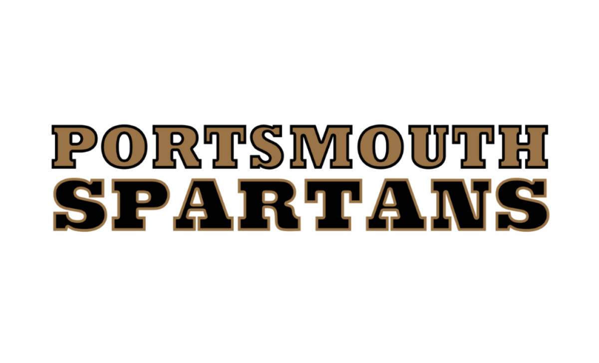
Before becoming the Detroit Lions, the team was known as the Portsmouth Spartans, a franchise in Portsmouth, Ohio, a small town with a population too small to sustain an NFL team.
Its branding was simple, featuring a bold, serif-font team name in a brown and gold color scheme, reflecting early football's rugged, no-frills attitude. However, financial struggles and the inability to compete with larger market teams led to a pivotal moment in 1934 when businessman George A. Richards purchased the franchise and relocated it to Detroit.
With the move came a new identity inspired by the city's baseball team, the Detroit Tigers. The newly named Lions adopted a fiercer, more regal image to symbolize strength, dominance, and their goal of being "king of the NFL."
1940: The First Lion Appears
_bcdf455cd8c7-desktop.jpg)
As football entered a new decade, teams sought to create stronger visual identities that reflected their toughness and competitive nature. The first true Lions logo featured a muscular football player riding a roaring golden lion, a bold artistic representation of strength and dominance.
While visually compelling, the complexity of the design made it less practical for merchandising and media use. This hand-drawn illustration embodied football's toughness and bold personality in the 1940s.
Check out our collection of animal-inspired high school football logos and more.
1961: The Blue Lion Debuts
_410e6f2a284c-desktop.jpg)
By 1961, the NFL had begun embracing more streamlined and marketable team logos, leading to a major rebranding for the Lions. This period marked the introduction of the now-iconic blue lion, a design that brought a more stylized, minimalist aesthetic.
The elongated lion mid-stride was set against two vertical blue and gray bars, symbolizing both tradition and forward momentum. The redesign coincided with the NFL’s growing popularity and the increasing presence of televised games, necessitating designs that could stand out on-screen.
A more stylized, minimalist design featured a sleek, elongated lion mid-stride, backed by two vertical blue and gray bars. This version laid the groundwork for the modern Lions' identity.
1970: A More Recognizable Lion
_9f944ddbc005-desktop.jpg)
The 1970 redesign introduced an entirely blue lion silhouette with a white outline, ensuring a stronger contrast and a more dynamic presence on helmets and promotional materials.
This period also saw significant rule changes in the NFL that increased the speed and athleticism of the game, and the new logo reflected this shift by making the lion appear as if it were charging forward.
The team enhanced its brand’s impact by simplifying the design, making the logo more distinguishable on and off the field. The stance became more dynamic as if the lion were charging forward — capturing the team’s competitive energy.
2003: Sharper Angles and Black Outline
_8f6a50fca349-desktop.jpg)
The early 2000s marked a dramatic shift in sports branding, with teams embracing bolder, more aggressive visuals. In 2003, the Detroit Lions responded by updating its logo with bold black outlines and sharper edges, adding more definition to the lion’s mane and body.
The enhanced design aligned with the team’s efforts to reestablish itself as a dominant force in the league, reinforcing a sense of strength and determination in their branding. This version aimed to make the emblem more aggressive and visually impactful.
Discover how to build a powerful brand identity, starting with a comprehensive brand book.
2009: Modern Refinement
_24762ad65820-desktop.jpg)
A streamlined version of the 2003 logo debuted with cleaner lines, a slightly modified pose, and the removal of excess black detailing. The focus shifted to a sleeker, more balanced silhouette that worked well on digital platforms.
2017: The Current Detroit Lions Logo
-desktop.jpg)
In 2017, the Detroit Lions introduced the most refined version of its logo to date. The silver outline was enhanced to provide better contrast and visibility, ensuring the logo remained distinctive in digital and print formats.
The modernized lion retained its sense of motion, embodying the franchise’s relentless pursuit of success. This update came as part of a larger rebranding effort that included redesigned uniforms and an emphasis on a more cohesive team identity.
By keeping the essential elements intact while refining details, the Lions ensured that their logo would continue to stand strong in the ever-evolving world of sports branding, enhancing contrast and visibility. The modernized lion remains in motion, embodying the franchise’s drive to compete at the highest level.
Detroit Lions Symbol: Strength and Heritage
From a detailed illustration to a sleek, modern emblem, the Detroit Lions logo has evolved into a powerhouse symbol of strength, tradition, and fierce competition. The current sports logo perfectly balances history with modern aesthetics — ensuring that wherever the Lions play, its iconic leaping lion remains a symbol of unwavering pride.