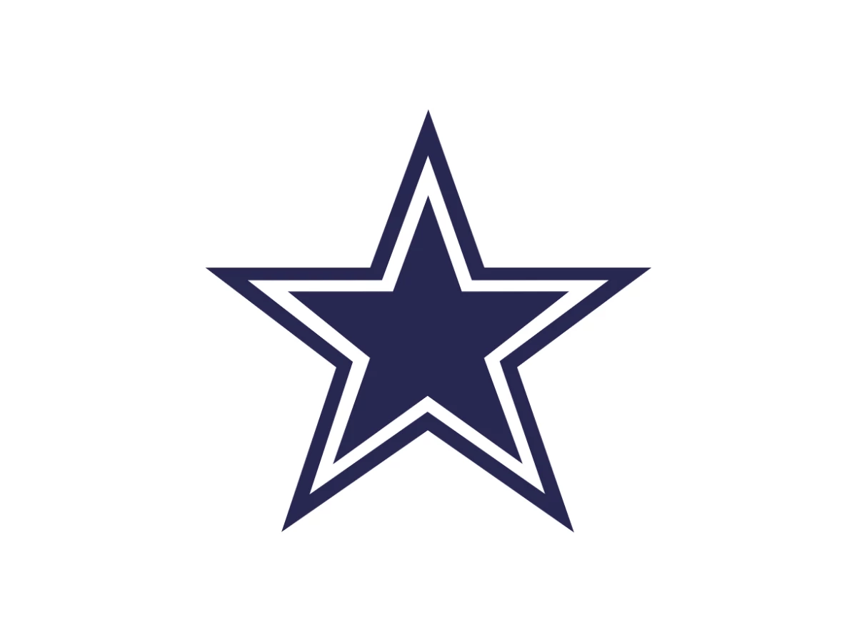

The Dallas Cowboys logo is one blue star. No mascot, no wordmark, nothing else. In more than 60 years it has changed exactly once that counts: a 1964 fix from an equipment manager who needed the star to stop vanishing into a new helmet. Everything people love about the mark today traces back to that one afternoon of problem-solving.
What To Know
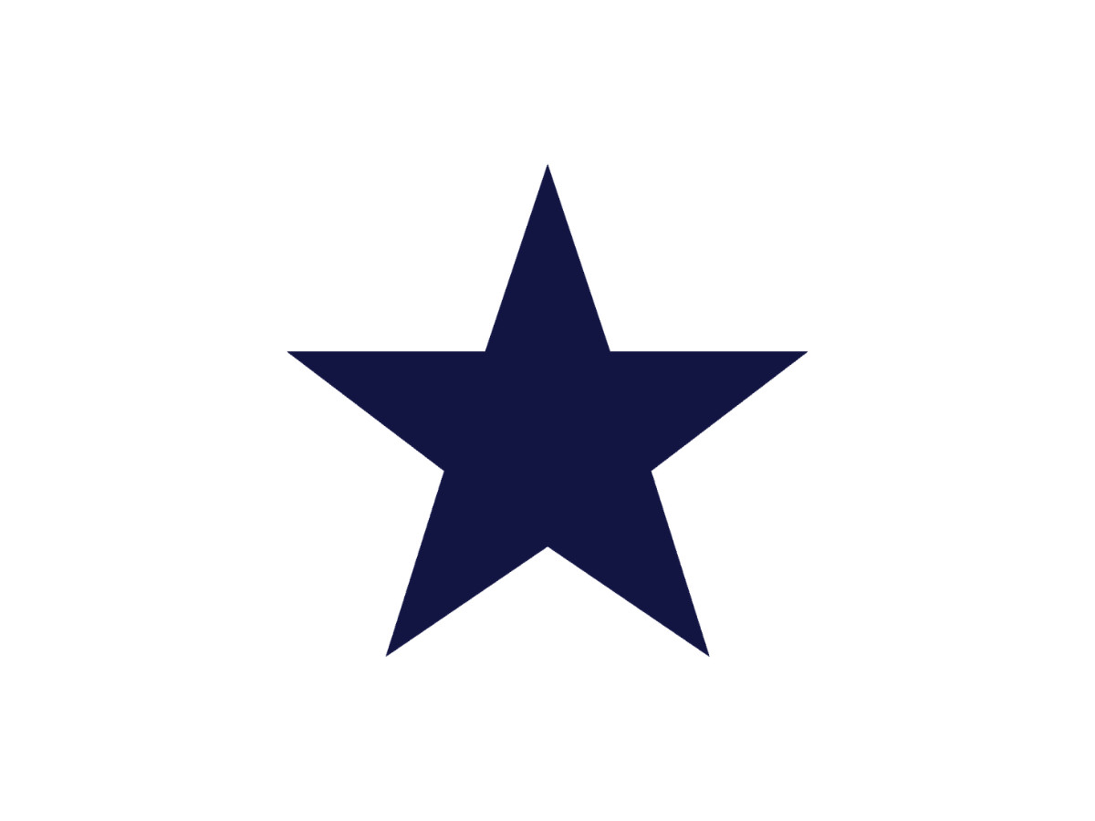
- The Cowboys star was created in 1960 by equipment manager Jack Eskridge, who drew a plain navy five-pointed star for the Lone Star State.
- The defining change came in 1964, when Eskridge added a white and navy double outline for depth and legibility on a new silver-blue helmet.
- The primary color is navy blue: Pantone 282 C, hex #041E42, CMYK 94, 55, 0, 74.
- The star is a registered U.S. trademark, and the club has a long history of defending it in court.
- Two versions of the primary star exist in the team's entire history, and the gap between them is those outlines.
Dallas Cowboys Logo History
The Cowboys joined the NFL as an expansion team in 1960, playing their first season under head coach Tom Landry and general manager Tex Schramm.
The franchise needed a mark that could stand on its own in a state that already treated football as close to religion, and it settled on the most direct symbol available: a single five-pointed star, the emblem of Texas, the Lone Star State.
The person behind it was Jack Eskridge, a former professional basketball player who joined the club in 1959 as its equipment manager. Eskridge drew a solid navy blue star with clean edges and no other detail. No wordmark, no illustration, no motto. The star did the whole job.
The 1964 Redesign That Actually Mattered
By 1964 the star had one real problem. The Cowboys were moving from white helmets to silver-blue ones, and a solid navy star risked disappearing against the darker shell.
Eskridge's answer became the change that defined the logo for the next six decades: he wrapped the star in a white outline, then set a navy contour around that. The double border lifted the star off the helmet and gave it a shallow three-dimensional feel, so the mark read clearly at a distance and at speed.
The star's proportions did not change. Historians describe the update as deliberately conservative, keeping the original drawing and adding only two contours.
After 1964 the team treated the redesign as finished and never reopened it. The Cowboys have used only two versions of the primary star in their history, and the difference between them is those outlines.
A Star Built Into The Helmet
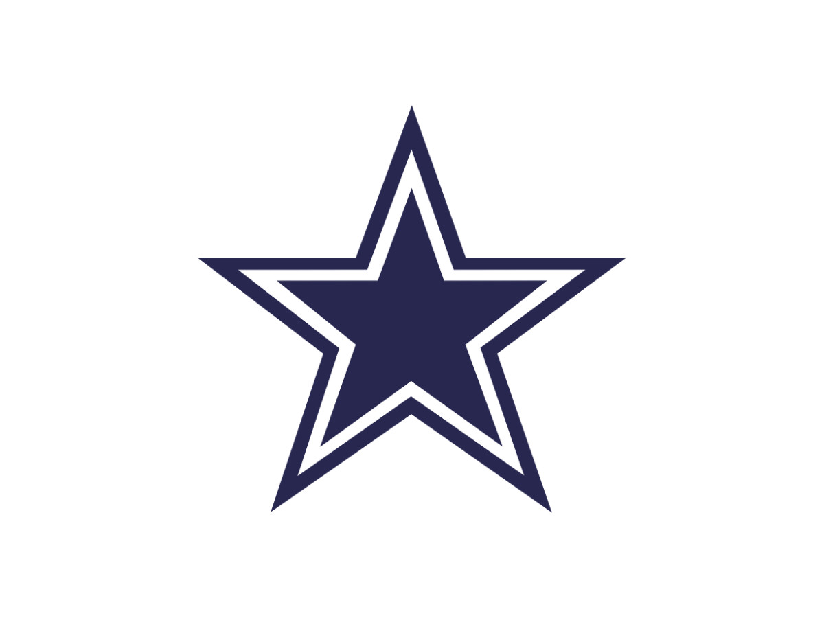
The logo never really lived apart from the helmet, and the helmet has its own timeline worth tracing. From 1960 to 1963 the Cowboys wore white helmets carrying the plain navy star and a blue-white-blue center stripe. In 1964 the team adopted a simpler look, switching the shell to silver-blue and picking up Eskridge's white-outlined star, the version most fans read as classic Cowboys today.
Three years later the team refined it again. In 1967 the decal added the navy outline around the white border, giving the star the bolder, layered edge it still carries.
That 1967 helmet has stayed almost untouched ever since, with one exception. In 1976 the Cowboys swapped the right-hand blue stripe for a red one, turning the center stripe into a red, white, and blue tricolor to mark the United States bicentennial.
The bicentennial stripe lasted a single season, though the team has revived it since for military tributes.
Dallas Cowboys Logo Colors
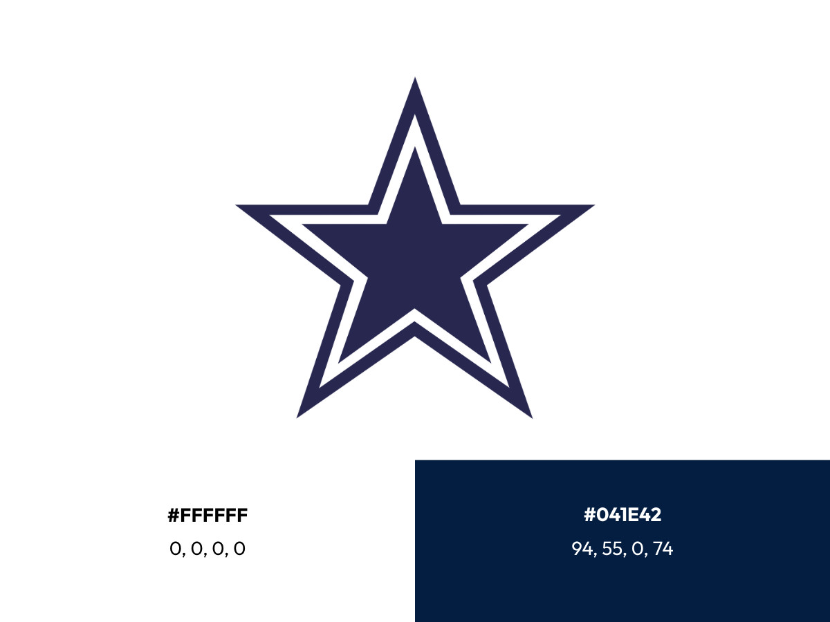
The Cowboys palette is narrow by design. The primary star is navy blue, specified as Pantone 282 C, hex #041E42, and CMYK 94, 55, 0, 74. White, hex #FFFFFF and CMYK 0, 0, 0, 0, handles the outline and the negative space.
The modern uniform system adds metallic silver, but the logo itself stays close to navy and white. Holding that range steady across helmets, screens, and merchandise is part of why the star survives shrinking to a lapel pin or blowing up to the side of a stadium.
Dallas Cowboys Alternative Symbols
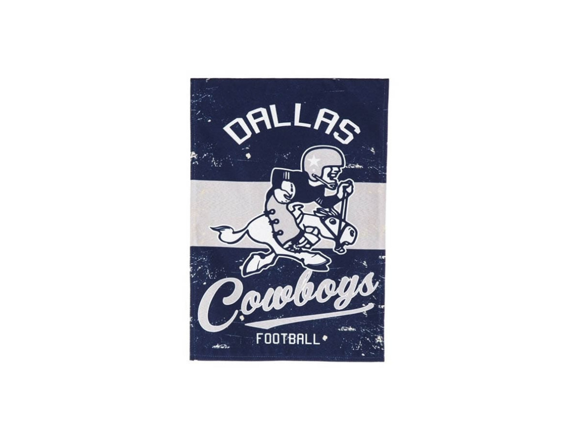
The star has never been completely alone. In the early 1960s the Cowboys occasionally used a cartoon cowboy riding a bucking horse for merchandise and promotions, a nod to the Western side of the brand.
It never competed with the star as the official mark, and it faded out as the team consolidated around the simpler symbol. Today it survives mostly as a nostalgia piece in the franchise's early visual history.
Dallas Cowboys Anniversary Emblems
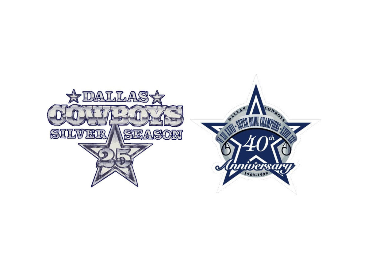
Milestones have produced their own one-off marks. For the 25th anniversary in 1985, the team ran a Silver Season logo built around a silver star with the number 25 at its center and the words "Dallas Cowboys" and "Silver Season" set alongside it.
In 1999 the 40th anniversary emblem wrapped the star in a banner reading "Super Bowl Champions," a reference to the team's wins in Super Bowls VI, XII, and XXVII, with the years 1960 to 1999 marking the run.
Both were seasonal, and both gave way to the standard star once the year ended.
A Trademark Worth Defending
Six decades of consistency turned the star into a valuable piece of property, and the Cowboys treat it that way. The star design is a registered U.S. trademark, filed for apparel under registration number 3,097,072, and the club has a long record of protecting it.
In 2016 the team filed a formal opposition against a youth football group trying to register a bordered five-point star and the phrase "Prichard Cowboys" for sportswear, arguing likelihood of confusion and dilution of its marks.
The club cited its "longstanding, widespread and continuous use" of the star design in the filing. The mark has surfaced in bigger fights too, including a 1990s dispute between the NFL's licensing arm and owner Jerry Jones over sponsorship deals that leaned on the star.
For a logo this plain, the legal file is surprisingly thick.
Why The Star Never Needed Fixing
Most logos get redrawn for predictable reasons: new ownership wants a mark of its own, the first attempt was never quite right, or enough time passes that the design starts to look dated. None of those pressures ever landed on the Cowboys star.
A few sports marks share that staying power. The Chicago Bulls emblem has gone untouched since 1966, and another Texas franchise circled back to its classic look after years of experiments.
Set those against a property like the FIFA World Cup logo, redrawn for every tournament, or the shifting national football crests of the international game, and the Cowboys' refusal to tinker starts to look like the bolder call.
The lesson for anyone building a brand is not that simple always wins. It is that a mark solving one clear problem, in this case reading instantly as Texas, rarely needs revisiting.
Eskridge's 1964 outline fixed a real legibility issue and then left the idea alone. As one Dallas sports writer described it, the star holds up because it does not need a mascot or a wordmark to explain itself.
Sixty years of restraint is its own kind of design decision, and it is the harder one to make. It ranks among the best sports logo designs for exactly that reason.
Frequently Asked Questions
Who Designed The Dallas Cowboys Logo?
Jack Eskridge, the team's equipment manager from 1959, is widely credited with both the original 1960 navy star and its 1964 refinement.
Some accounts tie the early identity to general manager Tex Schramm's front office, but Eskridge is the name most consistently attached to the mark itself.
Why Is The Dallas Cowboys Logo A Star?
The star stands for Texas, nicknamed the Lone Star State for its history as an independent republic. A single blue star let the new franchise claim its home state at once, with no wordmark or mascot needed to explain the connection.
Has The Dallas Cowboys Logo Ever Changed?
Barely. The Cowboys have used only two versions of the primary star. The 1960 original was a plain navy star, and the 1964 update added a white and navy double outline for depth and legibility. The proportions have stayed the same ever since.

Our team ranks agencies worldwide to help you find a qualified partner. Visit our Agency Directory for the Top Logo Design Companies as well as: