For most of its history, the Norwegian Football Federation treated its crest as an administrative detail: a flag on a white circle, functional, replaceable, good enough.
The story of how that changed, and why the badge that finally replaced it matters more than ever right now, is a 90-year argument about what a national football crest is actually for.
Part One: The Flag Era (1920s–2007)
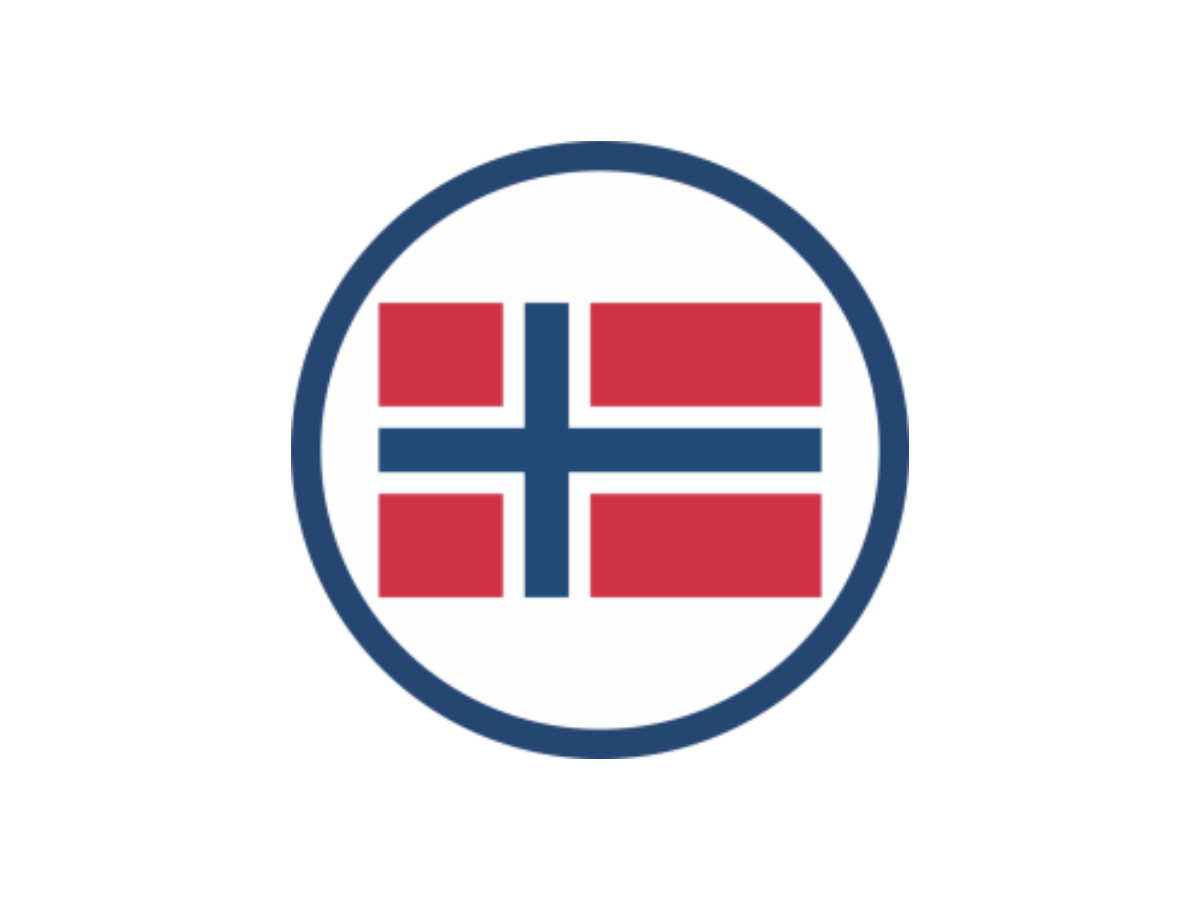
Since the 1920s, the NFF put the national flag inside a white circle on the player's chest and called it an identity.
For most of eight decades, that was the whole brief.
It worked, in the narrowest sense.
Norway's red-and-blue cross on white ranks among the most recognizable flags anywhere, so the country was never in doubt.
Yet a flag pinned to a shirt makes a poor crest. The badge added nothing the flag hadn't already said on its own.
No heraldic weight, no history, no visual language that read as Norwegian football rather than just Norway.
The federation would later build its redesign around a phrase it had always leaned on: å spille med flagget på brystet, or "to play with the flag on your chest."
That line framed the NFF's identity from the start. For 80 years, though, they took it at face value and stopped there.
The flag was the badge. The badge was the flag, and nobody questioned the loop.
Through the 1980s and 1990s, the NFF logo turned up on the opposite breast beside the flag circle.
This short-lived flourish mixed an initial "N" with football motifs, yet the core logic held. The badge stayed paperwork.
Part Two: The Dragon Disaster (2008)
In May 2008, the NFF finally moved. What they did became a cautionary tale.
The federation unveiled a new crest: a Viking-style dragon coiled around the NFF logo, set inside a modern shield with "norge" stenciled across the top in a contemporary mixed-case style.
The designers called it recognizably Norwegian and pointed to Viking culture as the source.
It was, in the loosest and most decorative sense. A dragon carries no specific place in Norwegian heraldry.
It reads as Viking-adjacent. It reads as costume.
The public rejected it fast and loud. Two days after the launch, the NFF said they would scrap the crest and bring back the flag while they reassessed.
That dragon badge never reached a senior international shirt.
The failure taught a clear lesson. The crest fell apart because it had no structural justification, even though the craft itself was fine.
Viking imagery got slapped on with no grounding in real Norwegian heraldry.
So the dragon felt borrowed rather than earned, and the public sensed that difference even without the vocabulary for it.
Part Three: The 2014 Redesign — How to Actually Earn a Badge
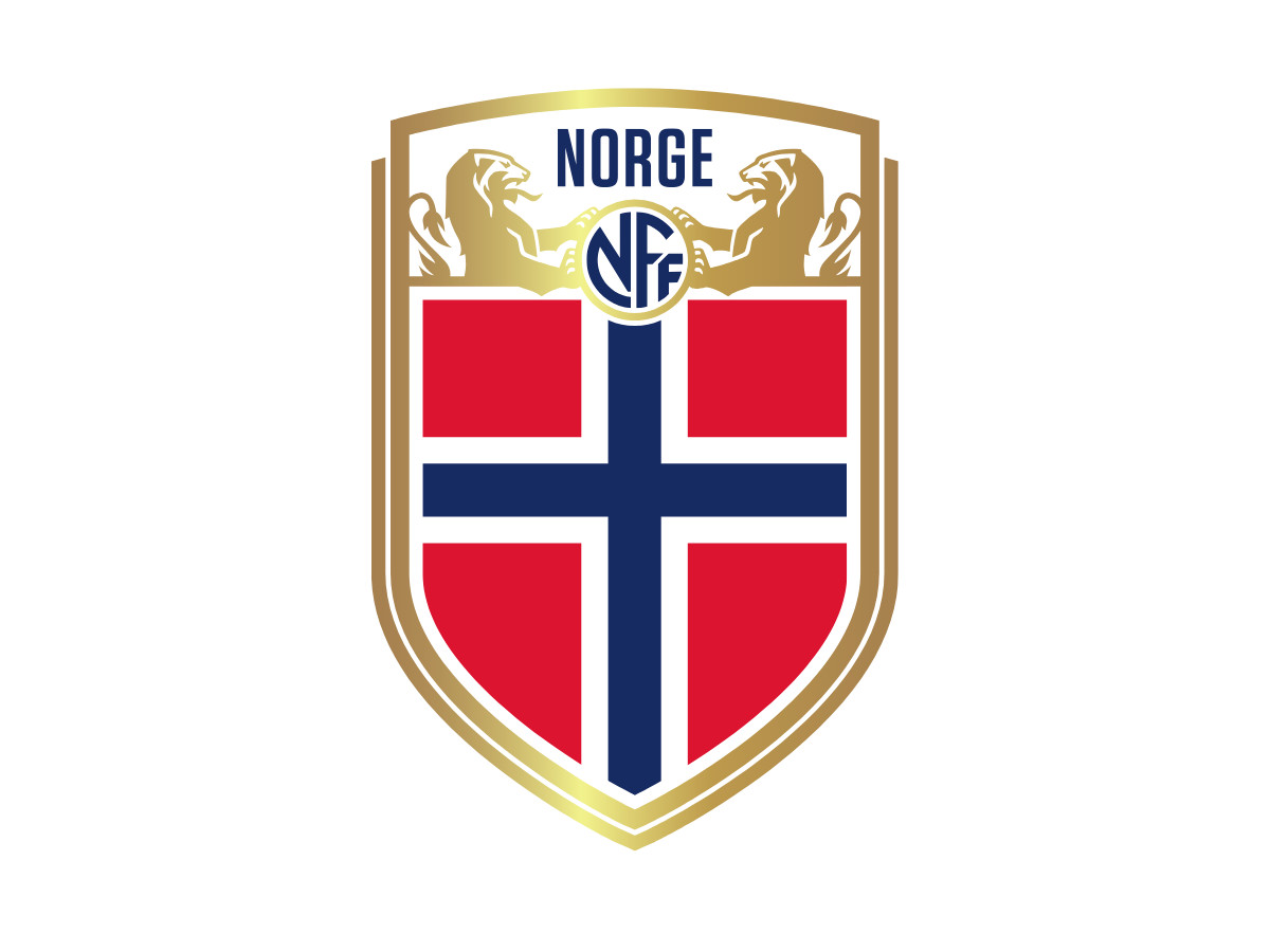
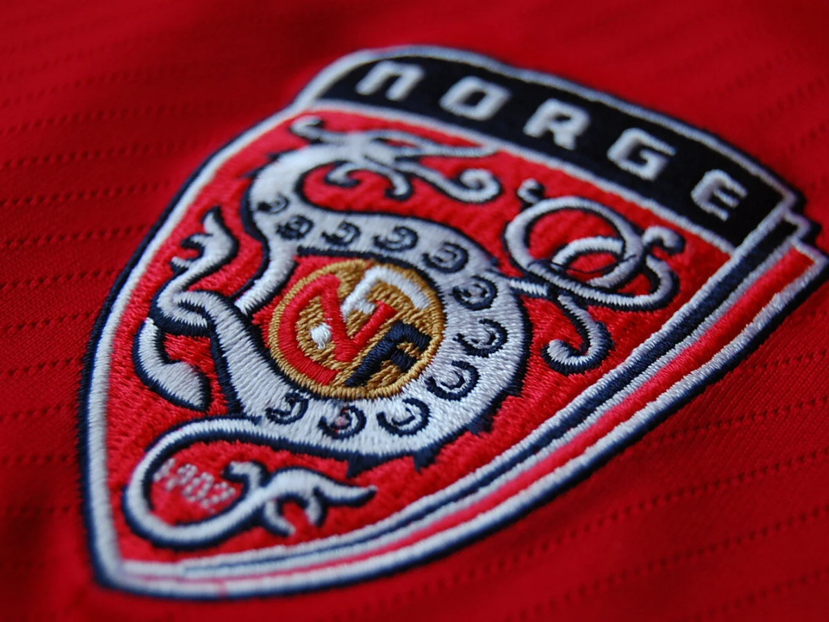
On 12 December 2014, the NFF presented a new crest, the one on every Norway shirt today.
Scandinavian Design Group, an Oslo agency, designed it, and it tackled a different problem than the dragon had.
SDG started from the Norwegian expression å spille med flagget på brystet.
The federation had always spoken this way, leaning almost entirely on the national flag and its colors.
The brief asked them to change that and build something larger than the flag yet still rooted in it.
So they made the expression structural. The cross of the Norwegian flag became the skeleton of the crest: the shield shape, the red quarters, the bold blue cross with white outlines.
Framing that structure at the top of the shield sit two crowned lions from the Norwegian coat of arms, facing each other and holding a small NFF emblem between them.
Those lions earn their place. The lion motif in Norway's coat of arms has tied to Norwegian royal heraldry since medieval times.
The earliest documented instance shows up on the seal of Skule Bårdsson in 1225, and later royal seals from King Haakon IV Haakonarson onward cemented its link to the crown.
The arms trace back to the 13th century, which ranks them among the oldest state symbols still in use anywhere. You're looking at an 800-year-old mark of Norwegian sovereignty.
SDG's own case study says the new crest "resurrects the lion and shield" used in the 1910s and 1920s, when the lion appeared on the badge and on caps and branded elements honoring national players.
This revival came with a function behind it.
The 2008 dragon had grabbed Viking imagery with no heraldic grounding, while the 2014 lions came straight from the actual coat of arms of the Norwegian state and had already worn the kit during the program's earliest organized years.
The accompanying identity work photographed the women's and men's teams against dramatic Norwegian landscapes, with typography pulled from excerpts of the national anthem.
That crest anchored a wider system, and it finally read as Norwegian football rather than just Norway.
Part Four: The Crest That Carries the Story (2026)
The crest is now carrying one of the tournament's better stories.
Norway reached the round of 32 on its first World Cup appearance since 1998, opening with a 4-1 win over Iraq and a 3-2 win over Senegal.
Erling Haaland scored four goals across those two games, two in each, joining a short list of players to manage multiple goals in each of their first two World Cup appearances and becoming Norway's all-time leading World Cup scorer.
With qualification already secured, coach Ståle Solbakken rested Haaland and captain Martin Ødegaard for the final group game and Norway lost 4-1 to France, finishing second in Group I behind Les Bleus.
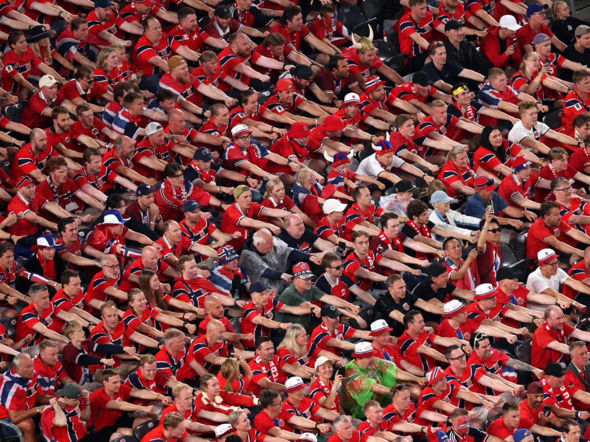
The off-pitch story has traveled further than the scoreline.
The Viking row, a chant where fans sit close together and pull imaginary oars in unison while shouting "ro" (Norwegian for "row"), has been filmed on an escalator at Boston's South Station, on a New York City subway, and in the middle of Times Square.
After the Senegal win the players performed it on the pitch, Ødegaard on a drum and Haaland out front, after seeing it go viral online.
Norway face Ivory Coast in the round of 32 on Tuesday, June 30, at AT&T Stadium in Arlington, Texas, with a place in the round of 16 on the line.
The crest on every red shirt in those broadcasts is the 2014 design, the most considered badge the program has ever put on a player's chest, on the biggest stage it has returned to in a generation.
After 90 years of treating the flag as enough, Norway is finally playing with a mark that earns the flag it is built around.
Design Takeaways
- Heritage works when it's earned rather than decorated. The 2008 dragon failed because it placed Viking iconography on a badge with no structural justification. The 2015 crest uses the lion from the actual Norwegian coat of arms, a heraldic mark with 800-plus years of documented use, and skips the decorative Viking reference entirely. That gap between the two approaches is the gap between costume and identity.
- The flag is a foundation for identity rather than the identity itself. Norway spent 80 years treating the national flag as a finished visual identity. It works for recognition, yet it does nothing the flag hadn't already done. The 2015 crest shows what happens once the flag becomes structure, the cross and the colors, instead of the whole mark. You get something that reads as Norwegian football rather than just Norway.
- A revival differs from a throwback. SDG explicitly revived the lion-and-shield from the 1910s and 1920s, and the key word in their own case study is "resurrects." A revival works when the revived element solves a current problem, and here the lion supplies the heraldic weight the flag-circle always missed. A throwback just reuses old art. The NFF crest is a revival with a job to do.

Our team ranks agencies worldwide to help you find a qualified partner. Visit our Agency Directory for the Top Logo Design Companies as well as:
- Top Sports Marketing Agencies
- Top Design Agencies
- Top Branding Companies
- Top Graphic Design Companies