Standout Features:
- Elegant geometric monogram
- Sophisticated minimalist typography
- Subtle nod to Italian heritage
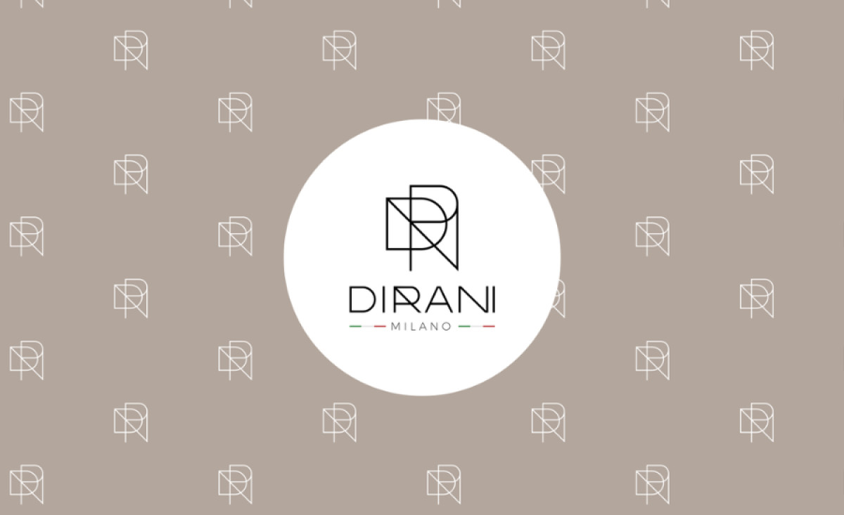
Refined, contemporary, and effortlessly sophisticated — the logo for the Dirani Milano Restaurant by Three Dot Studio captures the essence of this luxurious Milanese restaurant. Through geometric precision and minimalist aesthetics, the brand achieves a strong and timeless identity.
At the core of the visual identity is the geometric monogram, which merges the letters "D" and "R" into an interconnected structure. The sharp lines and precise angles create a sense of balance and symmetry. This monogram also serves as a versatile brand mark, working effortlessly across different applications, from menus to signage.
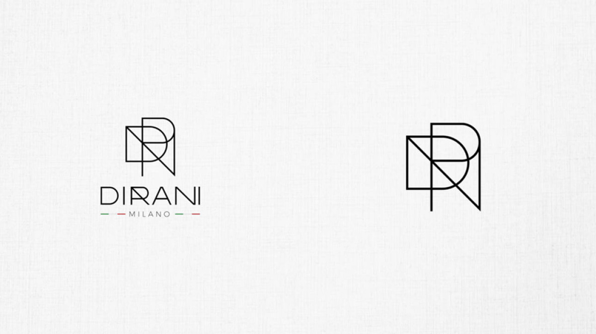
Beneath the emblem, the minimalist typography exudes understated elegance. The clean, sans-serif font enhances legibility while maintaining a modern aesthetic. The spacing and alignment are meticulously refined, contributing to an overall sense of sophistication.
Adding a distinct cultural touch, the subtle Italian tricolor accents beneath the brand name provide a refined nod to Dirani Milano’s heritage. The red, white, and green lines are understated yet impactful, reinforcing the restaurant’s deep connection to its roots without overpowering the design.
Three Dot Studio’s approach results in one of the best hospitality logo designs that is both timeless and contemporary, capturing the essence of Dirani Milano’s luxurious dining experience. This identity design effortlessly translates into various brand touchpoints, ensuring a cohesive and memorable presence in the hospitality space.