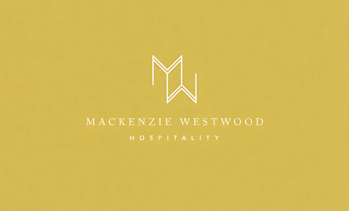
Standout Features:
- Monogram with angular symmetry
- Refined serif logotype and wide tracking
- Clean gold and white palette exuding elegance
Hospitality branding lives in the details and Cojo Moxon Design delivers precision with personality in this identity for MW Hospitality. The design merges architecture-inspired geometry with luxe typographic minimalism, creating a monogram and logotype system that captures premium service and timeless design in a single mark.
At the center is a symmetrical MW monogram, rendered with clean angles and subtle optical adjustments to suggest both structure and elegance. The linear form evokes architectural linework — fitting for a hospitality group that prides itself on refined aesthetics and high-touch experiences. It feels handcrafted but calculated.
Supporting the monogram is a logotype set in a slender serif with generous spacing. The wide tracking increases readability while communicating calm and class. This spacing reflects physical luxury, imagine ample space in a boutique hotel suite, through purely typographic form.
The palette is limited but potent: white space dominates, while muted gold adds polish and restraint. There’s nothing loud or overdone, but just enough visual richness to hint at premium service, paired with the neutrality required for versatility across signage, menus, or web use.
The MW Hospitality logo is a study in restraint and refinement. Cojo Moxon Design creates a brand identity that doesn't need embellishment, it speaks through its symmetry, elegance, and deliberate use of space.