Standout Features:
- Multilayered icon
- Monochromatic color palette
- Sleek sans-serif typography
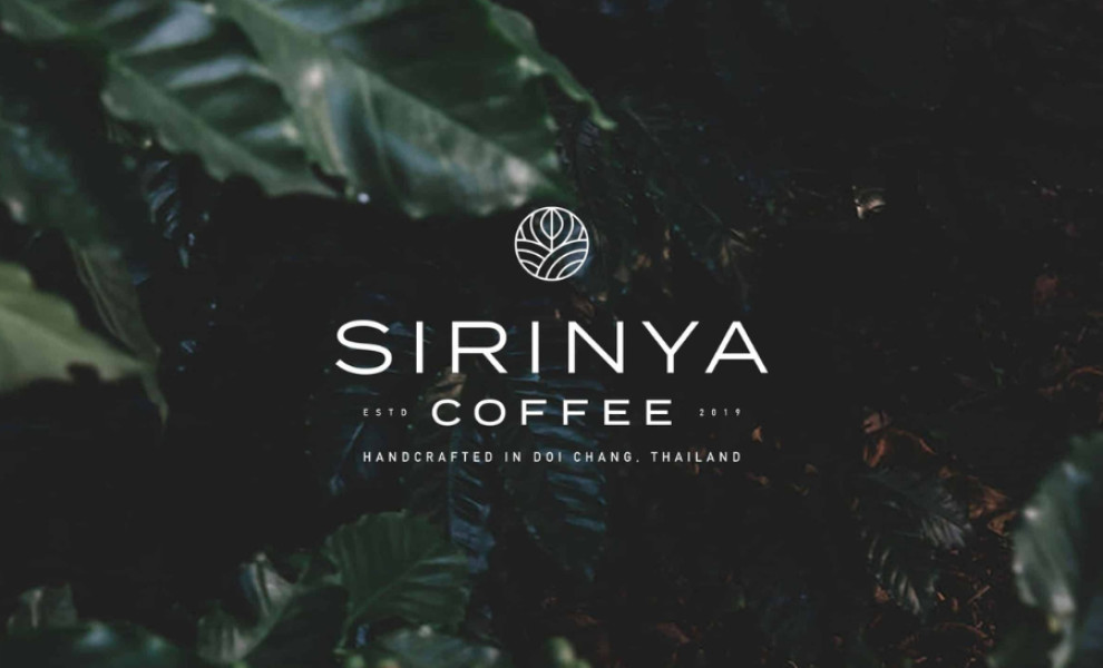
SIRINYA COFFEE's logo design, created by Thuro Design, combines minimalism with unique symbolism, encapsulating transparency and simplicity in this brand's direct coffee process. The multilayered icon conveys a rich narrative through elegant composition, featuring two hills on either side, representing the location of the company's farm nestled in the mountains of Thailand.
Between these hills lies a coffee bean shape inspired by traditional Thai patterns, adding a touch of cultural heritage to the logo. The upper half of the bean resembles a leaf, underscoring the brand's dedication to sustainable farming practices.
A monochromatic color palette infuses the logo with modern and sophisticated vibes, and the single-color scheme ensures a cohesive and clean look and highlights the brand's focus on clarity and purity. Lastly, underneath the icon is sleek sans-serif typography. This stylish, legible typeface reinforces the minimalist design while ensuring the brand name stands out.

