Standout Features:
- Funky aesthetics
- Witty rooster illustration
- Vintage arched typography
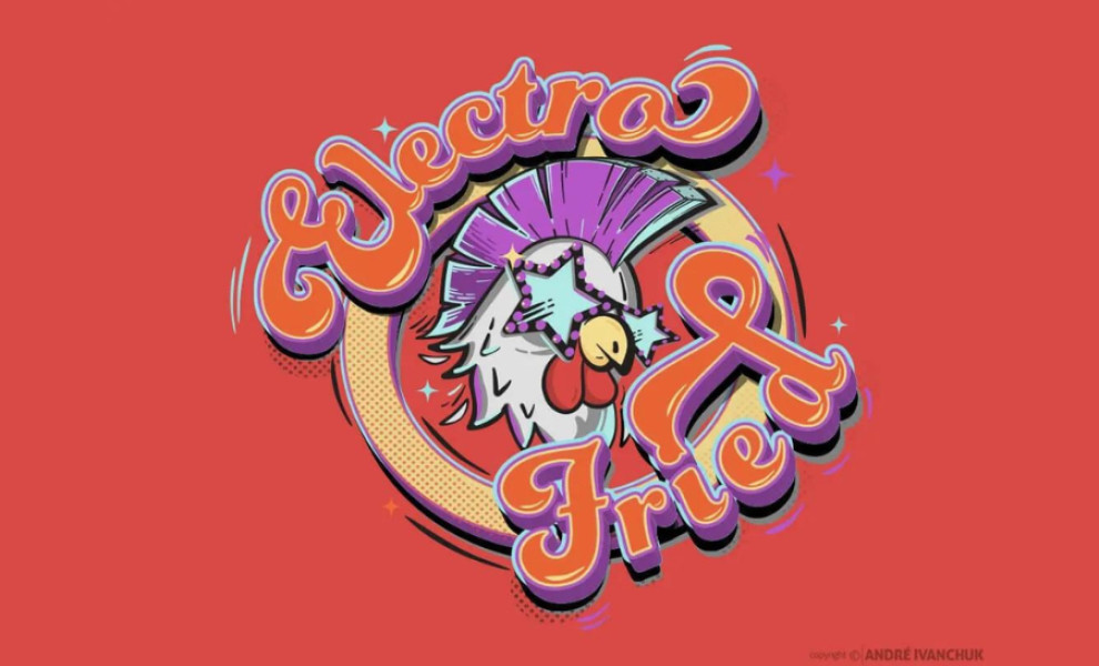
Electro Fried Restaurant’s logo design is funky, electric, and fun, featuring a rockstar rooster illustration paired with vintage arched typography.
The focal point of Such Chaos’ design is the rooster illustration. However, it’s not your average barnyard bird. Wearing star-shaped sunglasses and rocking a purple mohawk, this rooster is a symbol of cool punk attitude. Its playful expression and accessories instantly catch the eye and set the tone for the restaurant's lively atmosphere.
The handwritten vintage typography adds to the overall groove and psychedelic vibe. Every element works together to enhance the logo’s funky aesthetics, evoking a sense of celebration, party, and fun times.
Get a chance to become the next Design Award winner.
SUBMIT YOUR DESIGN


