Standout Features:
- Heavy bottle form reflects product strength
- Vintage crate-style stencil typography
- High-contrast red and off-white palette
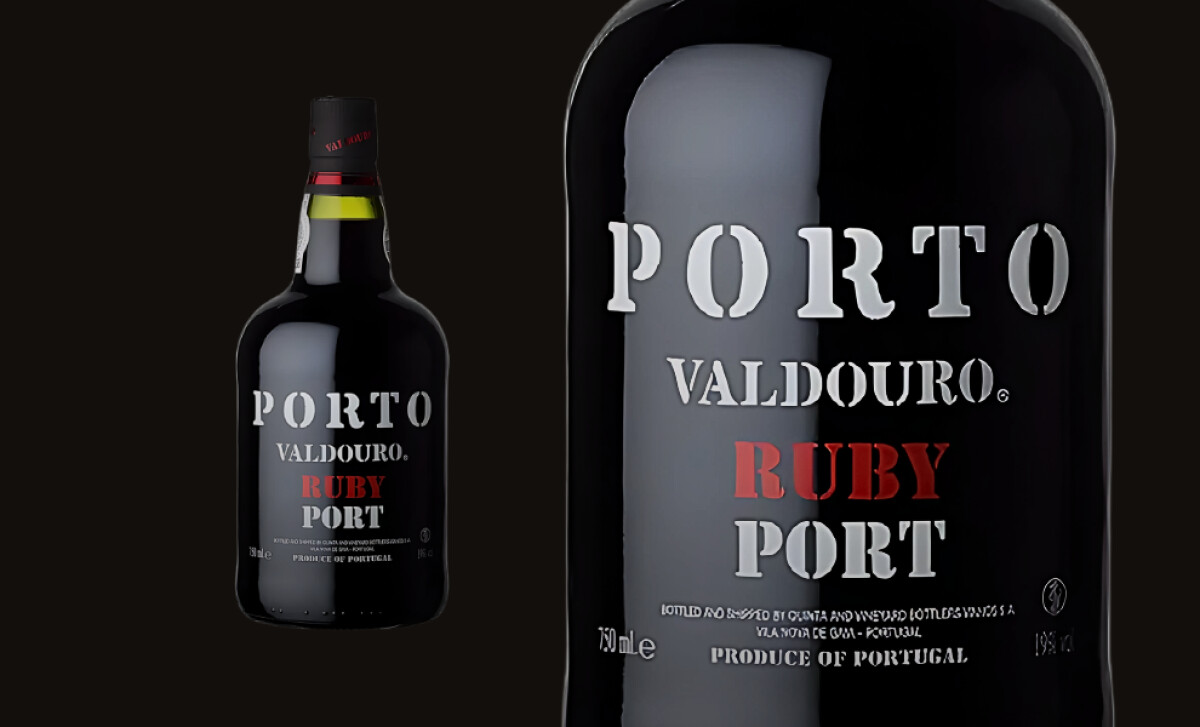
With its brooding presence and bold stencil typography, the Porto Valdouro Ruby Port logo design doesn’t whisper — it commands attention. One glance and you know what to expect: a rich, fortified wine that’s unapologetically strong and built on heritage.
At the center of the logo is its bold, all-caps stencil-style typography, a deliberate nod to vintage shipping crates and smuggler barrels. This isn’t decorative flair; it’s a reference to tradition, evoking strength, storage, and age. The type design makes the logo feel weathered, industrial, and grounded in old-world authenticity.
The color scheme reinforces the logo’s tone. Set against a matte black background, the off-white lettering provides high-contrast clarity while maintaining a dark, moody atmosphere. A single hit of crimson red, used only in the word “RUBY,” adds intensity and focus. This restraint gives the logo an edge without sacrificing readability.
What makes the Porto Valdouro logo design effective is its singular focus on mood and meaning. There are no flourishes or frills: just bold lettering, stark contrast, and historical symbolism. It’s a mark that delivers strength, clarity, and brand alignment in a single, impactful visual.
The Porto Valdouro logo design proves that bold typography and tight visual restraint can deliver just as much storytelling as ornate labels. Built for impact and rooted in legacy, it earns its place among the best wine bottle logo designs that cut straight to the point.