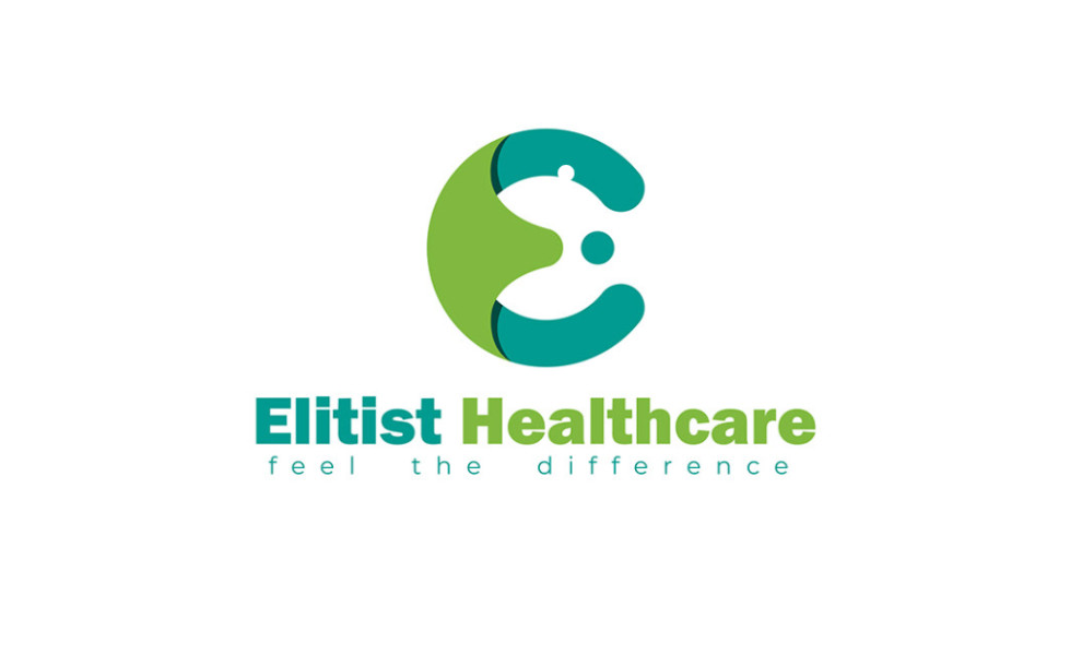
Standout Features:
- Cutout shapes forming an E
- A mother caring for a child's image
- A calm and relaxed color story
One notable feature in the Elitist Healthcare logo design by Pixenite is the use of shapes, hitting two birds with one stone: brand recognition and unique identity.
The logo consists of curved shapes forming an E for Elitist, a unique way of expressing the brand's values through visual elements. It also looks like a mother caring for a child, which is a great way to illustrate how much care and attention the brand has for its clients.
The green and blue shades in the monogram logo signify tranquility and freshness to the design.
Check out some of the best simple logo designs here.
Get a chance to become the next Design Award winner.
SUBMIT YOUR DESIGN