Standout Features:
- Interlocking lowercase monogram in a circular frame
- Minimalist sans-serif typography with curved geometry
- Adaptive brand application
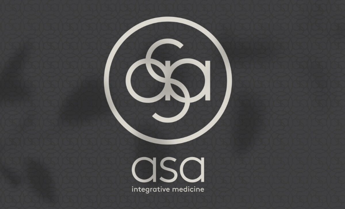
In the world of integrative medicine, branding must convey trust and serenity. The Asa Integrative Medicine identity, designed by Kim Berlin, achieves this remarkable balance.
Through a refined logomark system and minimalist typography, the Asa brand radiates a calm, professional elegance that is perfectly aligned with its holistic values.
You'll see a central monogram made of the letters “a,” “s,” and “a” in a continuous, interlocking design.
The lowercase forms are enclosed in a perfect circle and rendered in a soft, premium silver tone that feels etched and calm.
This interlocking form visually embodies the merging of medical disciplines, body, and mind. The perfect circle also reinforces a sense of wholeness and healing, creating a unique and instantly recognizable emblem that feels both proprietary and meaningful.
Below the monogram sits the wordmark “asa” in a geometric, rounded sans-serif font. The typography is all lowercase with generous spacing, and its curves mirror the arcs in the monogram.
The use of all-lowercase maintains an open and welcoming tone that speaks to emotional accessibility. The typography is a perfect reflection of a brand that is serious in its practice but very gentle in its overall tone.
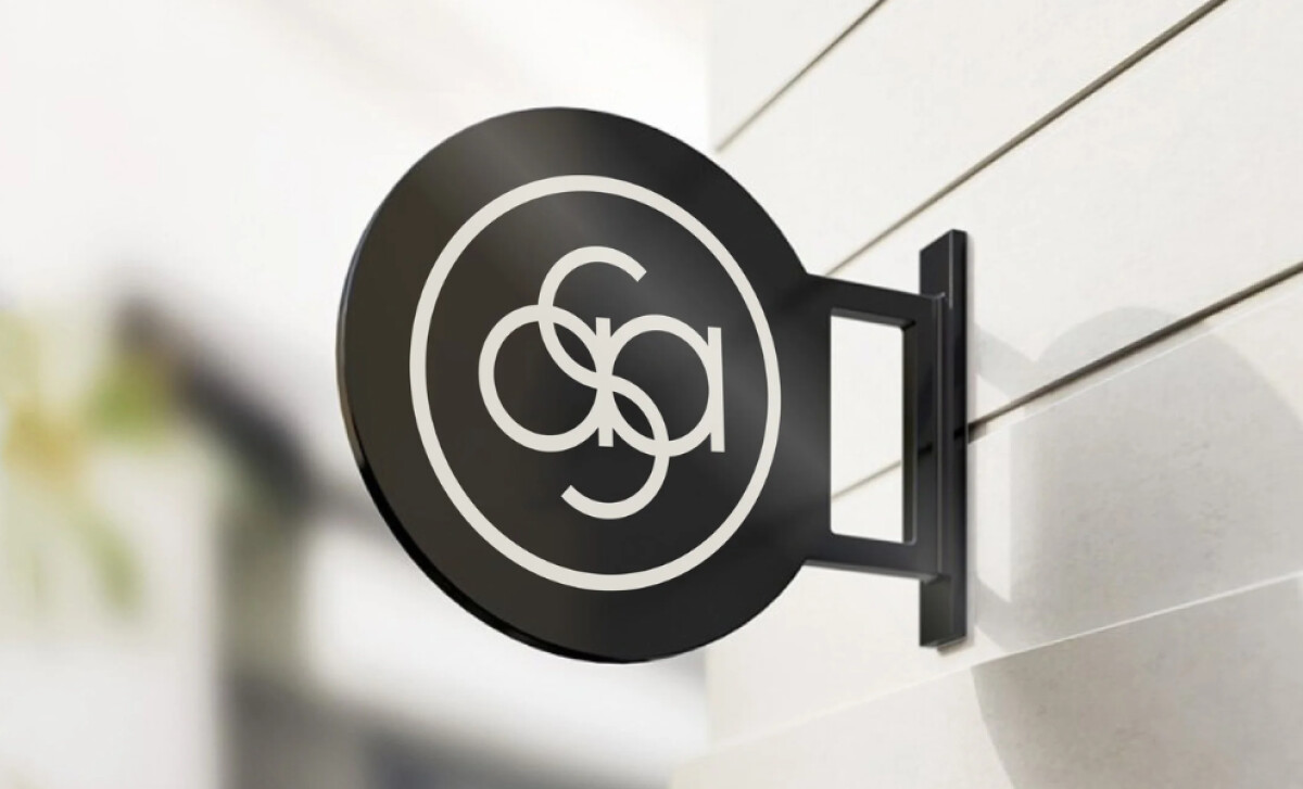
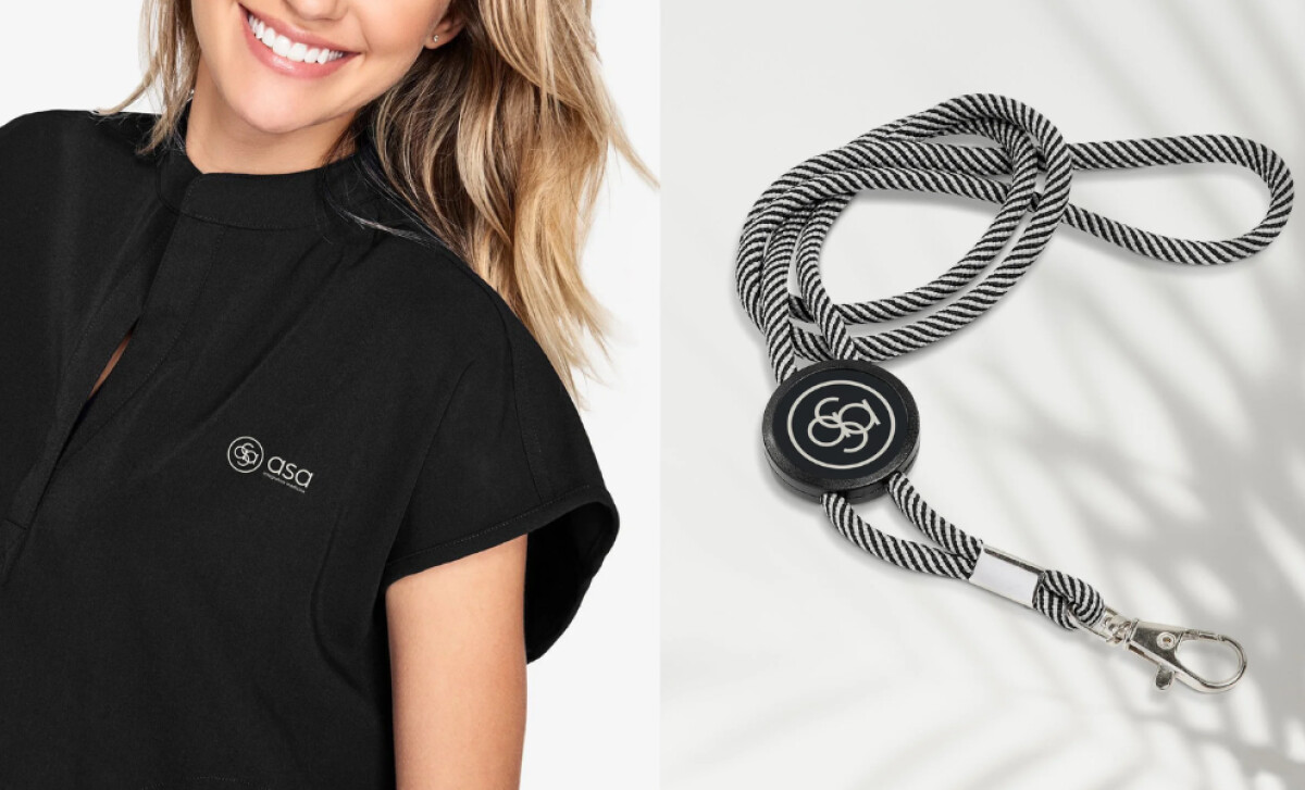
Across various applications like clothing and signage, the Asa logo is consistently presented in simple monochrome formats. You'll see it in either a light-on-dark or a reversed-out version.
This health and wellness logo design also works as a standalone mark on signage, a secondary element on scrubs, and even as a background motif. The silver-on-black palette adds a sense of luxury, too.
A major takeaway is the strategic choice of a soft, rounded, all-lowercase typographic system. This proves that medical branding can be approachable and gentle without sacrificing professionalism.
According to a 2020 StudyFinds poll, this is a critical balance to strike, as 75% of consumers believe the 'look and feel' of a brand can make or break its success.
Here, the type successfully moves away from the cold, intimidating feel of traditional clinical design, making the brand feel more human.
A great brand for a medical practice needs to achieve a difficult balance — feeling professional and trustworthy while also being gentle and approachable.
That's why brands turn to expert partners, and our team has ranked the best agencies worldwide to make finding them simple.
Visit our Agency Directory for the Top Logo Design Companies, as well as:
Our design experts also recognize the most innovative design projects across the globe. Visit our Awards section to see the best & latest in logo design.