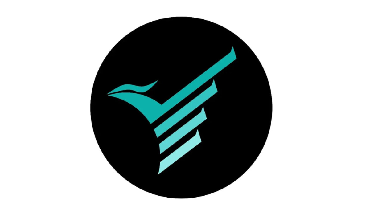
Standout Features:
- Stylized bird icon
- Diagonal motion stripes suggesting speed
- Teal gradient on a black circular field
For Fenix Shopping, an international import brand with a presence in the USA, Barcelona, and Guangzhou, the agency Bartistic was tasked with creating a strong visual identity.
The final logo expresses its services and message through a bold, vector-based symbol of a highly stylized phoenix.
With its beak and flowing head hinted through curves, the overall shape implies wings mid-flight, built from a series of angled, parallel strokes.
These diagonal stripes with sharp upward tails give the logo a feeling of being in the middle of a powerful ascent, lending a sense of perpetual forward movement to the brand.
The symbol is rendered in a vibrant teal-to-light-cyan gradient. This is contrasted against a solid black circular backdrop. The gradient is subtle but directional, running from the bottom to the top of the icon.
The retail logo design's color choice is deliberate, as teal, like all forms of the color blue, help make a brand look more trustworthy. The black circle then gives the logo a much-needed contrast and readability.
A 2025 Vistaprint survey found that for 42% of consumers, it is this unique personality that makes them trust a brand. All design aspects considered, Bartistic’s logo for Fenix Shopping creates an ambitious and reliable brand personality.
The big challenge for any global brand is to create a single logo that can tell a complex story of ambition and movement in any language.
That's why brands turn to expert partners, and our team has ranked the best agencies worldwide to make finding them simple.
Visit our Agency Directory for the Top Logo Design Companies, as well as:
Our design experts also recognize the most innovative design projects across the globe. Visit our Awards section to see the best & latest in logo design.

