Team Behind the Design
Logo Design Analysis
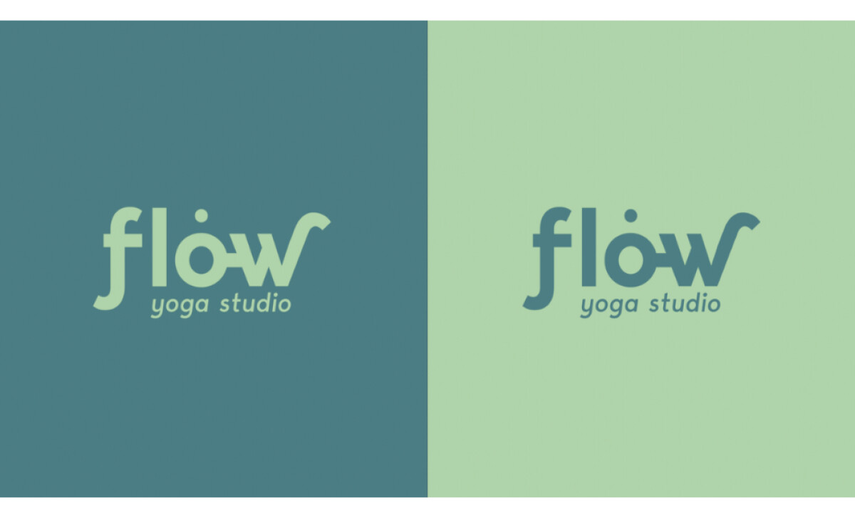
What I love about the Flow Yoga Studio logo is how it transforms a simple concept into an experience. This hospitality logo design expresses the studio’s identity through three ideas:
- movement
- calm energy
- balance
Together, these qualities create a visual language that feels soothing, uplifting, and effortlessly connected to the spirit of yoga.
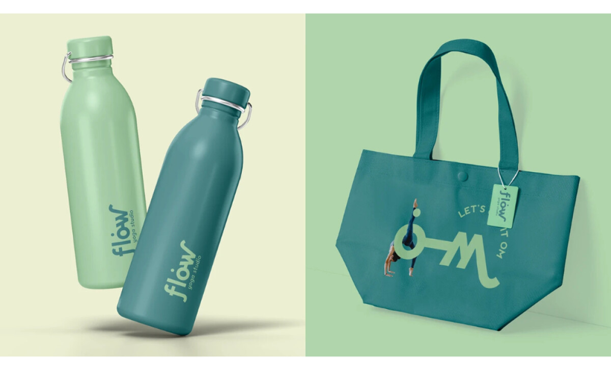
- Typography and Form: I appreciate how the custom letterforms bend and transition smoothly, making the word “flow” feel like it’s in motion. When I noticed the subtle reveal of “OM” inside the lettering, it added a layer of meaning that feels intentional without ever sacrificing readability.
- Color Palette: The soft greens and teals immediately stood out to me. They strike a balance between grounding calm and gentle vibrancy, which mirrors the dual nature of yoga practice: peaceful yet energizing.
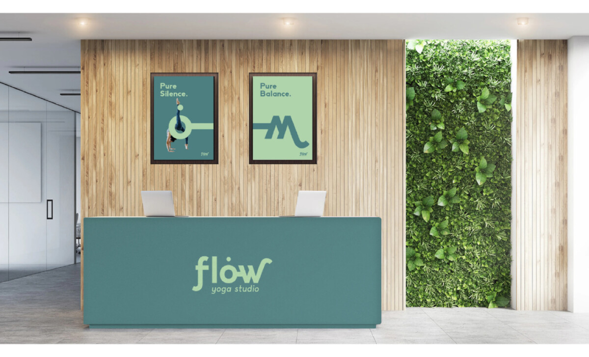
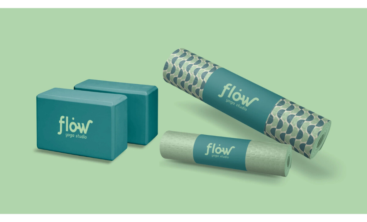
- Brand Expression: As I looked at how the logo appears across mats, signage, bottles, and tote bags, I could see how consistently it carries its personality. The curves give it warmth, while the minimal structure keeps it modern and clean.
- Overall Usability: I find the identity incredibly versatile. Whether it’s scaled large in a studio space or applied to small merchandise, it holds its clarity and maintains that sense of ease the brand promises.
What Brands & Agencies Can Learn from Flow Yoga Studio
Flow Yoga Studio’s identity shows how a simple idea can become a calming, meaningful brand experience through movement, softness, and intention.
1. Use Form to Express Feeling
The custom letterforms bend gently, creating a sense of motion that mirrors the name itself. The quiet reveal of “OM” adds depth without drawing attention away from readability, proving that symbolism works best when it feels naturally integrated.
2. Let Color Support Emotional Tone
The soft greens and teals ground the identity in calm energy while still feeling fresh. This palette reflects both the peaceful and invigorating sides of yoga, helping the brand communicate its atmosphere instantly.
3. Build Versatility Through Simplicity
Whether printed on mats, bottles, signage, or tote bags, the logo keeps its clarity. The minimal structure and warm curves make it adaptable and recognizable across every touchpoint.
About DesignRush Featured Designs
At DesignRush, we review hundreds of agency projects each month. The featured designs stand out for creativity, relevance, and execution.
Many go on to be recognized as winners of our Monthly Design Awards.
Discover more examples here:
- Best Logo Designs
- Best Website Designs
- Best App Designs
- Best Print Designs
- Best Packaging Designs
- Best Video Designs
For a full list of design agencies and related services, see our Agency Directory.