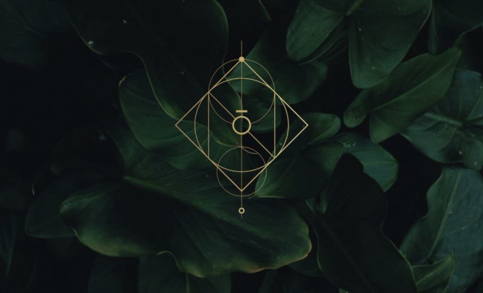
Nova Yoga's Logo Design Is a Geometric Symphony of Harmony and Balance
The Nova Yoga Studio's logo features interconnected shapes like circles, squares, triangles, diamonds, and lines that form a captivating symbol representing yoga's essence.
Designed by Soona Studio, these shapes embody the wholeness, stability, aspiration, clarity, and interconnectedness central to yoga. Meanwhile, the noticeable vertical line in the middle of the design catches attention, symbolizing yoga's unifying power.
This balanced, intricate design reflects Nova Yoga's commitment to providing a harmonious space, inviting tranquility and mindfulness through its representation of yoga's transformative nature.

The Nova Yoga Logotype Exudes Elegance in Simplicity
Many top logo designers use typography as a powerful tool in communicating key messages with their audiences, and this one is no exception.
The Nova Yoga logotype is an example of minimalist elegance. Its thin, delicate sans-serif font mirrors the peaceful nature of yoga while establishing a modern aesthetic. This approach also allows the brand's name to be legible and memorable.
Another subtle yet impactful design element is the horizontal line above the letter "O." This geometric addition acts as a visual anchor, emphasizing balance and stability — two elements central to the art of yoga.
These typographic and geometric elements create a visual language that speaks to the mind and body.
The logotype also creates a calming and sophisticated unified visual identity. This pairing highlights Nova Yoga's commitment to mindfulness, balance, and inner peace.
The sans-serif typeface, often associated with clean lines and simplicity, communicates a sense of clarity and openness. It invites viewers to explore their potential for self-discovery through yoga.
Browse other powerful logo designs for inspiration.
Nova Yoga's Logo Design Displays Tranquility Through Its Green and Gold Palette
The Nova Yoga logo's green and gold color palette establishes a connection with nature.
Green, the dominant color associated with growth and harmony, promotes a calming and rejuvenating effect. Gold, the accent color, represents the inner light cultivated through yoga, symbolizing wisdom and enlightenment.
This grounding yet radiant combination captures yoga's transformative power, inviting self-discovery, healing, and inner peace. Colors are a huge element in all outstanding logo designs, and Nova Yoga truly takes advantage of their chosen palette.
Check out some of these best wellness branding designs for more creative inspiration.
The Nova Yoga Logo’s Cross-Platform Adaptability Exemplifies Versatility in Design
The Nova Yoga logo's minimalist geometric design allows seamless adaptability across various platforms, such as websites, merchandise, and signage, maintaining visual impact and brand recognition.
Its clean lines and shapes translate beautifully across sizes and resolutions, enabling monochromatic versions or subtle adaptations without compromising essential elements.
This versatility is crucial for a modern brand like Nova Yoga to connect with its audience through diverse channels, fostering familiarity and trust.
Overall, the logo's clever use of symbolism, colors, and adaptability contributes to a cohesive and impactful brand identity, making it worthy of the Best Design Award.