
Standout Features:
- Geometric strength and stability
- Versatile use across product range
- Timeless, modern aesthetic
Cornerstone Finance’s rebrand, designed by Arlo & Ball, features a logo that symbolically captures the foundation of strength and stability inherent in the brand’s name. A cornerstone represents the structural base of a building, a perfect metaphor for a financial services company.
By using a hexagonal form, the design implies strength, stability, and balance — qualities essential for a company that operates in the finance sector. The sharp, clean lines give the logo a sense of professionalism and clarity, while the overlapping facets reflect the dynamic, multifaceted nature of financial services.
Another key strength of the logo is its versatility, which allows the logo to maintain a consistent identity while adapting to various product types, ensuring coherence in the branding while keeping each service distinct. This enhances the brand’s visual language, making it easier for clients to recognize and trust the different financial solutions provided.
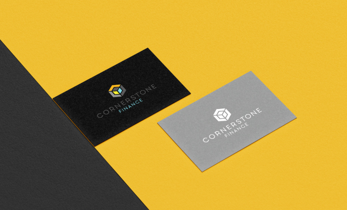
Additionally, the clean and minimalist design ensures the logo won’t feel outdated, providing lasting appeal across both digital and physical touchpoints. Whether on business cards, websites, or promotional materials, the logo stands out with its professional, sharp look, reinforcing the brand's trustworthiness and competence.
In conclusion, the Cornerstone Finance logo by Arlo & Ball is an excellent example of how a brand can communicate strength, stability, and versatility through thoughtful design. This logo design makes Cornerstone Finance stand out in the competitive finance and banking industry, establishing a strong, memorable identity.


