GoVolt’s Logo Design Stands For Accessibility, Green Living And A Greener Future
GoVolt is a Dutch solar panel import and installation company founded in 2011. Their focus is making renewable energy accessible and affordable to the “common man” at the lowest price possible.
Their logo design is the work of Mr Boost, a creative agency from Apeldoorn, Netherlands.
Both of these companies have a lively, personable and outgoing personality, despite coming from different backgrounds.
GoVolt's logo design is the result of the client and the agency being on the same page about engaging target audiences. Collaborating with the right logo companies ensures the brandmark aligns with the company's values and resonates with its potential customers.
In their mission statement, GoVolt professes the commitment to “introduce the world to sustainable energy for a fair and reasonable price," so that “everyone can benefit from this inexhaustible energy source.”
Up until recently, solar energy was seen as difficult to attain and reserved for big organizations and corporations.
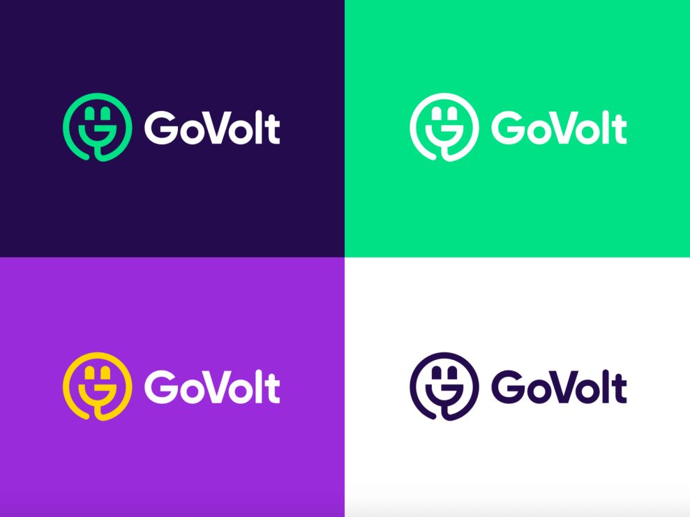
GoVolt’s logo is a simple vector image of (most often) a green power plug that forms a “smiley” face. Its simplicity cannot be overstated – the logo can basically be drawn in a single move of a hand, except for the two dots representing the power connectors or the eyes.
As such, it embodies the brand’s core values: the green color stands for sustainable living and an ecological mindset. The image of a plug signifies energy, while the smiling face indicates accessibility, approachability and optimism about the world’s future (and, likely, the agreeable price range).

Two Symbols Form A Hidden Meaning In GoVolt’s Logo
But there is another, third layer of meaning behind GoVolt’s logo design.
The company also prides itself on its expedient nature – they guarantee the delivery and installation in seven days, anywhere in the country and abroad, in Belgium. They also claim to “respond to a callback request within four hours, and 24 hours for a competitive tailor-made quote.”
This dynamism is revealed in the image of a round smiley face and power plug create together – a tilted and stylized word “GO,” which is, of course, part of the brand name.

GoVolt’s Logo Comes In Several Vibrant Color Schemes Applicable To Different Media
GoVolt’s primary corporate color is bright green and their logo comes in this shade on their website and in other facets of their branding.
The green color has been commonly associated with all sorts of eco-friendly initiatives because of its relation to the preservation of nature.
However, GoVolt has four more brand colors that they use sporadically (five, if white is included): yellow, blue, purple and navy. They are all defined in hexadecimal values in their style guide as #FAD531, #27DB8C, #8B39D3 and #210F4B, respectively.
The principal, green version of the logo ordinarily comes paired with the navy background (when not as a transparent .png, with just the green logo). The white logo stands against the green background and the navy one is paired with a white background.
The most vibrant variant is the yellow logo on a purple background.
These different colored logos exist for different media and different surroundings. They can either blend in, if the logo needs to follow a set of standardized guidelines, or pop out and be recognized for their colors. It’s precisely why branding professionals emphasize the importance of color versatility in adapting to various platforms!

The Text Version Of The Logo Uses A Contemporary Font In Line With The Topical Technology
GoVolt’s logo design exists in two forms: with and without the brand name.
The version with the “GoVolt” text uses Gilroy Extra Bold typeface. It is described as “a modern sans-serif font with a geometric touch” very much suited for graphic design and various display use. It’s a font that works well on business collateral, web, signage and other branding surfaces and mediums.
It has a mildly serious personality to it, but not the distant, huge corporation kind of seriousness. Instead, its slightly rounded edges emanate something that is reachable, open and friendly, while also being at the vanguard of its industry.

GoVolt’s Logo Design Is An Exercise In Attention-Grabbing Simplicity
Mr Boost’s logo design for GoVolt is remarkably straightforward and unassuming, and yet it comes with a multilayered symbolism that doesn’t fail to turn heads.
Even though the solar panel/sustainable energy industry may not be everyone’s immediate interest, the sheer quality of this logo lies in its apparent detachment from the design tradition in this niche.
Instead of a high-brow monogram or an elaborate icon, GoVolt communicates openness and vitality, signaling that the time has come for renewable energy to be fully embraced by everyone, not just a particular few.
The logo is carefully optimized for application on any object, from corporate cars and vans to merchandise and billboards. The versatile nature of the GoVolt logo lies in its color adaptability and the two variants, with and without the company name.


