Team Behind the Design
Agency: MARK™ | Real Estate Branding
Client: HAB Concept
Category: Logo Design (Real Estate)
Location: Buenos Aires, Argentina
Project Brief: Create a logo conveying HAB Concept’s boutique urban identity with minimalist elements for recognition.
Logo Design Analysis
Logos are often judged by concept, typography, scalability, and application. That’s the approach I take in this review.
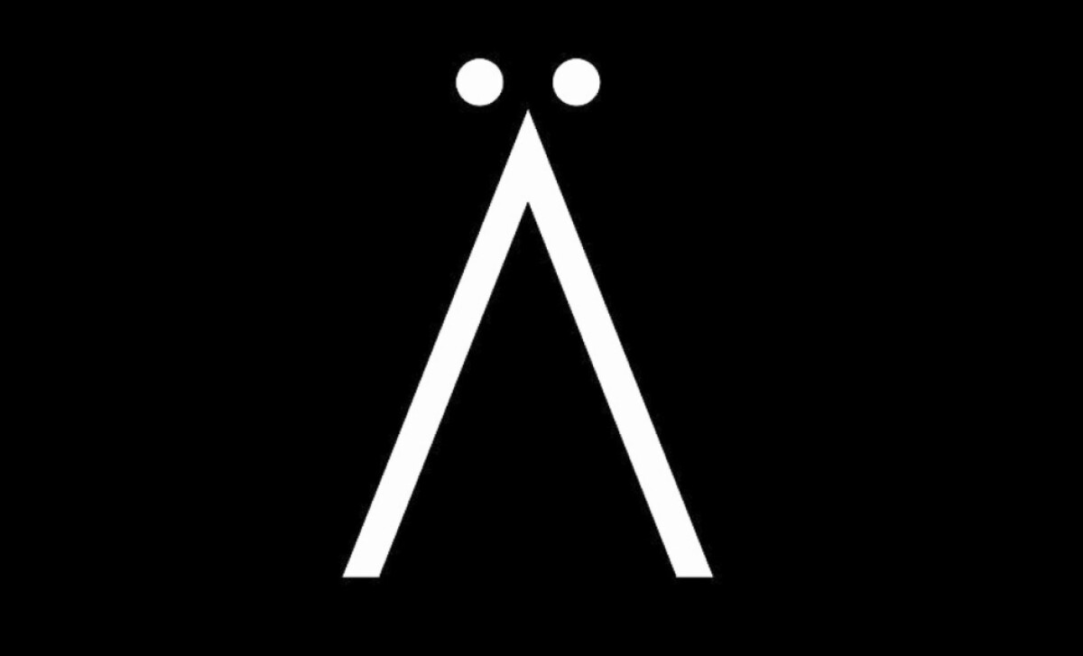
- Concept: I appreciate how the logo reduces to a simple geometric form, with two dots and a sharp angle creating a distinct, memorable symbol. It reflects modern architecture in real estate while staying abstract enough for broad use.
- Typography: The wordmark uses clean, minimal lettering with the umlaut over the “A,” reinforcing uniqueness without overcomplicating the design. This detail adds sophistication while supporting brand recognition.
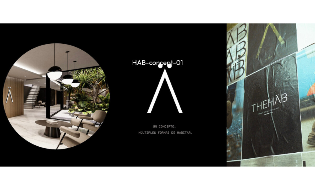
- Scalability: The mark works equally well on building façades, print campaigns, and digital screens. Its bold simplicity ensures legibility at all sizes.
- Applications: Seeing the logo applied across posters, signage, and interiors, I like how it adapts seamlessly to different touchpoints, strengthening HAB Concept’s premium positioning.
Get connected with the right web design agency for your project.
GET STARTED
About DesignRush Featured Designs
At DesignRush, we review hundreds of agency projects each month. HAB Concept’s logo stands out for its clarity, adaptability, and timeless elegance. These standout projects are recognized for creativity, relevance, and execution.
The best advance to become Monthly Design Awards winners, celebrating excellence across industries.
Looking for more inspiration in real estate logo designs? See our curated collections:
- Best Logo Designs
- Best Website Designs
- Best App Designs
- Best Print Designs
- Best Packaging Designs
- Best Video Designs
For a full list of design agencies and related services, see our Agency Directory.
Get a chance to become the next Design Awards winner.
SUBMIT YOUR DESIGN