Standout Features:
- Luxurious color story
- Curved lines
- Thin, serif typography
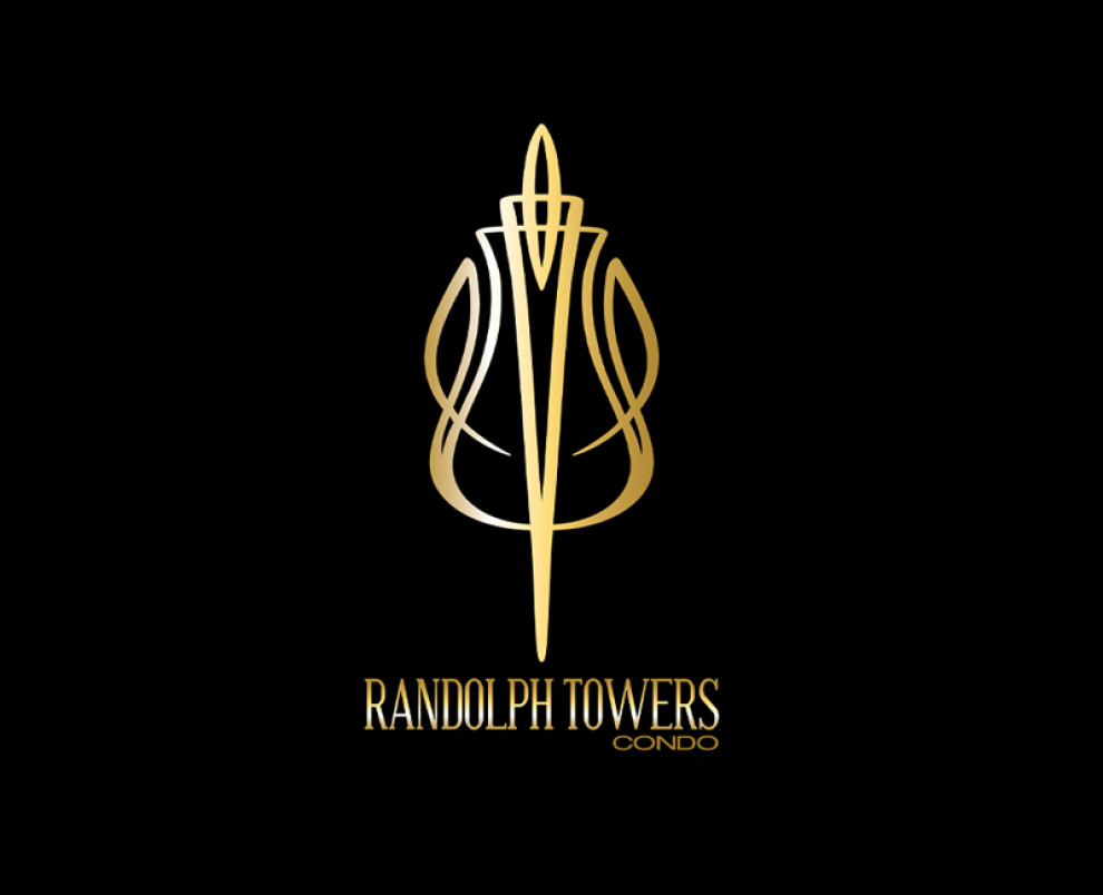
The Randolph Towers Condo logo features a luxurious color story, focusing on metallic gold against a black background. This combination evokes a sense of sophistication and high-end living, appealing to a discerning clientele.
Created by Maksoft, the design features tower illustrations adorned with curved lines, elegantly representing the development's structure. This illustration also makes a perfect standalone logo, ideal for brand recognition.
The thin, serif typography adds a touch of refinement, further aligning with the luxurious image the logo portrays. Ultimately, this logo design aims to attract potential residents seeking an exclusive and opulent living experience.
Get a chance to become the next Design Award winner.
SUBMIT YOUR DESIGN


-preview.jpg)