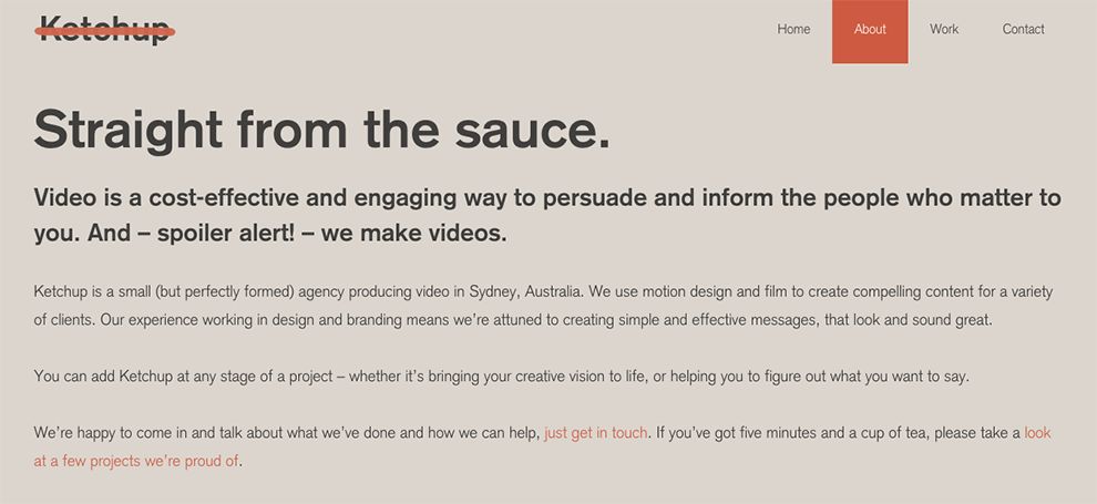
Ketchup is an unusual name for a business production agency. How does the tasty tomato condiment relate to videos and marketing? The agency website says that, much like ketchup, video can be added to any project to make it better.
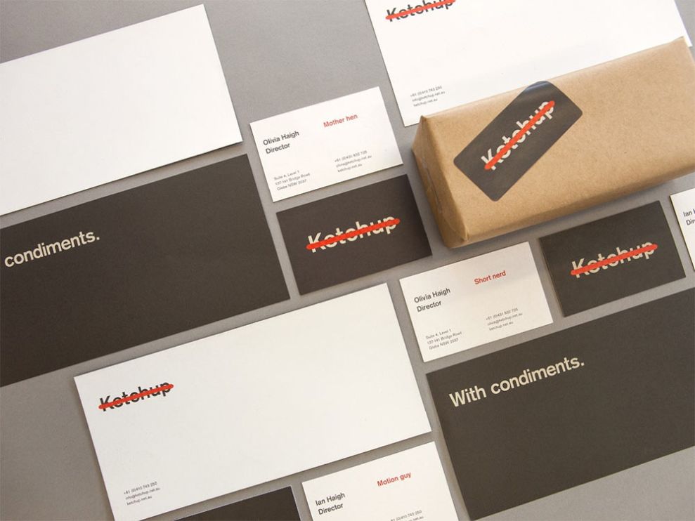
The Ketchup logo is very simple with basic text and only two colors. Each individual’s analysis of the logo may vary, which is what makes this logo very interesting. For example, one person might see the “Ketchup” text as a sort of hot dog, where the red line is ketchup. Others may see the red line as more of a strikeout kind of effect.

In the alternate versions of the logo, it’s interesting to see how the word “Ketchup” is readable no matter what form the red accent takes. The secondary versions also don’t serve to clarify whether we’re looking at ketchup (the condiment) or a red pen effect. Perhaps the logo was intentionally left to the viewer’s imagination to fill in the blanks.
Ketchup proves that you don’t need a complicated logo with multiple colors in order to get people talking. The logo’s meaning will surely be debated and leave different impressions on different viewers. If people are discussing your logo then we say: mission accomplished. Check out our article on the best condiment packaging.
Ketchup is a simple logo design in the entertainment and professional services industries.