- Agency: Lauren Richards
- Client: Kasama
- Category: Logo - Restaurant
- Location: Chicago, Illinois, United States
- Project Brief: Design an identity for Kasama, a Michelin-starred New-American Filipino restaurant and café in Chicago, that visually narrates its shift from daytime café culture to an evening-led, fine-dining experience through a refined, symbolic mark.
Restaurant logo design often works best when it sets a mood instead of spelling things out.
The Kasama logo does this through symbolism, material choice, and restraint, communicating time, transition, and the dining experience without leaning on literal cues.
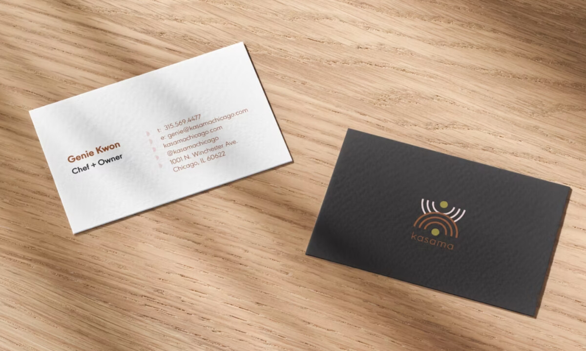
- Concept & Symbolism: The rising-and-setting sun metaphor reads clearly in the signage and wall-mounted mark. The concentric arcs and circular structure are visually dominant and align well with the idea of rhythm, time, and transition.
- Color & Material Sensitivity: Muted gold set against deep charcoal feels warm and considered. I appreciate that the finish avoids high shine, which keeps the identity grounded and aligned with craft.
- Typography: A lowercase wordmark introduces softness and approachability. I find the generous spacing effective, giving the logo room to breathe while keeping the symbol as the emotional center.
- Application & Presence A print-first approach adds quiet confidence. I like how the logo settles into menus and signage naturally, supporting the dining atmosphere without competing for focus.
What Brands & Agencies Can Learn from Kasama
1. Symbolism Can Communicate Experience
Abstract forms, when grounded in a clear idea, can express atmosphere and narrative more effectively than literal imagery.
2. Material Choices Shape Perception
Subtle finishes and thoughtful color restraint often signal quality and care more convincingly than bold visual statements.
3. Design for the Moment of Use
Logos that consider how they live on menus, signage, and printed materials tend to feel more natural and enduring in hospitality spaces.
