Standout Features:
- Strong, impactful typography
- Electrical visual elements
- Professional and trustworthy color scheme
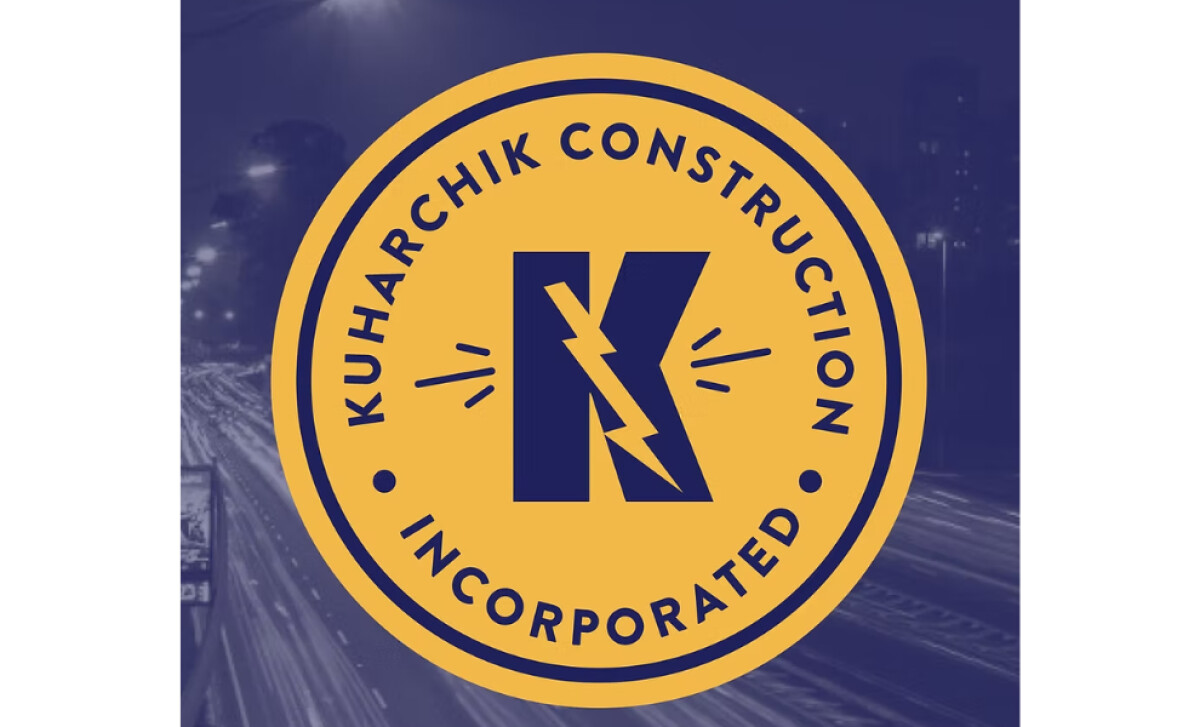
Kuharchik Construction, a leading provider of commercial electrical services, has developed a strong reputation in Pennsylvania, offering top-notch electrical services ranging from traffic signal construction to high-voltage applications. Danielle Crockett’s logo perfectly encapsulates the bold and professional identity of the company.
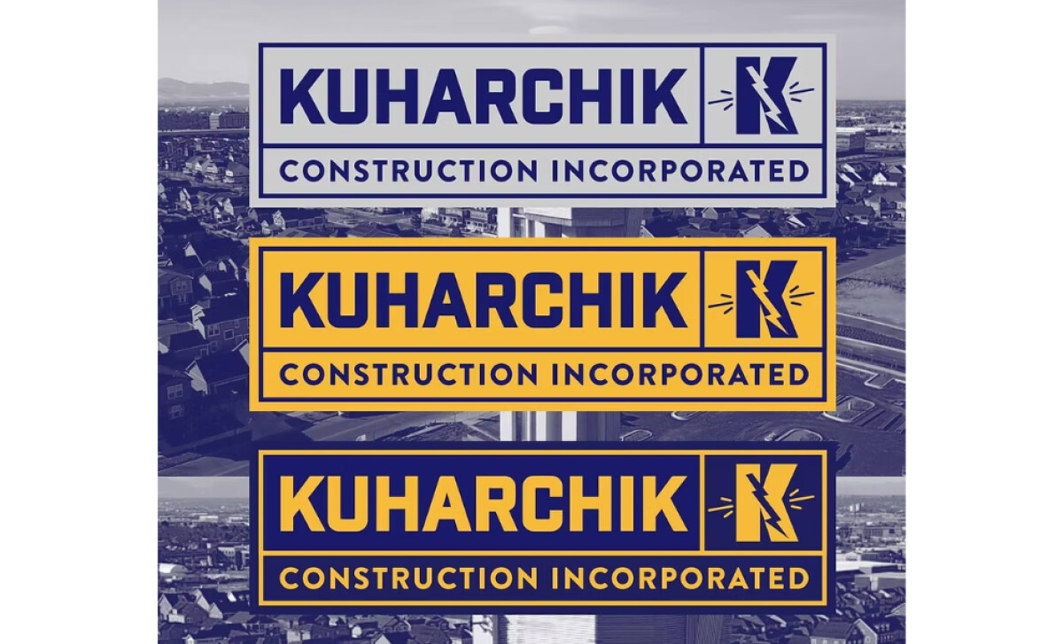
The typography makes a strong statement about the company’s reliability and no-nonsense approach. The sans-serif font is clean and ensures legibility across various mediums, from signage to business cards. The letter spacing is tight, giving it a sense of stability that’s ideal for a company that works with high-voltage and heavy-duty projects.
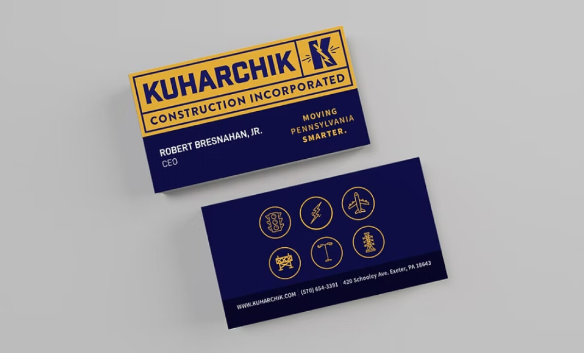
One of the most distinct aspects of the Kuharchik Construction logo is the clever use of lightning embedded in the letter “K,” tying directly into the company’s electrical expertise. This kind of symbolism is a powerful way to quickly convey what a business does, helping the brand stay memorable to potential clients.
The color palette of the Kuharchik logo uses deep blue and yellowy. The blue symbolizes trust and stability, which are critical values for a company responsible for high-stakes infrastructure projects. Meanwhile, the yellow accent brings a sense of energy and attention, subtly referencing the electrifying power the company provides through its work.
The strong typography, strategic use of electrical symbols, and professional color scheme all work in harmony to create an engineering logo that speaks to the company’s reliability, power, and industry expertise. This design effectively communicates the company’s values, making it a strong visual representation of Kuharchik Construction’s legacy.