Team Behind the Design
Agency:Rafael Oliveira Design
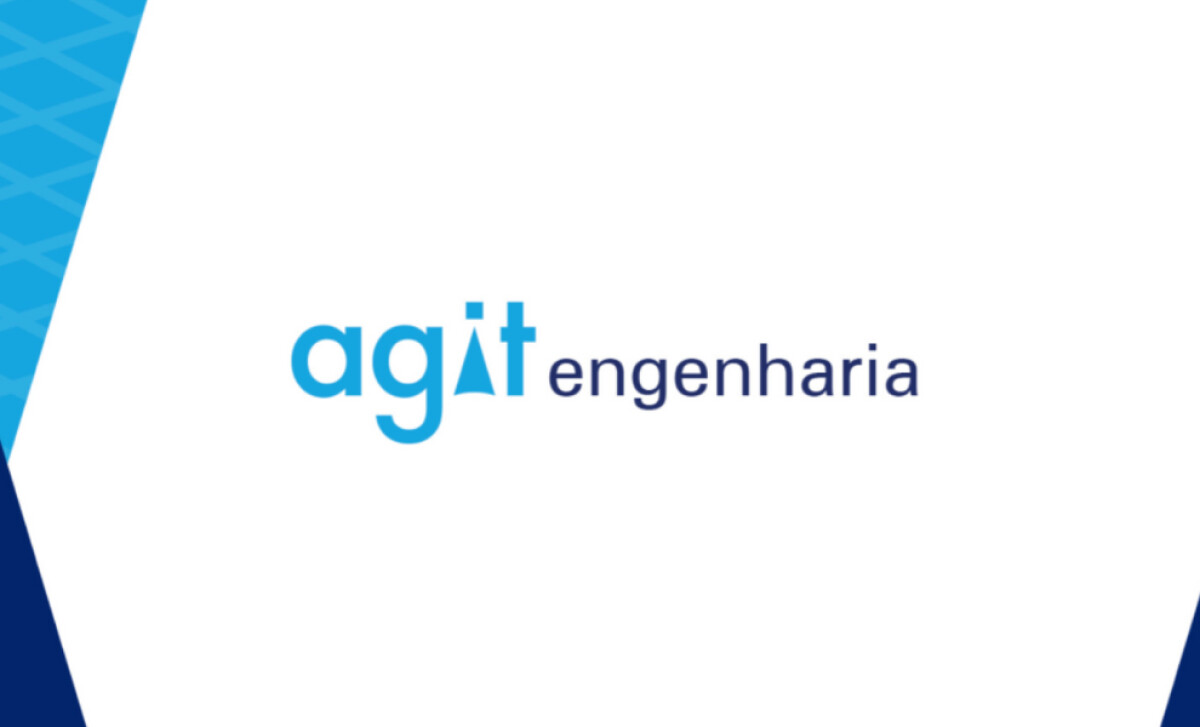
Client: Agit Engenharia
Category: Logo Design (Engineering)
Location: Sorocaba, Brazil
Project Brief: Create a logo conveying engineering precision with symbolic elements and versatile typography for recognition.
Logo Design Analysis
Related Articles:
When I review engineering logo designs, I often focus on concept clarity, typography, scalability, and application.
Agit Engenharia’s identity showcases these elements with a strong, modern direction.
- Concept: I appreciate how the “i” in agit incorporates a triangular shape, suggesting structural engineering and technical precision. It’s a subtle but meaningful symbol.
- Typography: The typeface is bold yet approachable. Pairing lowercase “agit” with the more formal “engenharia” creates balance between modernity and professionalism.
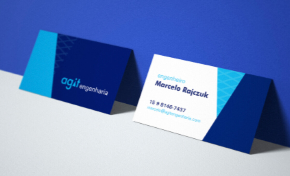
- Scalability: The design works across formats, from digital screens to print to large-scale signage. The consistent readability adds to its effectiveness.
- Applications: I like how the logo adapts to different brand touchpoints — business cards, digital presence, and building signage — without losing visual impact.
Get connected with the right web design agency for your project.
GET STARTED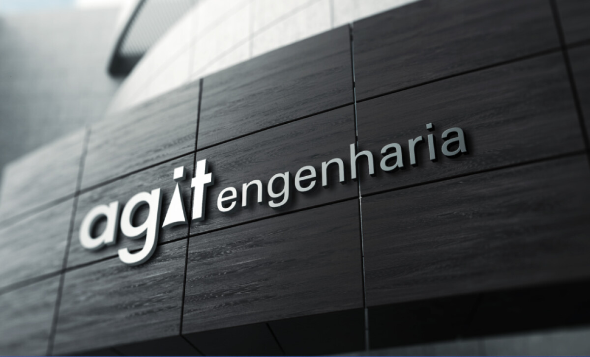
About DesignRush Featured Designs
At DesignRush, we review hundreds of agency projects each month. Featured works like this stand out for their creativity, clarity, and execution across branding touchpoints.
The best of these go on to be recognized as Monthly Design Awards winners, a mark of industry excellence.
Looking for more inspiration in engineering logo designs? See our curated collections:
- Best Logo Designs
- Best Website Designs
- Best App Designs
- Best Print Designs
- Best Packaging Designs
- Best Video Designs
For a full list of design agencies and related services, see our Agency Directory.
Get a chance to become the next Design Awards winner.
SUBMIT YOUR DESIGN