Standout Features:
- Sophisticated geometric emblem
- Elegant typography with subtle details
- Luxurious yet approachable color palette
As a growing jewelry brand committed to offering high-quality, trend-driven pieces at accessible prices, Larema Joias needed a refined and professional identity to match its evolving reputation. The company’s founder sought out Matheus Paschoalini to craft a logo that would capture the essence of elegance, sophistication, and modernity.
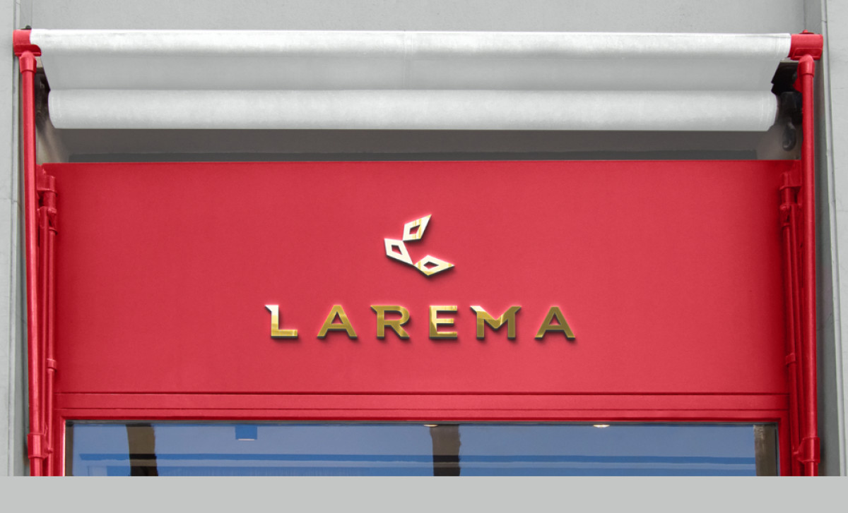
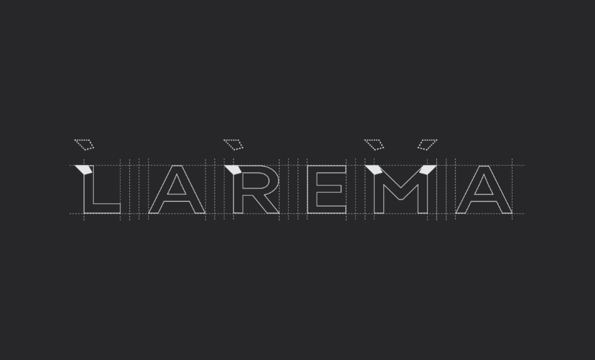
At the heart of the logo is a minimalist geometric symbol composed of three diamond-like shapes. This abstract yet recognizable representation of gemstones reflects the brand’s focus on fine jewelry while maintaining a sleek and contemporary feel. The emblem’s symmetry and clean lines give it a timeless quality, ensuring lasting appeal.
The logotype itself is a refined, custom serif that exudes luxury. Notably, the letters feature carefully integrated angular cutouts that mimic the facets of a gemstone, subtly reinforcing the brand’s identity. These small yet impactful details elevate the overall design, making it distinctive and memorable.
The luxurious logo design is further strengthened by its rich red and gold color scheme, as seen in applications like storefront signage and promotional materials. Red evokes passion and confidence, while gold adds an element of prestige, striking the perfect balance between accessibility and exclusivity.

By combining clean geometry, thoughtful typography, and a bold yet inviting color palette, Matheus Paschoalini has successfully positioned Larema Joias as a brand that embodies both luxury and affordability.