The Logo Design Conveys the Client’s Nature of Business by Using Unconventional Symbols of Justice
In a world where legal logos often lean on overt symbols like scales or Mother Justice, Dragana Komljenovic's design for a law office stands out.
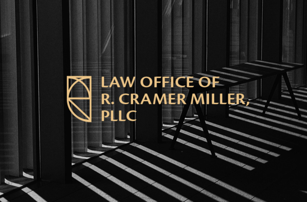
The objective was clear: craft a logo for the Law Office of R. Cramer Miller that doesn't rely on the obvious. Instead, the design draws inspiration from the owl, a creature long associated with wisdom and knowledge.
In Greek mythology, it's also linked to Athena, the goddess of wisdom, representing the illumination of truths. Regardless, the owl's symbolism is relevant to the legal profession, where clarity and truth-seeking are paramount.
This choice not only sidesteps clichés but also introduces a fresh, modern perspective to law logos. The best logo designers have wanted to achieve this feat in their designs and succeeded this time.
Explore more of the most powerful logo design examples.
Dragana Komljenovic Presents a Unique Law Office Monogram Logo Thanks to Their Unconventional Design Techniques
Monogram logos, especially for law firms, can often feel repetitive. However, Dragana Komljenovic's design approach is anything but typical.
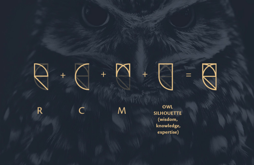
The client's initials, RCM, are masterfully incorporated into the logo. But there's a twist: these letters also form the silhouette of an owl.
The "R" forms the foundational base, the "C" curves elegantly to shape the body, and the "M" crowns the design, mimicking the tufts of an owl. This strategic placement ensures that the initials are recognizable and crafts a cohesive and harmonious visual.
This layering technique allows each letter to retain its distinct identity while creating a unified image.
This design choice is symbolic and innovative, ensuring that the logo is memorable and distinct from the sea of monogram logos.
RCM Law Office’s Logo Reflects Good Reputation and Prestige Through a Minimalist Design
Minimalism in design is more than just simplicity; it's about conveying a message with precision and clarity. Sleekness in design brings a sense of professionalism and efficiency.
For law offices, a minimalist logo can encapsulate the firm's reputation and prestige. Dragana Komljenovic's design achieves this by focusing on the essentials: the owl silhouette and the RCM monogram.
The result is a logo that looks modern, elegant, and serious, capturing the essence of the law firm without being overly ornate or flashy.
It's a subtle yet powerful way to communicate the firm's commitment to excellence, adding prestige and a reputation boost to the law firm.
Browse our collection of the most successful logo designs.
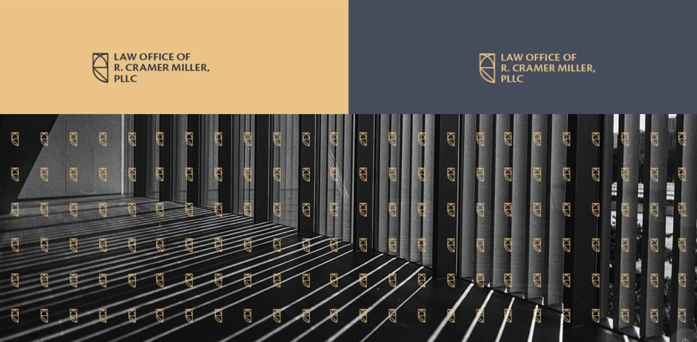
RCM’s Logo Design Conveys Luxury and Premium Quality Through Its Color Story
The agency's use of blue and gold for this logo design is wise, as it adds a professional and sophisticated touch to the minimalist design.
Gold and blue are associated with professionalism, knowledge, trust, and authority. In a legal context, these are important as clients want to trust their legal representatives.
But the specific shade of gold (#eac484) truly elevates the design. This hue, often called "gold tweed," is not as flashy as bright gold but carries an understated elegance. It speaks of luxury and premium quality without being ostentatious.
The colors’ muted richness adds depth to the logo, making it stand out while maintaining a sense of sophistication. The color suggests the firm offers top-tier services but does so with grace and discretion.
Aside from the colors, using the Cronos Pro sans serif font enhances the logo's elegance and simplicity. This also goes with the minimalist style of the monogram, ensuring that all design elements are aligned.
Together, these design choices elevate the logo, making it a true reflection of the law firm's stature and expertise. It instantly creates a harmonious palette that conveys professionalism, triumph, trust, and authority.
Indeed, this law logo design by Dragana Komljenovic deserves the Best Designs Award and stands side-by-side with DesignRush's best logo designs.