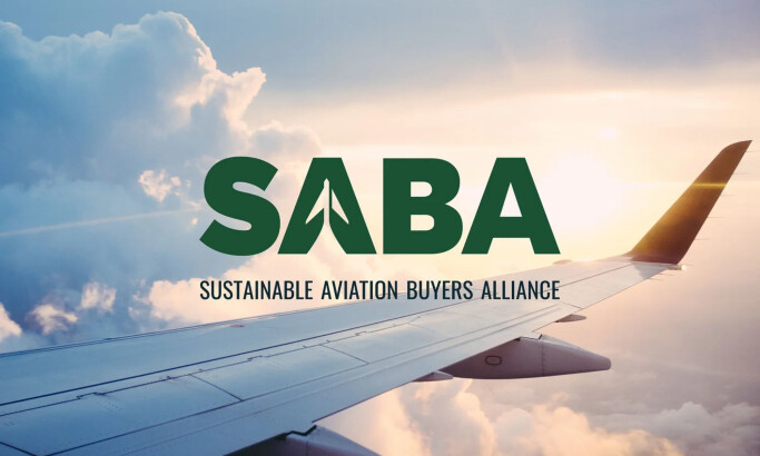
Team Behind the Design
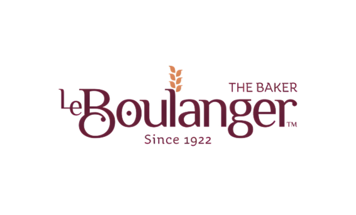
Logo Design Analysis
A strong logo refresh should do three things:
- Preserve what customers already recognize
- Modernize the look for today’s audience
- Strengthen the story behind the brand
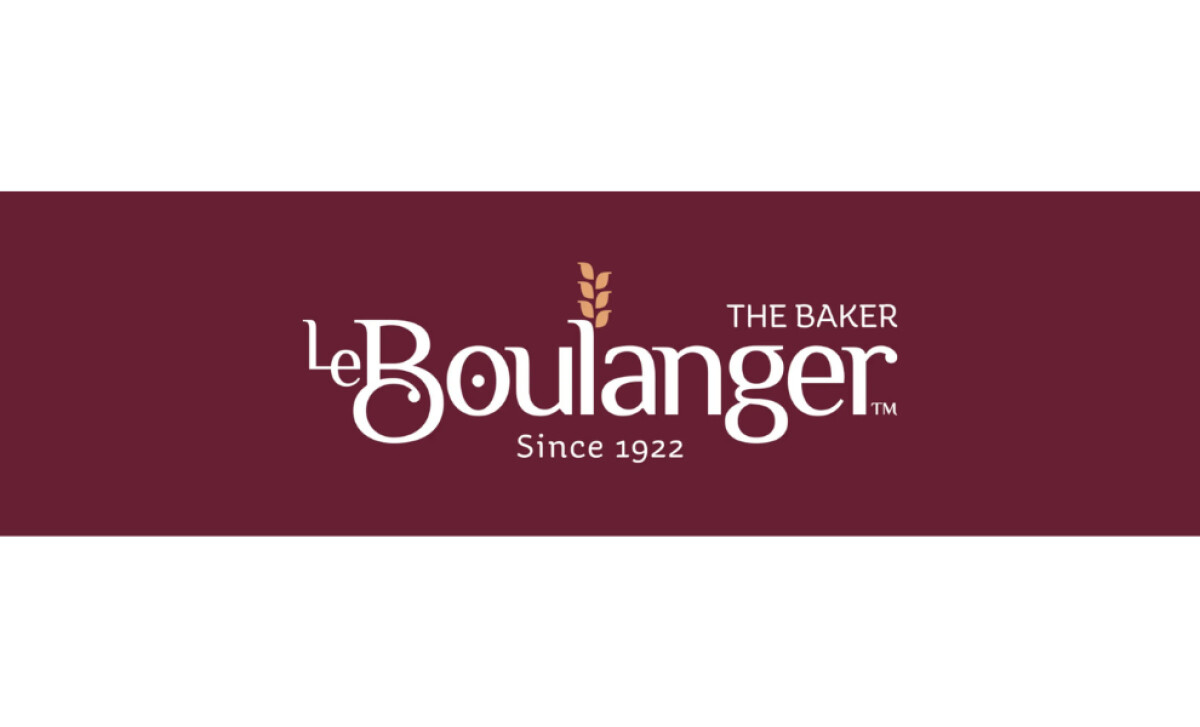
Le Boulanger’s redesign does exactly that. It honors a century of baking tradition while refining every curve, color, and detail to feel contemporary and inviting.
- Concept: I see how the refreshed mark keeps the brand’s familiar warmth while simplifying the structure. The wheat element immediately caught my eye because it ties the company’s history to its ongoing story of craft and care. It feels both symbolic and practical.
- Typography: I like how the serif typeface echoes tradition yet feels lighter and more approachable. The balance between the elegant “B” and the reduced “Le” works nicely, creating a better reading flow and a modern rhythm that still feels French and artisanal.
- Customization: I can tell a lot of thought went into refining the details. The new “B” has real character. It retains the flourish that made the old logo memorable, and the rounded “r” at the end adds personality without breaking harmony.
- Color: The color choice feels deliberate. The burgundy tone brings a sense of richness and reliability, while the golden wheat accent softens it with warmth. Together, they create the same inviting feeling as walking into a bakery on a quiet morning.
What Brands & Agencies Can Learn from Le Boulanger
Copa Design’s work for Le Boulanger proves that renewal does not have to mean reinvention. The redesign respects a century of history while giving the brand a refined presence that feels contemporary and sincere.
1. Evolve Without Erasing
By preserving key symbols and proportions, the new logo honors what customers already recognize. This approach shows how design can evolve heritage brands without breaking their connection to the past.
2. Use Craft to Express Care
Every curve and letterform feels intentional, mirroring the precision of the bakery itself. Thoughtful detailing communicates pride in workmanship and reminds brands that refinement often begins with restraint.
3. Let Color Carry Emotion
The pairing of burgundy and wheat tones captures both warmth and trust. It feels familiar yet sophisticated, proving that a well-chosen palette can hold decades of meaning.
About DesignRush Featured Designs
At DesignRush, we review hundreds of agency projects each month to uncover standout work in branding, digital, and visual design. The featured designs represent some of the most compelling executions, standing out for clarity, creativity, and technical precision.
Top-performing projects often advance to our Monthly Design Awards, gaining wider industry recognition.
See more creative projects across categories:
- Best Logo Designs
- Best Website Designs
- Best App Designs
- Best Print Designs
- Best Packaging Designs
- Best Video Designs
For a full list of design agencies and related services, visit our Agency Directory.