Standout Features:
- Elegant Ivymode font heading
- Viewable color contrast
- Sleek emblem of merged initials
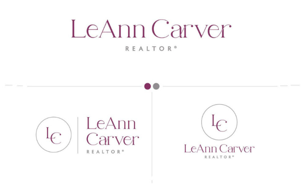
LeAnn Carver’s modern and professional logo design sets the brand apart from other realtors in the area. Designed by Shannon Lockwood Design Co. LLC, the logo features an Ivymode style heading, infusing the design with a sophisticated and contemporary flair.
Individual letters of the brand are tailored, with elegant line bridges connecting the “a” and “r,” as well as the “e” and “r.” These details add a unique touch to the logo’s design. Moreover, the brand’s initials “L” and “C” are placed within a circle either above or to the left of the text, offering a dynamic variation of the logo for different presentations.
The cannon pink and gray color palette ensures a visually striking contrast. The vibrant cannon pink of the brand name and merged initials add energy to the design, while the sleek gray of the “realtor” text and circle conveys sophistication and refinement.
With its stylized heading, easily viewable color scheme, and dynamic variations, the logo embodies modern professionalism, ensuring LeAnn Carver stands out as a leader in her field.