Levi’s logo is an icon that has shaped fashion for generations, reflecting a rich heritage of craftsmanship and innovation. Over the years, the logo has remained recognizable, strategically adapting to trends and consumer preferences. Featuring a bold red color and a straightforward sans-serif typography, Levi’s logo continues to resonate with fashion enthusiasts around the globe.
Levi's Logo Design Details
The Levi's logo keeps things simple but undeniably striking. Its geometric precision and clean lines radiate strength and classic appeal, making it a standout not just in fashion but across pop culture.
At the heart of the design is the iconic batwing emblem that adds a distinctive flair. It makes the logo instantly recognizable and serves as a perfect symbol of Levi’s durability and authenticity.
The bold, attention-grabbing red in the Levi's logo is impossible to miss. It’s vibrant, energetic, and packed with power — evoking confidence, passion, and a strong sense of action.
This punchy color is paired with clean white or black typography, creating a sharp contrast that makes the logo pop. It’s this combination of red and a minimalist palette that gives the Levi's jeans logo its timeless appeal and lasting impact.
Levi's Logo History
The Levi's logo has undergone several transformations over the decades, each reflecting the brand's evolving identity while staying true to its core values of quality and durability. Let's explore how the Levi's logo has adapted over the years and see how Levi's has maintained its timeless appeal.
1853–1892: The Birth of the Levi's Logo
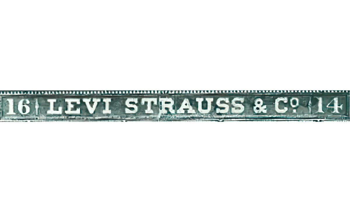
The original Levi’s logo was a straightforward, text-driven design that prominently displayed the words "Levi Strauss & Co." It prioritized clarity and easy identification, reflecting the functional, utilitarian nature of the brand's products. This focus on legibility ensured that the logo effectively communicated the brand name.
At the same time, the classic typography hinted at craftsmanship and quality, aligning with Levi’s reputation for durable, well-made products. However, the design’s plain and text-heavy appearance fell short of creating a strong visual identity. While functional and appropriate for the brand’s early years, it had not yet achieved the iconic status that later versions would embody.
1892–1925: The Introduction of the "Two Horses" Logo
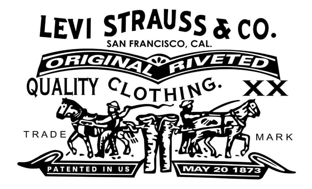
The 1892–1925 Levi's logo marked the debut of the now-iconic "Two Horses" symbol, a design that would go on to define the brand’s identity for decades. This version featured the two iconic horses pulling at opposite ends of a pair of Levi’s jeans, which symbolized the toughness and durability Levi’s was known for.
Additionally, the logo was framed with intricate borders and detailed typography, creating a formal and slightly ornate aesthetic that was common in that era.
While intricate by today's standards, this logo served its purpose well in the late 19th and early 20th centuries. Its detailed design, best suited for printed labels and packaging, clearly identified the brand and emphasized its commitment to quality.
1925–1929: A Bold New Wordmark
This version took a significant departure from previous designs by moving away from imagery altogether. Instead, it featured the brand name "Levi Strauss & Co." in all capital letters, set in a clean, sans-serif typeface. This shift to a text-only approach aimed to simplify the brand's identity, making it versatile and more modern for the time.
This version was effective in emphasizing clarity and adaptability. By removing the decorative elements and focusing on a strong typographic presence, Levi’s created a design that was straightforward and professional.
However, the absence of any symbolic imagery, such as the "Two Horses," made it less distinctive and memorable. While functional for branding across various media, it lacked the emotional resonance and storytelling power that would come to define later iterations.
1929–1943: The Bold and Modern Era
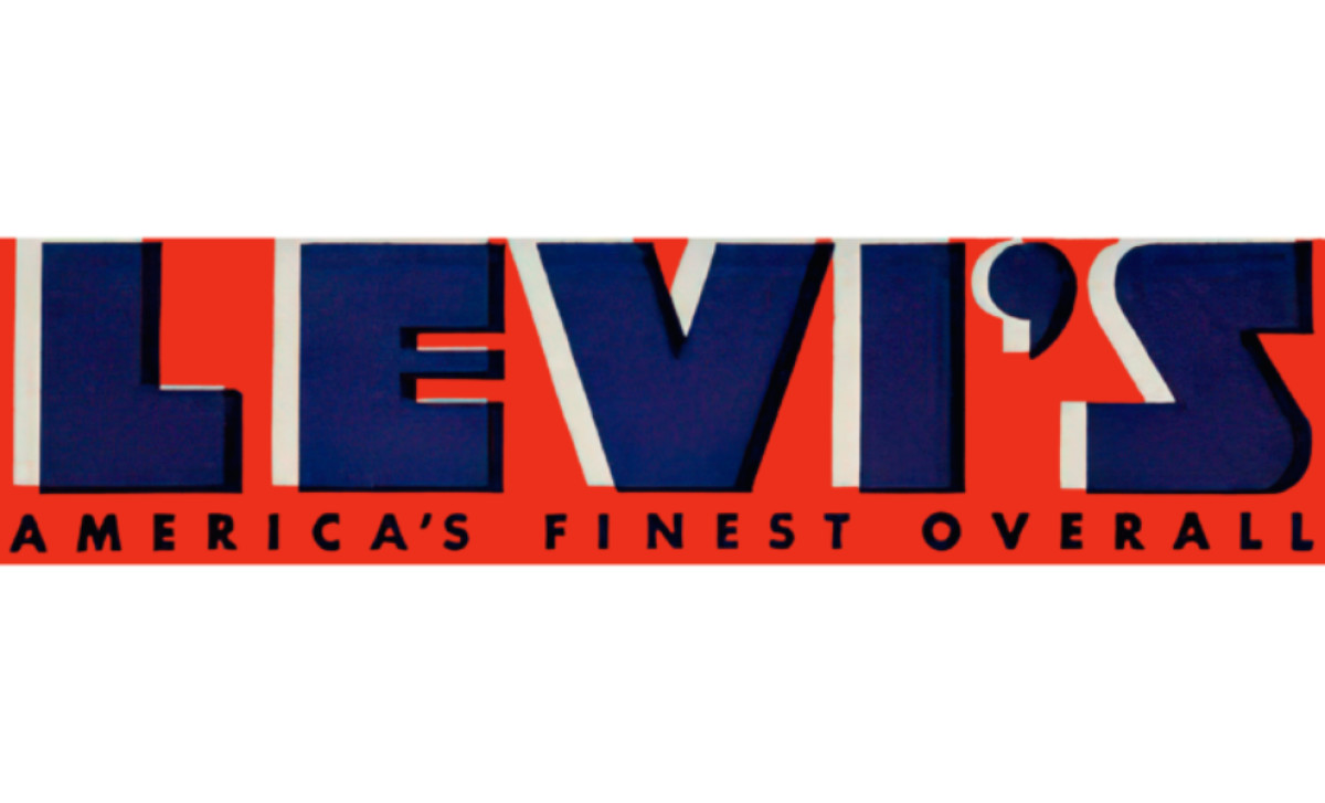
The 1929 logo introduced a striking, modernized aesthetic that set it apart from earlier designs. The logo prominently displayed the brand name "LEVI'S" in bold, capitalized letters with a sharp, geometric typeface. Below the wordmark, the tagline “AMERICA’S FINEST OVERALL” was added in a clean, sans-serif font, reinforcing Levi’s reputation for quality and craftsmanship.
The deep blue letters were given a three-dimensional effect, contrasting sharply against a vibrant red background. The combination of bold, blocky lettering and vibrant colors created an eye-catching design that perfectly captured the spirit of innovation during the era, making the logo more impactful in advertising and product labeling.
Explore the best logo wordmark designs that infuse brands with character and impact.
1943–1949: A Modernized, Subdued Wordmark
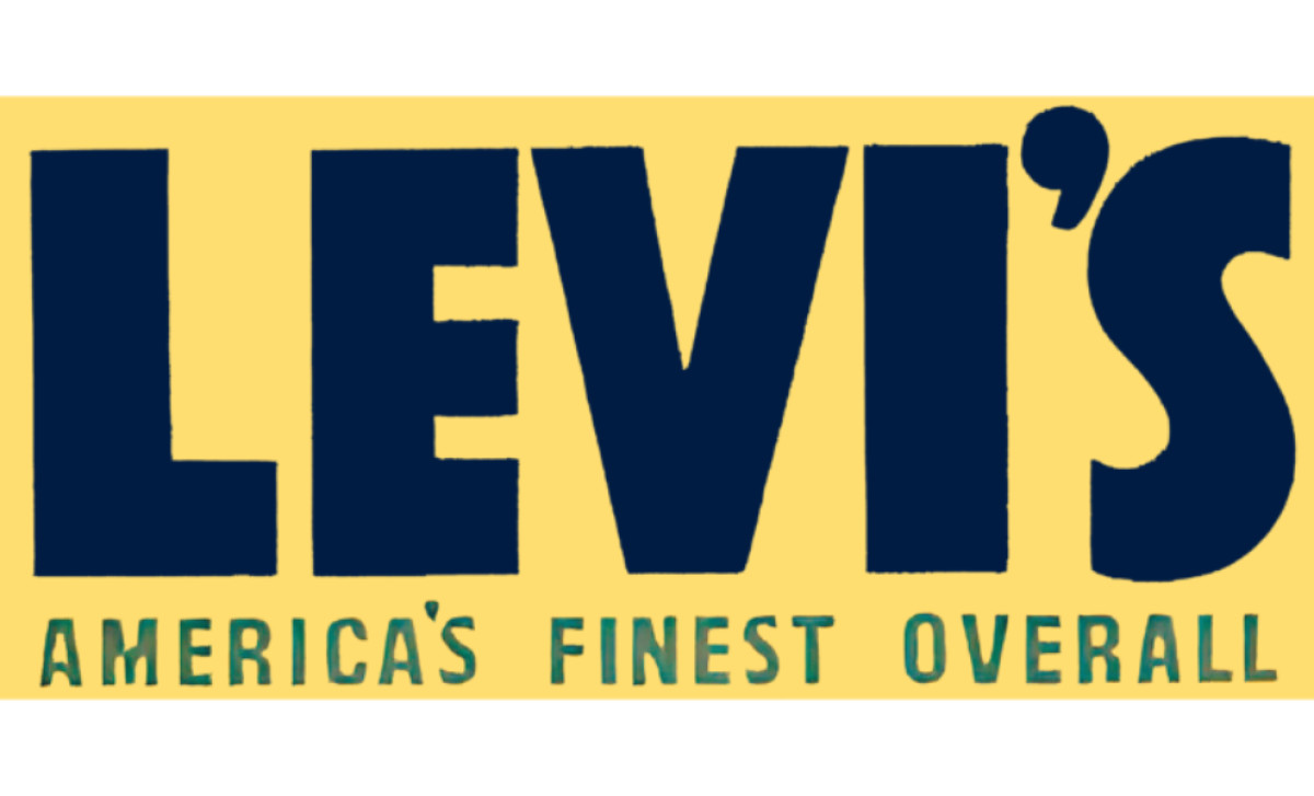
The 1943–1949 version embraced a cleaner, more streamlined aesthetic while maintaining its bold identity. The logo prominently featured the word "LEVI’S" in a thick, capitalized typeface with slightly rounded edges, giving it a friendly yet robust appearance. The design was placed on a yellow background and retained the same tagline in a sans-serif font.
This iteration of the Levi's logo effectively communicated strength, reliability, and a distinctly American identity. The contrast between the deep blue text and the bright yellow background made the logo visually striking and easy to spot, even from a distance.
1949-1954: Levi’s Bold Red Evolution
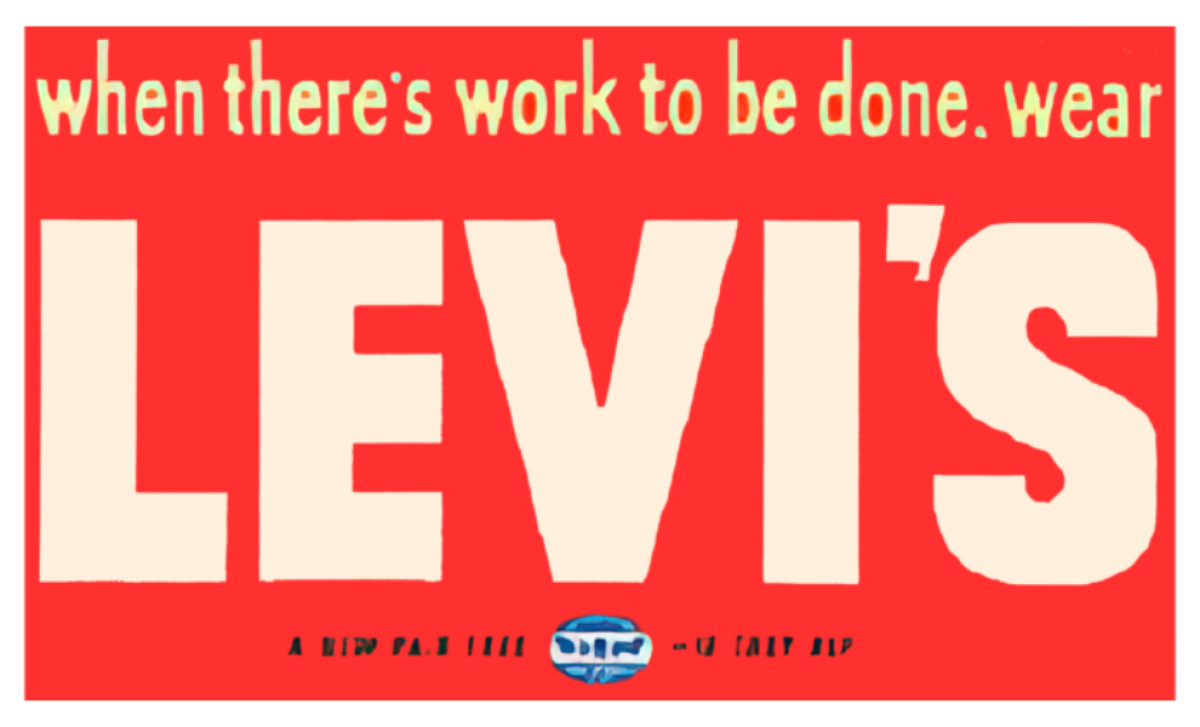
Between 1949 and 1954, Levi’s introduced a bold, minimalist logo that perfectly captured the post-war era's pragmatic and hardworking spirit. The design featured the Levi’s name in sharp, white sans-serif letters against a striking red-orange background. This simple yet impactful approach amplified brand recognition.
The addition of the tagline, “When there’s work to be done, wear Levi’s,” reinforced the brand’s roots in durable, reliable workwear while connecting with its target audience on a practical level. This phase represented a turning point in Levi’s logo evolution, marrying aesthetic clarity with a clear message, and setting a strong foundation for the brand's future iconic designs.
1954–1969: Levi’s Heritage Meets Modern Appeal
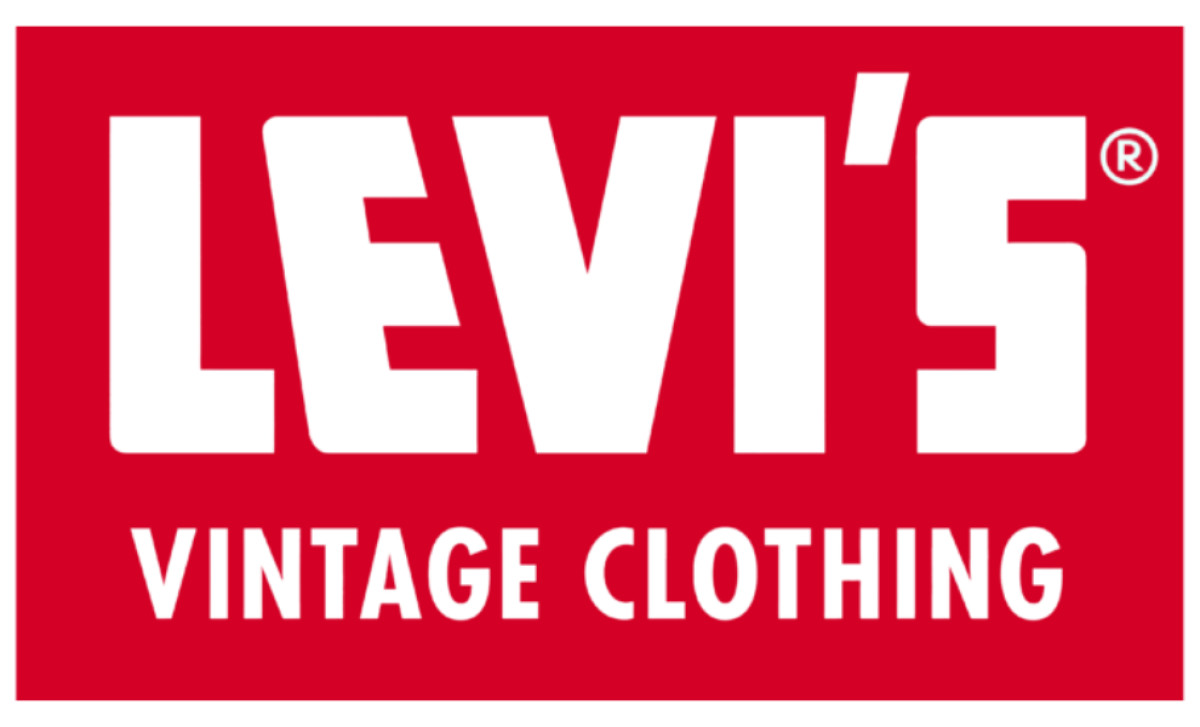
The 1954 logo era was a strategic move to align Levi’s with the cultural shifts of the mid-20th century. The clean typography and high-contrast red and white palette conveyed confidence and permanence. By introducing the “VINTAGE CLOTHING” tagline, Levi’s tapped into a burgeoning appreciation for classic styles, reinforcing its status as a brand rooted in authenticity and craftsmanship.
The design's simplicity broadened its appeal, attracting everyone from traditional workwear users to emerging fashion-forward subcultures like greasers, rockers, and hippies. This iteration of the logo was not only functional but also aesthetic, symbolizing Levi’s evolution into a cultural icon.
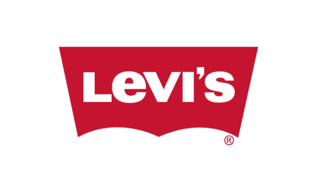
1969–2003: Levi’s Iconic Batwing
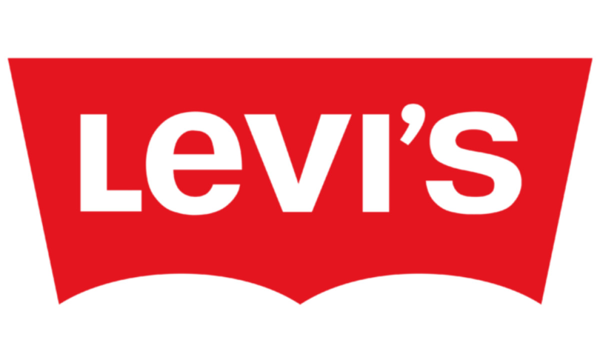
The Levi’s logo from this era showcased the brand name in bold, white sans-serif lettering, framed by a vibrant red trapezoid that cleverly mirrored the iconic stitching on its jeans' back pockets.
The trapezoid's curved lower edges formed a distinctive batwing shape, infusing the design with energy and movement. Additionally, the shift to a lowercase “e” and the rounded apostrophe added a subtle yet memorable touch of personality to the wordmark.
The 1969 logo was a defining milestone in Levi’s branding journey, embodying its transition into a global lifestyle brand. The batwing design became a symbol of authenticity, quality, and style, cementing Levi’s place as a leader in both fashion and culture.
2003–Present: The Levi’s Legacy
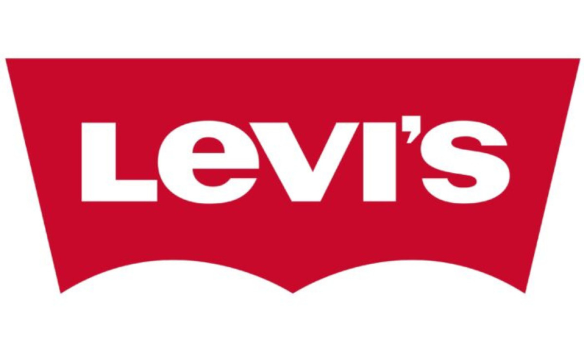
Decades later, Levi's shifted to a cleaner, bolder, and more straightforward look. The brand typography feels fresh, assertive, and reliable — just like the jeans themselves. Notably, the font used for "Levi’s" has been subtly refined with smoother curves and more precise proportions, lending a modern edge while maintaining its bold, unmistakable identity.
This version also retains the signature batwing shape from 1969 but adopts a deeper, richer red hue for a more sophisticated and contemporary aesthetic. Additionally, the sharp contrast between the white text and red background enhances visibility, ensuring the logo stands out across both digital and physical mediums.
The refined simplicity of the design allows it to seamlessly adapt to changing trends while maintaining Levi’s timeless visual language. As a symbol of both its workwear origins and global lifestyle appeal, the logo continues to resonate with a diverse and ever-evolving audience.
Levi's Logo: An Emblem of Durability and Craftsmanship
Each stage in Levi's logo evolution tells a story of adaptability and commitment to quality, echoing the brand’s rugged roots while staying relevant in a fast-changing fashion landscape.
From the original text-based logo to the introduction of the red tab and the "Two Horses" symbol, each iteration has contributed to Levi's logo’s identity as a brand synonymous with durability, ensuring its place in the best fashion logos of all time.
Today, the Levi's logo remains a global symbol of authenticity, strength, and effortless style