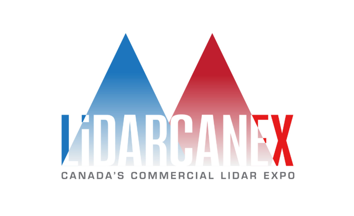
Standout Features:
- Negative space in typography
- Distinctive color-coded triangles
- Lowercase "i" in the brand name
The challenge of visually representing LidarCanex — Canada's Commercial LiDAR Expo, a significant event centered around LiDAR technology (Light Detection and Ranging) — was taken on by Web Global Solutions. LiDAR, which uses light in the form of pulsed lasers to measure distances, is a core concept that the logo needed to represent.
The agency first attempted to achieve this effect through its use of negative space in the typography. The word "LiDARCANEX" is integrated into the white space, which can be interpreted as a visual representation of LiDAR technology itself, as it relies on the interaction of light and space to map and measure.
The logo also features two prominent triangular shapes. Triangles can symbolize measurement and precision, which is the very definition of how LiDAR technology measures distance and creates 3D representations of spatial data. Furthermore, the blue and red color gradient within these triangles adds a much-needed technological feel.
To add more of that modern feel, the logo also uses a lowercase "i" in "LiDARCANEX." And no, it’s not just an accurate nod to how LiDAR tech is formally spelled — in such an imposing, almost aggressive logo, this stylistic element softens the logo's appearance, making it less formal and more contemporary.
The logo's triumph is its ability to, ultimately, make LiDAR's complexity both memorable and concise — which is what all logos in professional services should strive to achieve.