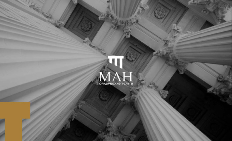
Standout Features:
- Pillar-style logo icon
- Professional typeface
- Black and gold colorway
Next from our list of best attorney logo designs is MAH illustrated by Bahali. The pillar-style logo symbol atop the brand name is the perfect visual testament to the legal attorney’s proven expertise in the field. The slashed look of the image gives the brand a nice modern touch while also giving a nod to the brand name’s initial, the letter M.
This image is so visually striking that it doesn't need outrageous details and styles, especially in the logotype. The brand name is written in a serif font reminiscent of the Roman era, helping position MAH as a well-established and reputable attorney.
Nothing screams excellence louder than black and gold, so this colorway didn’t fail to give the brand its premium identity.
Get a chance to become the next Design Award winner.
SUBMIT YOUR DESIGN