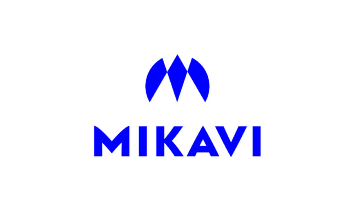
Standout Features:
- A diamond icon
- Electric blue color
- Bold sans serif typography
Jakub Sudra’s design for the Mikavi logo takes inspiration from the Apple brand, a bird, a drone, and a prism. Combining said visuals in mind, the agency shaped Mikavi's logo to look like a letter "M." The result is a minimalist modern logo design that complements the brand's professional image.
Below the icon, the brand name is spelled with a bold sans-serif typography. The icon and the typeface are blue, set against lots of positive space to build a reliable color story.
Blue is known for its stability and trustworthiness, whereas white refers to the pureness that reflects the brand’s product quality.
Get a chance to become the next Design Award winner.
SUBMIT YOUR DESIGN