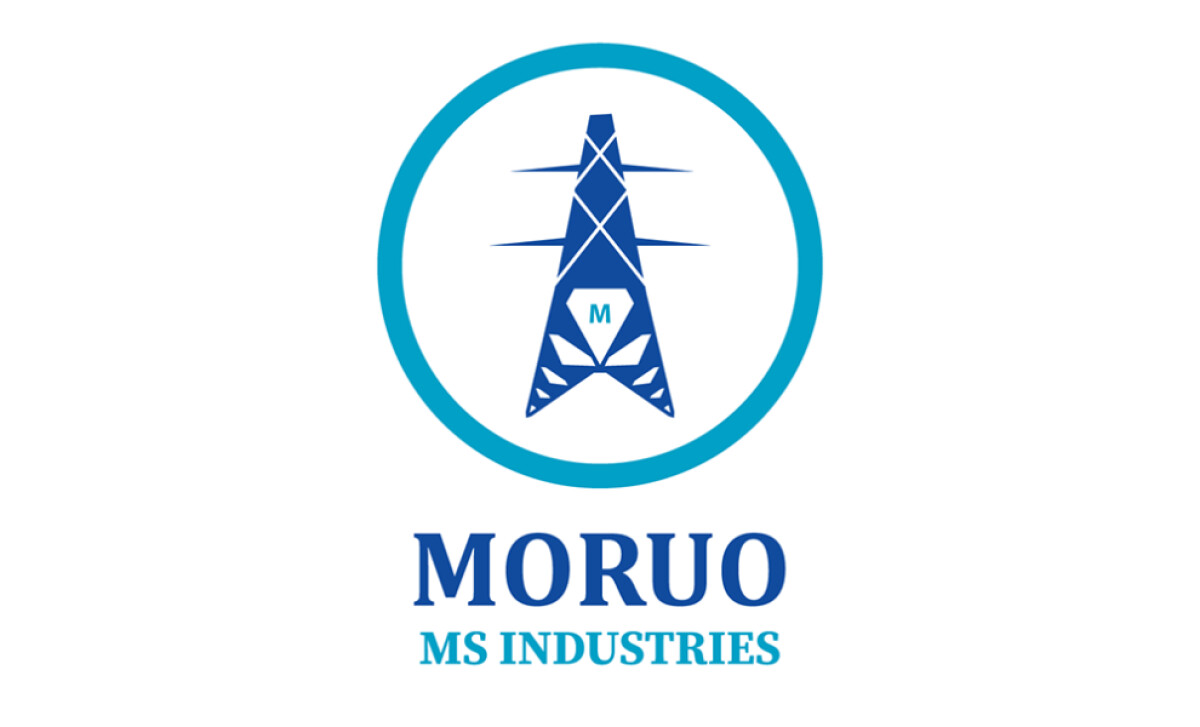
Standout Features:
- Symbolic power transmission tower
- Diamond shapes representing wealth
- Integration of the "M" in the design
For Moruo MS Industries, a provider of high-quality products and services to industrial sectors, its logo must signal reliability. The design by M Creative Compound achieves this through carefully chosen symbols.
The logo features a power transmission tower, a stylized representation with clean lines, geometric shapes, and enclosed in a circle. This central element correlates to Moruo MS Industries’ primary product offerings in mining and electrical equipment.
The diamond shapes in the logo represent wealth, incorporated into the lower section of the transmission tower to symbolize "Moruo" (wealth in Setswana). These diamonds connect the brand to the mining industry and emphasize its association with valuable products and services. Plus, it adds a meaningful cultural layer.
There's also a clever integration of the letter "M" in the design, subtly formed within the transmission tower near the diamond elements. This ensures the brand name "Moruo" is visually represented, creating a seamless link between the symbol and the wordmark.
M Creative Compound’s logo is a prime example for industrial or engineering brand identities. This demonstrates how thoughtful symbolism in a logo can clearly communicate industry relevance and a company’s core operational strengths to its target audience.