Standout Features:
- Symbolic geometric icon
- Clean, balanced typography with dual-color use
- Proven practical application
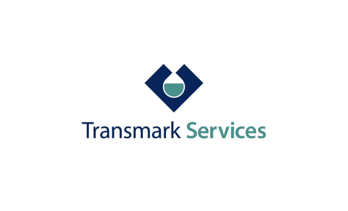
Transmark Services, a drilling specialist from the Netherlands since 2014, required a logo that spoke to its core strengths. The design team at Övünç Güven Ersoy created a visual identity meant to resonate with its customers by emphasizing the company's precision and trustworthiness.
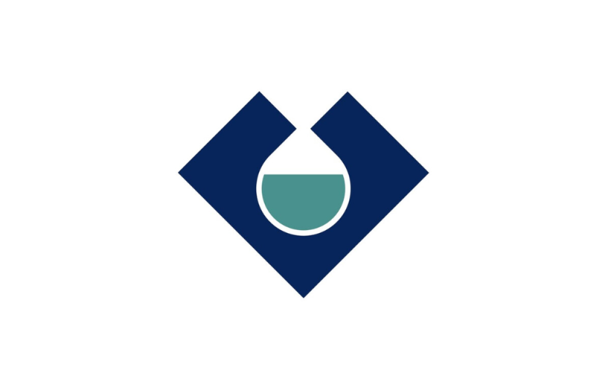
This logo features a a strong, navy blue diamond — a color that 54% of consumers identify as the most trustworthy for a brand — encasing a circle half filled with teal green liquid. This is a nod to the company's underground drilling services, as it resembles a bored tunnel or underground excavations. It’s a symbolic shorthand for the company’s services.
The way the company name is written also looks very professional. "Transmark" is in dark navy blue, and "Services" is in teal green, using a clean sans-serif font. This color split helps you quickly see the main name and what they do. It also matches the colors in the icon perfectly.
Another great thing about this logo is how well it works in the real world, like on company signs. The bold colors and clean shapes ensure it’s visible and legible, even at a distance. You can see how this contributes to Transmark Services' professional image and brand recognition when you encounter their facilities.
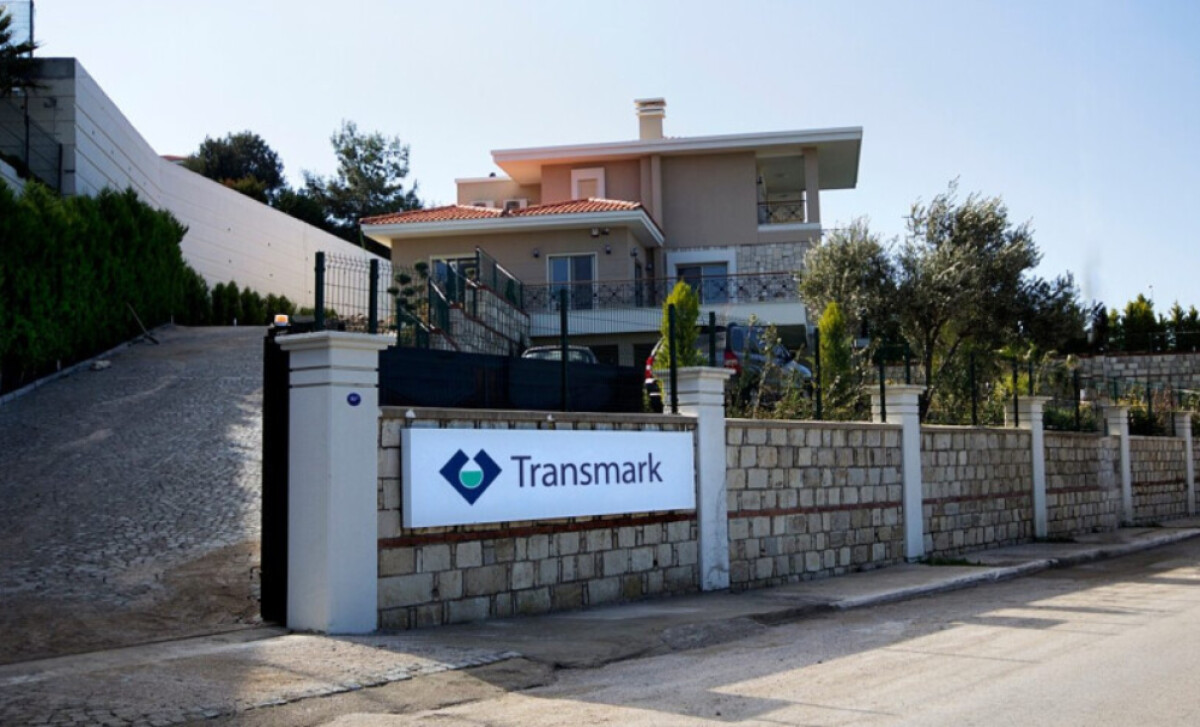
Essentially, Övünç Güven Ersoy has given Transmark Services an engineering logo that is both symbolic and highly functional. The unique icon, the clear typography, and its real-world application on signs all work together. This creates a visual identity that effectively tells you about their drilling expertise and commitment to quality.

