
Cisco Systems, Inc. is the largest networking company in the world. They manufacture networking hardware and telecommunications equipment. With a market cap of $165.1 billion—Cisco is a technology behemoth.
The original logo was intended to look like the two towers of the golden gate bridge. Theiconic symbol incorporates storytelling, as the bridge represents the company’s roots in the bay area.
Founders Leonard Bosack and Sandy Lerner were struck with inspiration for the logo as they witnessed the Golden Gate Bridge framed in the sunlight. They felt it represented a bright, authentic future where people could work together and connect ideas in a harmonious bridge of synergistic teamwork.
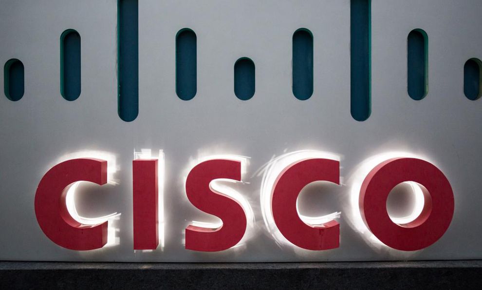
The idea for their logo was born, which comes in both blue and red.
The font of the logo is a custom Futura Bold typeface.
While the previous logo was visually cluttered, the current logo demonstrates how simplicity could remove visual clutter and breathe fresh air into a new company identity.
Blue represents tranquility, optimism, fame, and prosperity, directly relating to the original founder’s vision.
Red symbolizes the responsibility, passion, and preparedness required to work hard for further success.
The new redesigned CISCO logo owes its creation to Joe “Phenom” Finocchiaro and Jerry “The King” Kuyper. First meeting in the early 1970’s they went to school at the Basel School of Design.
The former bridge-in-a-box identity was cluttered and, quite frankly, boring.
Cisco’s new identity is sleek; it demonstrates the goals and potential of the company’s vision of the future.
We see a bridge symbol consisting of thick, vertical lines. These lines simultaneously represent the golden gate bridge and the universal signal for Wi-Fi and networking.

Most importantly, the new Cisco logo is no longer boring or dated. The colors are bright and the font is modern looking.
Birthed is a metaphor: Through its equipment and technologies, Cisco builds bridges between distant lands and enables close communication between far-reaching cultures.
They enable human progress to take a step forward, as millions of doctors, researchers, scientists, families, and businesses, rely on Cisco technologies to send and receive information.
That is why this logo is considered considered the best in design.
Cisco is a typography logo design in the distribution and technology industries.


