Standout Features:
- A fast and powerful look
- Pop-culture inspired logo
- A trustworthy, corporate color palette
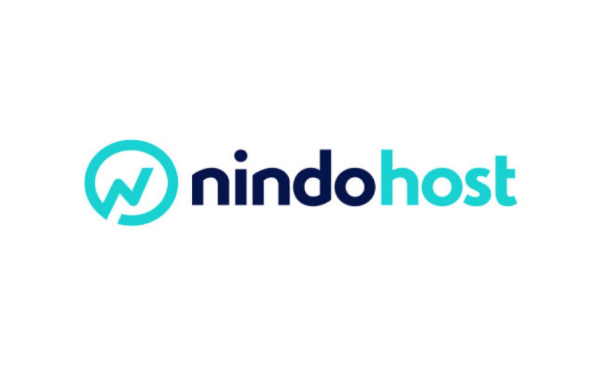
Nindohost was looking for a fresh, contemporary look after running a successful web hosting and domain name reservation business for over 15 years. Brandegree materialized a rebranding process encompassing the brand’s values and vision.
The new logo combines four elements: a clan symbol from Naruto (the popular anime series), a diagonal flash illustration, a checkmark, and the capital “N.”
Each of the elements reflects the brand. Nindohost is not a soulless organization. It’s a clan. Their services are fast and powerful, verified by their history of satisfied customers. The result is an italic “N” that extends into an unfinished circle that embraces it.
The color palette found on the logo and various promotional materials combines several shades of blue with white, communicating the loyalty and confidence of their quality to their customers.