
Les Diables Rouges. De Rode Duivels. Die Roten Teufel. The Red Devils, rendered in all three of Belgium's official languages, because Belgium is a country that has never agreed on a single one.
So how do you build a football identity for a nation divided by language, region, and political tradition, and make it stick for more than a century?
The answer sits on the chest of every Belgian shirt at the 2026 World Cup, where Belgium's run ended in a 2-1 quarterfinal defeat to Spain on July 10 after wins over Senegal and the United States.
The badge has been working on that answer since 1904.
Most people who search for the Red Devils logo meaning have no idea the name came from a journalist. On April 29, 1906, after Belgium beat the Netherlands 5-0 as heavy underdogs in Antwerp, Pierre Walckiers, editor-in-chief of La Vie Sportive, described the players as petits diables rouges, little red devils, a nod to their red kits and their ferocity.
A Dutch reporter had written a year earlier that three Belgian players "worked as devils," and Walckiers absorbed the phrase and added the color. Manchester United became Red Devils decades later. Belgium got there first.
This article traces how a crest built for a divided country survived two golden generations, a complete rebrand, and 120 years of almost.
Belgium National Football Team Logo History
Belgium's football history runs on brilliant peaks and baffling plateaus: two golden generations, one in the 1980s and one in the 2010s, each producing squads that deserved a major trophy and each settling for third place at best.
Through all of it, the same basic badge. A crown, a wreath, a tricolor, and a lion that came and went. The crest has outlasted a spell at number one in the world without a trophy to show for it, and a 2019 redesign that rebuilt it from the inside without most fans noticing.
Let's walk through the Belgium national football team logo history and see how the badge became the one constant in a century of Belgian football drama, and one of the more instructive case studies in logo design for a multilingual brand.
1895 – 1920: The Name Before The Badge
The Royal Belgian Football Association formed in 1895, co-founded FIFA in 1904, and played its first official match that same year, a 3-3 draw with France. Red jerseys arrived in 1905, and Walckiers' match report a year later gave the team its name. The federation felt the pull of that name immediately: its first mascot was a lion named Diabolix, a hybrid of diable and the heraldic lion from the national coat of arms, the first attempt to reconcile what Belgium wore (red, with devil energy) with the state symbolism it would soon carry on its chest. That unresolved tension would shape the crest for the next century.
1920 – 1980: The Lion and The Shield
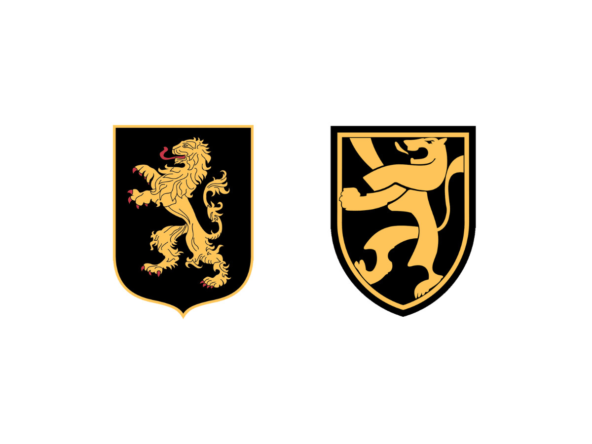
The first official crest arrived in 1920: a golden rampant lion with red claws and a red tongue on a black shield with a thin gold border, lifted directly from Belgium's coat of arms.
It debuted in the badge's finest year, as Belgium won Olympic gold on home soil at the Antwerp Games, still the team's only major international title. F
or six decades afterward the golden lion held with incremental refinement rather than rethinking.
The most visible update came in 1950, when the heraldic lion was redrawn in a more modern and abstract manner: the fine fur detail, red claws, and red tongue gave way to smooth, solid, intertwined shapes with clean contours, a flat gold lion on the same black shield. The palette and the pose stayed. The illustration style moved with the century.
The strangest identity moment of the era came from a kit decision. In the 1970s, coach Raymond Goethals switched Belgium from red to white shirts for visibility under floodlights, and the team temporarily became the White Devils.
Even the nickname bent to accommodate it. The Goethals era produced good football, including third place at Euro 1972, but the white identity never landed, and the red returned.
By the end of the decade, the lion's time was running out. In 1981 it left the badge for the first time since the team began.
1981 – 2019: The Trident Arrives, And Two Golden Generations
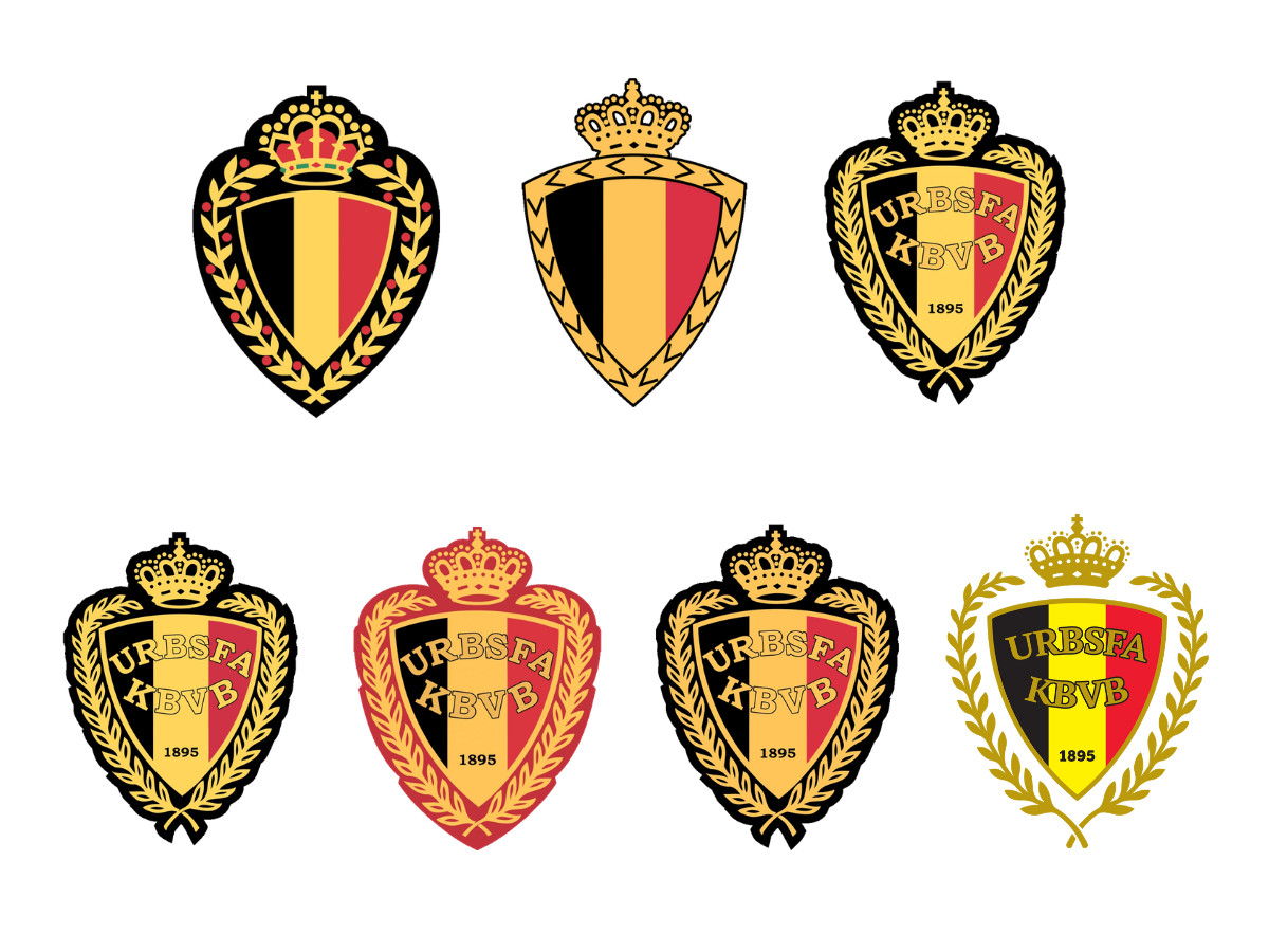
In the lion's place came a shield with an arched top and pointed bottom, its body painted in the vertical black, yellow, and red stripes of the national flag. A wide black frame surrounded it, carrying a gold laurel wreath dotted with small red berries, and an ornate royal crown with red and green accents sat on top.
The change mattered more than it looked.
The lion tied Belgium to the state, ancient, governmental, and shared with official institutions. The tricolor shield said something narrower and more useful: this is a football team's crest. The crown stayed, because this is the Royal Belgian FA, so the formal authority remained while the visual identity finally became the team's own.
The tricolor crest held its basic form for 38 years through a string of minor iterations. A 1984 update dropped the black background, sharpened the contours, and swapped the wreath for a gold border with a thin black chevron ornament.
In 1989 the black background and laurel returned, the berries gone, and lettering appeared for the first time: "URBSFA KBVB," the federation's French and Dutch abbreviations stacked across the tricolor, with the founding year 1895 near the base.
The 1990s and 2000s brought tonal edits, gold lettering in 1991, a red background in 1996, black again in 2000 with the yellow warmed toward orange, and a 2009 cleanup that set the crest on a transparent background with solid gold leaves.
None of it was structural. The badge sits comfortably alongside the best logo redesigns that adjust a mark without breaking it, the kind of restraint that skilled logo designers tend to respect when a mark carries real history.
2019 – Today: The Revolution That Nobody Noticed
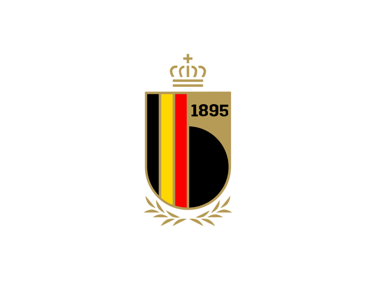
In November 2019, the RBFA unveiled a full rebrand by Brussels studio Mirror Mirror. The studio started from a thorough historical analysis of the crest's signifiers and symbolism, then deconstructed and rebuilt its heraldic elements, with three non-negotiables preserved: the royal crown, the wreath, and the Belgian tricolor. Everything else was open.
The bilingual abbreviations went first. URBSFA and KBVB, stacked on the crest since 1989, gave way to a single unified mark, RBFA, Royal Belgian Football Association, in English and internationally legible.
A federation that had carried its language divide on its own badge finally chose a neutral tongue, keeping only the founding year 1895 as text on the crest.
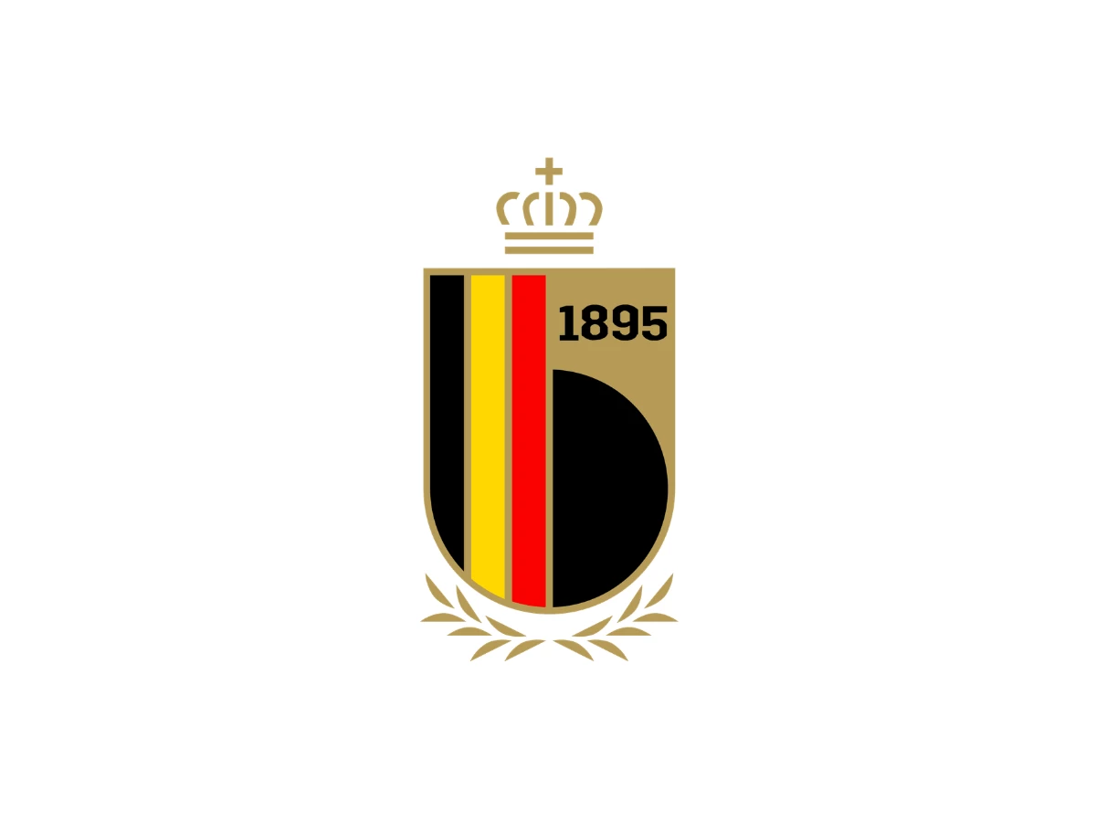
The most quietly brilliant decision hides in the shield itself. Mirror Mirror built the entire shape around a lowercase b.
On a gold field, the tricolor stripes run down the left while a black semicircle fills the right, and the negative space between them resolves into a b for Belgium. It goes unstated in the identity.
It simply exists, in every size and every color version, and in monochrome reproductions where the tricolor cannot show, the b ensures the badge still reads as Belgian. No previous version of the crest had a structural idea like it.
Mirror Mirror then built the Red Devils trident, the Red Flames women's team mark, and the 1895 fan club logo from the same circular geometry as the RBFA shield. Before 2019, Belgium ran multiple identities that happened to share a color. After 2019, it ran a design family derived from one shape.
The badge's competitive record since has been mixed: a quarterfinal exit at Euro 2020, a group-stage exit at the 2022 World Cup, and now a 2026 quarterfinal run under Rudi Garcia that ended against Spain, Belgium's best World Cup result since 2018. The crest has now outlasted one complete golden generation. It is watching the next one form.
What Is In The Belgium National Football Team Logo Today
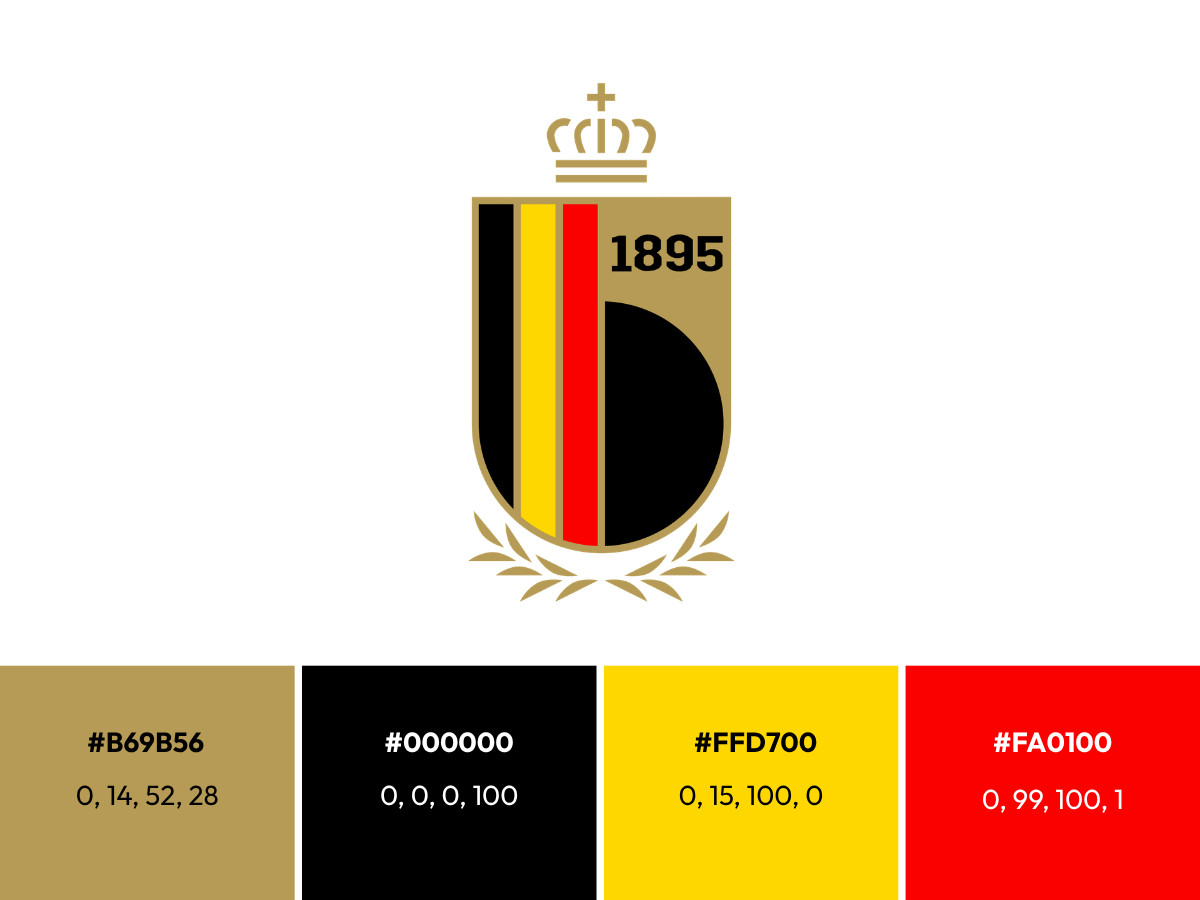
Good logo design makes every element earn its place, and the current Belgian crest carries less decoration and more intent than any version before it. Here is what the badge is built from:
- Tricolor stripes: vertical black, yellow, and red bands running down the left side of the shield, the Belgian flag carried on the crest in some form since 1981.
- The hidden b: a black semicircle fills the right side of the shield, and the negative space between it and the tricolor resolves into a lowercase b for Belgium, the structural signature of the 2019 redesign that keeps the badge legible even in monochrome.
- Founding year: "1895" set in the gold band across the top of the shield, dating the badge to the federation's founding and replacing the old URBSFA and KBVB lettering.
- Royal crown: a slim gold crown topped with a cross floating above the shield, retained as one of the rebrand's three non-negotiables and a marker of the federation's royal charter.
- Laurel device: a small stylized gold wreath at the base, a modern reduction of the full laurel frame that surrounded the crest from 1981 to 2019.
- Primary palette: Gold (Hex: #B69B56 | CMYK: 0, 14, 52, 28) forms the shield field and carries the crown and laurel, while Black (Hex: #000000 | CMYK: 0, 0, 0, 100), Yellow (Hex: #FFD700 | CMYK: 0, 15, 100, 0), and Red (Hex: #FA0100 | CMYK: 0, 99, 100, 1) carry the flag stripes and the semicircle.
- System geometry: the shield shares its underlying circular construction with the Red Devils trident, the Red Flames mark, and the 1895 fan club logo, so every identity in Belgian football derives from one shape.
Belgium National Football Team Logo: The Badge That Outlives Everything
The Belgian crest has now witnessed the country's only gold medal in 1920, two golden generations, 215 days at the top of the world rankings, and 120 years of almost. It is still there, slightly redesigned, carrying the same crown, the same wreath, and the same three colors it took on in 1981.
Whichever Belgian eventually lifts a major trophy will do it wearing a crest that contains a hidden b, a royal crown, and a memory of every team that came before them and did not quite get there. For designers studying sports and leisure logos, and for anyone comparing it against the other badges at the 2026 World Cup, that is the rare case among the most successful logo designs whose emotional equity comes almost entirely from waiting.
What Brand Builders Can Take From The Belgium Crest
Sub-brands and parent brands don't need to be resolved. They need to be systematized. Belgium ran two parallel identities, the formal RBFA crest and the Red Devils trident, for decades without conflict. Mirror Mirror eliminated neither. The studio built a shared geometry that holds both.
The hidden structural element is more durable than the stated one. The hidden b works in every context the visible tricolor cannot, including monochrome. If your brand must function across multiple languages and formats, the structural decision is worth more than the decorative one.
Renaming for international audiences is a positioning decision, not an admin one. Dropping URBSFA and KBVB for RBFA says the federation operates in a global market rather than managing a domestic league. Every multilingual organization faces a version of this choice.
Emotional equity accumulates without visual change, but only up to a point. The tricolor crest held its basic form for 38 years through six adjustments because it kept earning trust through results and moments. By 2019 it needed rebuilding, and the reason was generational rather than any design failure.
The founding story of a nickname almost always beats the badge. Pierre Walckiers wrote petits diables rouges in a 1906 match report and accidentally gave Belgium its identity. The badge has been catching up ever since. Find the founding story. That is where the brand actually lives.

Our team ranks agencies worldwide to help you find a qualified partner. Visit our Agency Directory for the Top Logo Design Companies as well as: