Standout Features:
- Folded “NV” monogram
- Gradient striping for a futuristic feel
- Dual-tone sans-serif wordmark
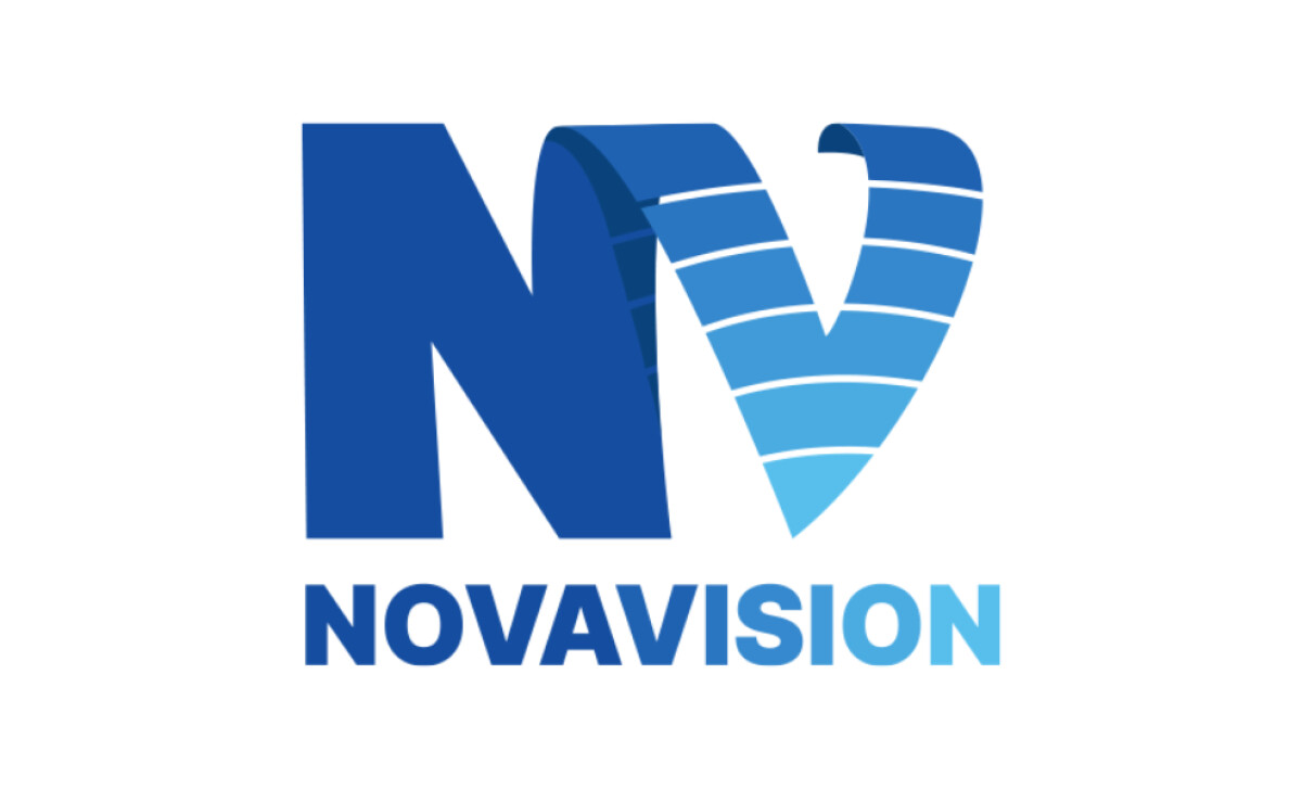
For the brand Nova Vision, the experienced team at Matramedia was tasked with creating a logo that could help its message take shape.
The final logo leverages color gradients and spatial layering to evoke a sense of progression.
A key feature of the design is the folded “NV” monogram. The seamless transition between the two letters, using subtle shading and curvature, adds to the 3D effect that makes the logo feel technological.
The “V” shape in the monogram of this blue logo design features a series of gradient stripes. These move from a deep cobalt at the top to a bright sky blue at the bottom.
This color's ability to build confidence is well-documented. According to a 2025 Adobe Express survey, 54% of consumers name blue as the most trustworthy color a brand can use.
Thin white lines also create a segmented effect in the letter "V." These stripes evoke technology: data streams, radar sweeps, or audio waveforms.
Finally, the bold, all-caps sans-serif font is a great choice for a modern and confident brand. It also enhances the legibility of the logo across all different sizes.
This logo shows how a concept like "vision" can be represented via color and shape alone, without being too on the nose. It's a great reminder that a simple, well-executed idea can be the foundation for a very powerful brand.
The big challenge for any innovative brand is to create a logo that feels futuristic and dynamic without being overly complicated or literal.
That's why brands turn to expert partners, and our team has ranked the best agencies worldwide to make finding them simple.
Visit our Agency Directory for the Top Logo Design Companies, as well as:
Our design experts also recognize the most innovative design projects across the globe. Visit our Awards section to see the best & latest in logo design.