Standout Features:
- Various logo colorways
- The dark and vibrant color combination
- Maze-like logotype design
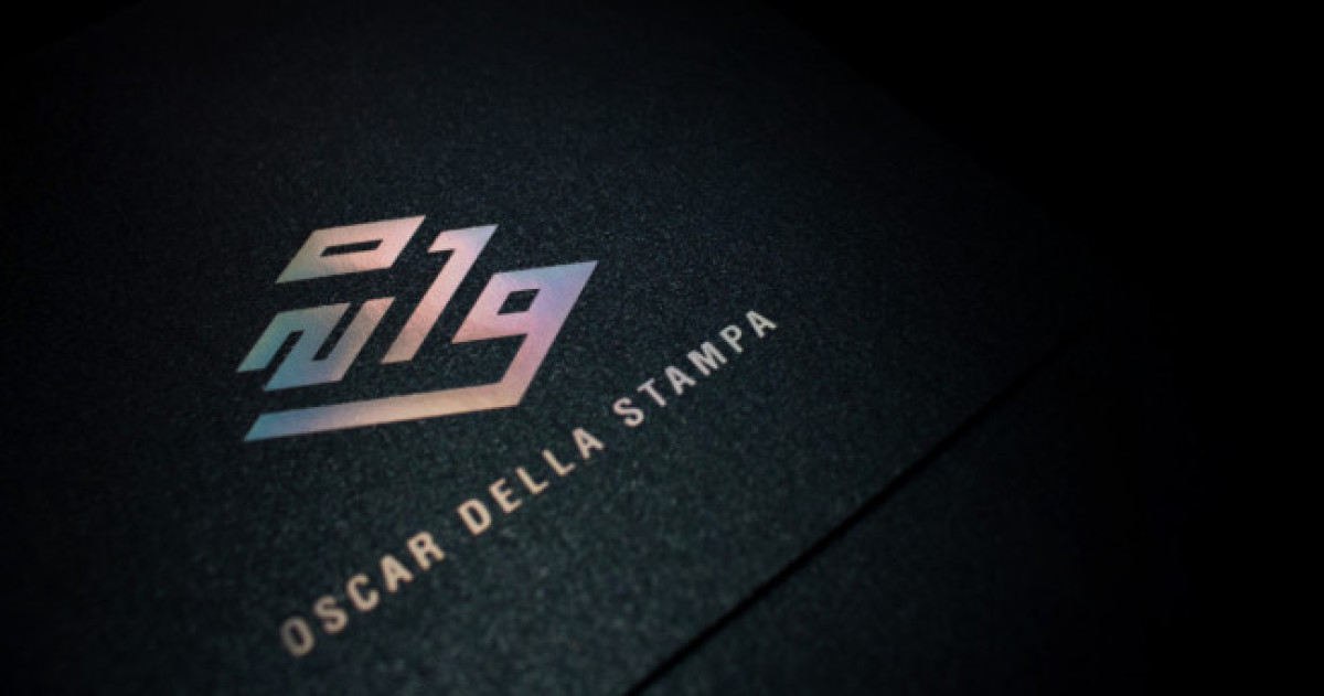
Visual design studio MOST had the noble job of conceptualizing the design for Oscars of the Press 2019, an award-giving body that recognizes excellent works in the graphic and paper converting industry.
Among their various creations for this project, the logo for the event itself deserves an Oscar!
The “2019” stamp is a total scene-stealer. Instead of displaying the year in a standard layout, the designers deconstructed it to form a unique and intricate illustration resembling a maze and a ladder to victory. Either way, the image is quite fitting for the brand!
Of course, we must discuss the real visual treat – the gradient design. The 2019 icon is painted in a stunning array of colors that blend into each other smoothly. The best part? It comes in various colorways, so every shade on the color wheel is showcased!
The logo also gets extra points for rocking a gorgeous dark-themed aesthetic. The colorful logo sits in mostly pitch-black backgrounds with straightforward typography. (Know how to pick the right typography for your brand).


