Team Behind the Design
Designer: Stephanie Erdel
Brand: Vitech
Category: Logo Design (Technology)
Location: New York, United States
Project Brief: Redesign Vitech’s logo to express its mission and values with modern typography and stronger brand recognition
Logo Design Analysis
Related Articles:
When I review logos, I often look at concept strength, typography choices, scalability, and application flexibility.
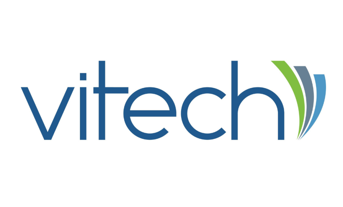
The Vitech rebrand, designed by Stephanie Erdel, balances modern simplicity with meaningful symbolism that strengthens its brand recognition in the technology industry.
- Concept: I appreciate how the three fan icons visually represent Vitech’s core business lines: Insurance, Retirement, and Investment. This adds depth beyond aesthetics.
- Typography: The small, sleek sans-serif font feels modern and readable. It supports the icon without overwhelming it.
- Scalability: The minimalist approach makes the logo highly adaptable across digital and print media, ensuring consistent recognition.
- Application: The splash of color from the icons brings energy to an otherwise straightforward wordmark, helping the brand stand out.
Get connected with the right logo design agency for your project.
GET STARTEDAbout DesignRush Featured Designs
At DesignRush, we review hundreds of agency projects each month. The featured designs are among the most compelling, standing out for creative direction, execution, and relevance.
The best projects often advance to our Monthly Design Awards as a mark of industry recognition.
Logo design plays a central role in technology branding. Explore more design inspiration here:
- Best Logo Designs
- Best Website Designs
- Best App Designs
- Best Print Designs
- Best Packaging Designs
- Best Video Designs
For a full list of design agencies and related services, see our Agency Directory.
Get a chance to become the next Design Awards winner.
SUBMIT YOUR DESIGN
