Standout Features:
- Radiant sunburst motif
- Elegant transitional serif typography
- Warm gold gradient color palette
Needing to appeal to a health-conscious audience, the logo for Pagoda Acupuncture & Wellness does this with a sophisticated and elegant approach. It immediately sets a tone of quality and compassionate care.
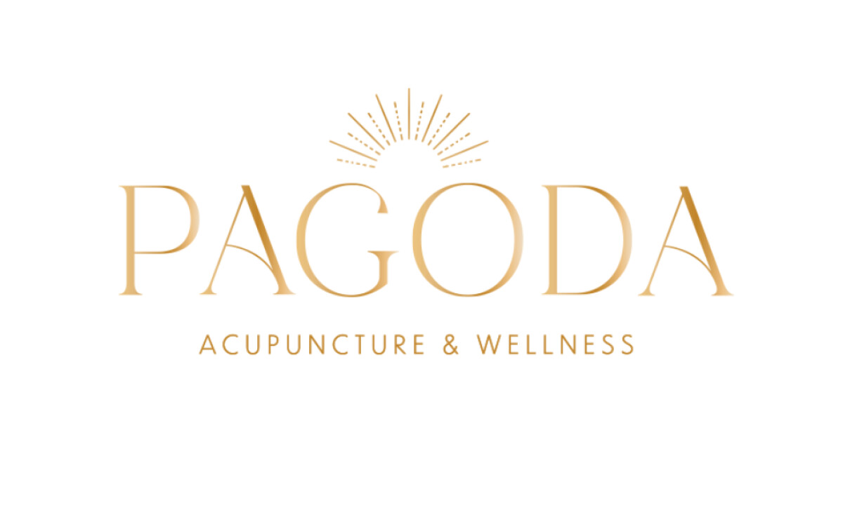
A simple sunburst emblem is positioned above the "G" and "O" in "PAGODA." The icon is a semicircle with fine, radiating lines. Some of these lines are solid, while others are dotted, which adds a nice textural detail to the design while representing energy.
The main brand name, "PAGODA," uses an elegant serif font with beautiful curves and generous spacing. This is paired with a clean, all-caps sans-serif for the descriptive text.
This custom serif is a smart branding choice, as research shows that the use of a serif font can create a significantly higher perception of a brand as being luxurious and refined. At the same time, the modern sans-serif ensures it feels versatile and professional in its application.
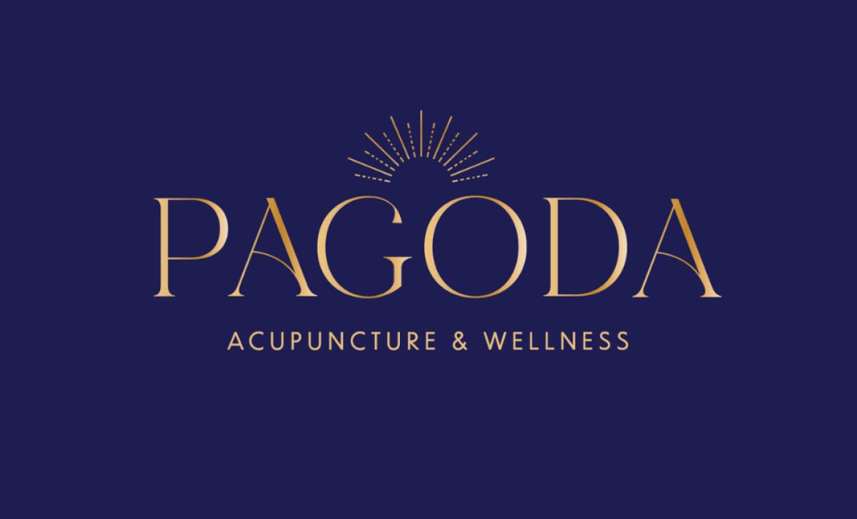
The color palette for the logo is a refined gold gradient. It transitions from a light amber to a deep bronze. The design is shown in both a light and a dark mode, proving that it is a flexible and adaptable brand mark.
This is a very smart color choice for this health and wellness logo. It feels much more special than a flat color. Plus, the gradient gives the logo a sense of depth and a tactile quality that is appealing to the senses.
An effective logo for a wellness brand can do more than just identify the business; it can symbolize calm and compassionate care.
That's why brands turn to expert partners, and our team has ranked the best agencies worldwide to make finding them simple.
Visit our Agency Directory for the Top Logo Design Companies, as well as:
Our design experts also recognize the most innovative design projects across the globe. Visit our Awards section to see the best & latest in logo design.