Team Behind the Design
Logo Design Analysis
When I look at the GAIAM rebrand, what stands out to me immediately is how confidently it modernizes a legacy identity without losing its spiritual foundation.
I see a system that feels disciplined, energetic, and refreshingly direct—something many wellness brands struggle to balance.
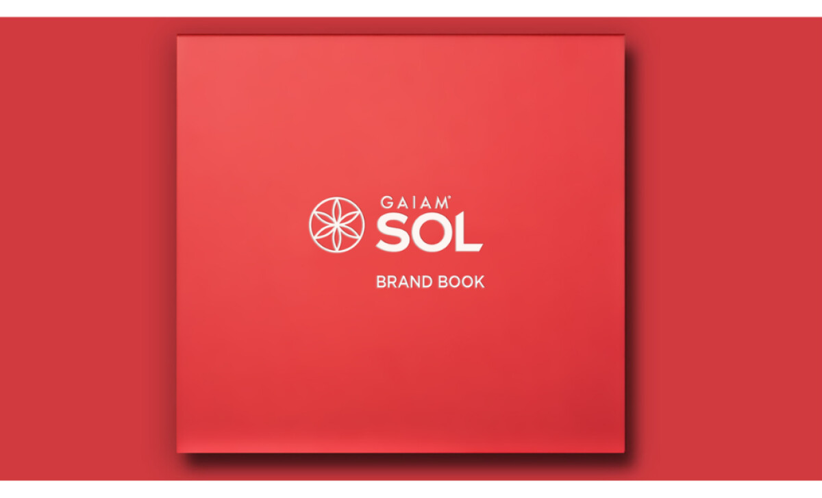
- Logo Construction: I notice how the simplified geometric emblem sharpens the brand’s overall presence. By refining the original Gaiam flower into a cleaner, tighter symbol, the mark becomes more recognizable at every scale while still reflecting the brand’s holistic DNA.
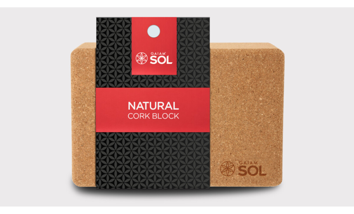
- Typography: The SOL wordmark catches my eye for its strength and clarity. I appreciate how its geometric structure gives the brand more authority, acting as a solid counterweight to the round emblem and reinforcing a premium, performance-driven tone.
- Color Strategy: The bold red paired with deep black makes a strong impression. I see how this palette communicates power and focus, setting the SOL line apart from the softer, pastel-heavy identities common in the wellness category.
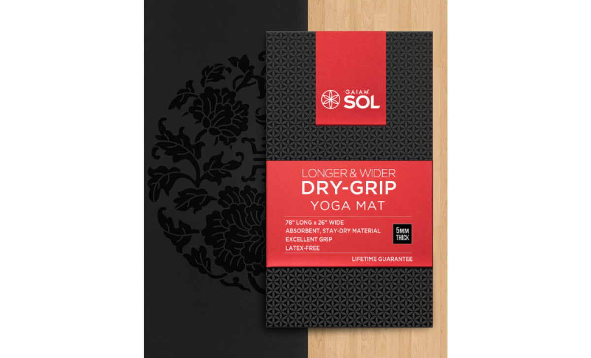
- Packaging Application: As I review the packaging, the consistency stands out. The textured patterns, clean hierarchy, and well-organized layouts give each product a cohesive feel, and I can see how this elevates shelf presence and strengthens brand perception.
Word from the Designer
“I pitched and won this wonderful project work. The Gaiam team saw an opportunity to change the direction of the Sol line. I disrupted the Sol legacy by developing muscular creative, coupled with relatable and inspiring copy, aligning with data and analytics identified by the IDEO team. My role included creative direction, illustration, logo design, package design, ad layouts, presentation graphics, persona development, content writing, and the brand book. All within a 5-week period.”— Matt Chansky
What Brands and Agencies Can Learn from the GAIAM
Here’s what the GAIAM rebrand demonstrates about building a modern, insight-driven identity that can scale across products and platforms.
1. Honor brand heritage while refining for clarity
By simplifying GAIAM’s iconic geometry, the redesign stays true to the brand’s spiritual roots while improving legibility across mats, packaging, and digital surfaces. Updating without abandoning recognition is key for legacy wellness brands.
2. Use bold, purposeful color to redefine perception
The strong red palette signals energy, confidence, and modernity. When grounded with deep neutrals, it shifts the line into a more premium, performance-oriented space without losing its approachable tone.
3. Build systems that scale across every product touchpoint
Structured layouts, embossed textures, and consistent visual rhythm create unity across dozens of SKUs. A scalable system ensures the brand looks intentional whether on a yoga block, an ad layout, or an e-commerce page.
About DesignRush Featured Designs
At DesignRush, we review hundreds of agency projects each month. The featured designs stand out for creativity, relevance, and execution.
Many go on to be recognized as winners of our Monthly Design Awards.
Discover more examples here:
- Best Logo Designs
- Best Website Designs
- Best App Designs
- Best Print Designs
- Best Packaging Designs
- Best Video Designs
For a full list of design agencies and related services, see our Agency Directory.