Team Behind the Design
Logo Design Analysis
In evaluating non-profit logo designs, I often look for how concept, typography, and system thinking blend into a cohesive identity.
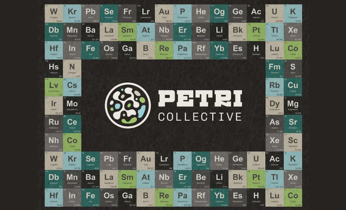
Here, Chirpy Bird Studio uses visual experimentation to reflect Petri Collective’s hands-on, science-forward mission.
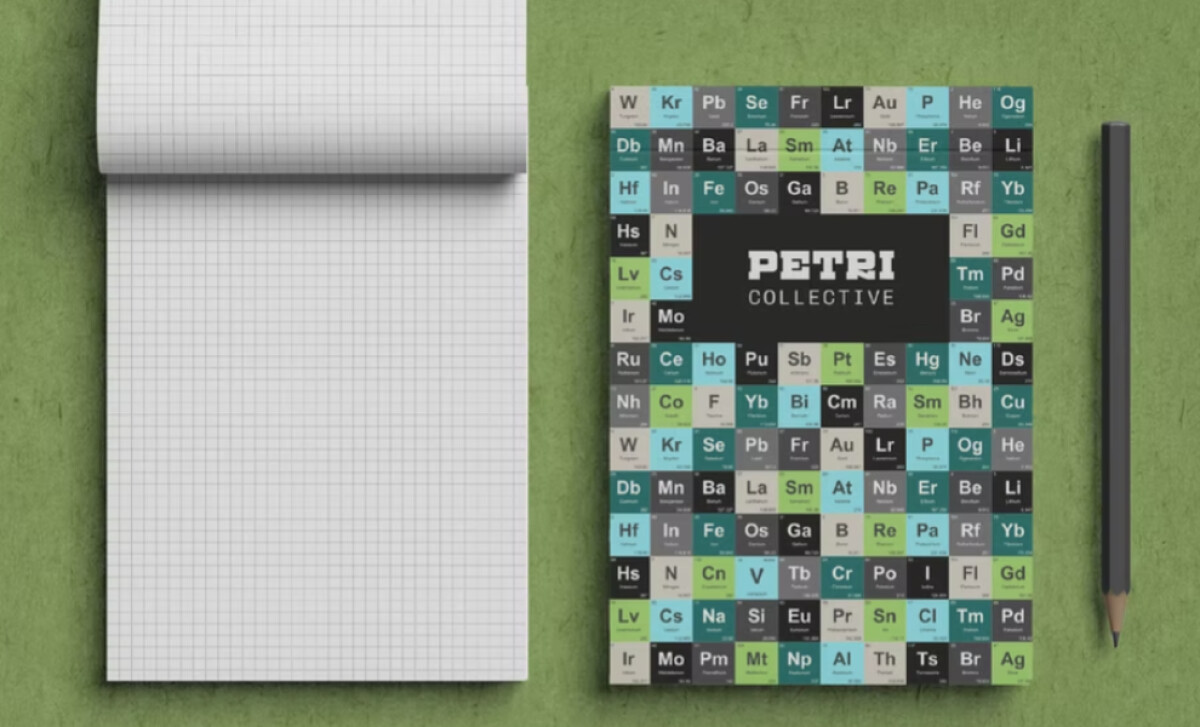
- Concept: The petri-dish symbol filled with biomorphic shapes becomes a compelling focal point. I like how this approach avoids literal laboratory clichés and instead channels the organization’s curiosity-driven ethos. The organic forms add personality while still feeling grounded in scientific reference.
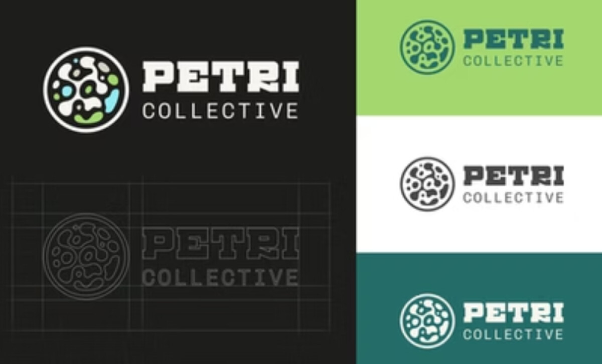
- Typography: The bold slab-serif paired with a clean sans-serif creates a confident, functional hierarchy. I appreciate how the slab-serif’s industrial weight anchors the design, while the lighter secondary type keeps the system approachable.
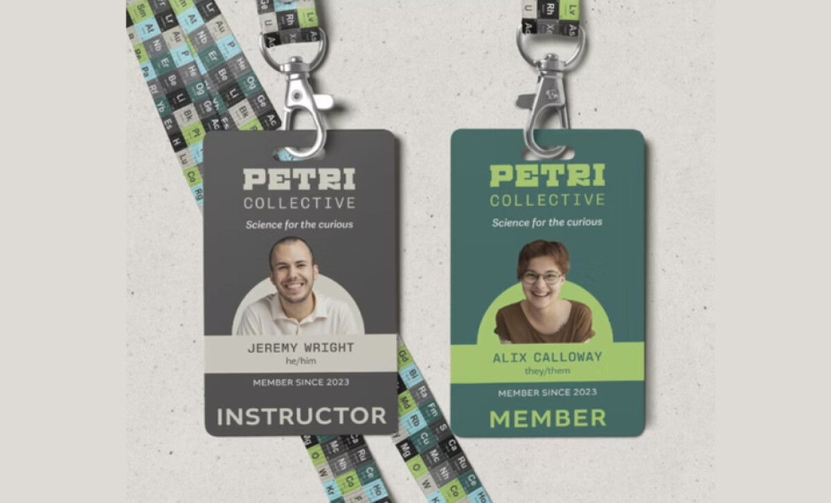
- Scalability: The emblem’s solid strokes and generous negative space help it stay readable at very small sizes. I find its simplicity particularly effective on badges, stickers, and merch, where the mark remains identifiable without added detail.
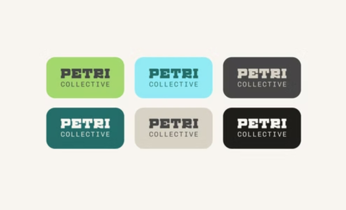
- Applications: The system includes full-color, monochrome, reversed, and single-tone versions that sit comfortably on bright, dark, and neutral backgrounds. I like how this modularity future-proofs the identity across digital interfaces, print collateral, and lab environments.
What Brands & Agencies Can Learn from Petri Collective
Here are a few key lessons from Petri Collective’s logo design:
1. Build a Concept That Reflects the Mission
A symbol rooted in the brand’s purpose helps audiences connect instantly. When the core idea mirrors what the organization does, the identity communicates more with fewer elements.
2. Balance Authority with Approachability
Mixing confident typography with softer or modular visuals allows brands to appear credible without feeling intimidating. This balance supports trust and engagement across diverse audiences.
3. Design for Real-World Flexibility
Creating a logo system with multiple treatments ensures consistent performance across digital, print, and merchandise. Brands benefit when their identity feels equally strong on a website header, a sticker, or a tote bag.
About DesignRush Featured Designs
At DesignRush, we evaluate hundreds of projects each month. Featured selections stand out for clarity, craftsmanship, conceptual depth, and execution across digital and brand experiences.
The strongest examples move on to our Monthly Design Awards, highlighting best-in-class creative work.
Check out more standout work across categories:
- Best Logo Designs
- Best Website Designs
- Best App Designs
- Best Print Designs
- Best Packaging Designs
- Best Video Designs
For a full list of design agencies and related services, see our Agency Directory.