Standout Features:
- Modern monogram logo
- Purposeful color palette
- Pattern-based visual element
Precisions Health, a forward-thinking clinic focused on preventive care, needed a strong brand identity that would work seamlessly across physical, digital, and product applications.
PIMM Communication & Design Agency addressed this need by creating a cohesive brand identity and a logo that balances professionalism and approachability, reflecting Precisions Health's commitment to proactive wellness.
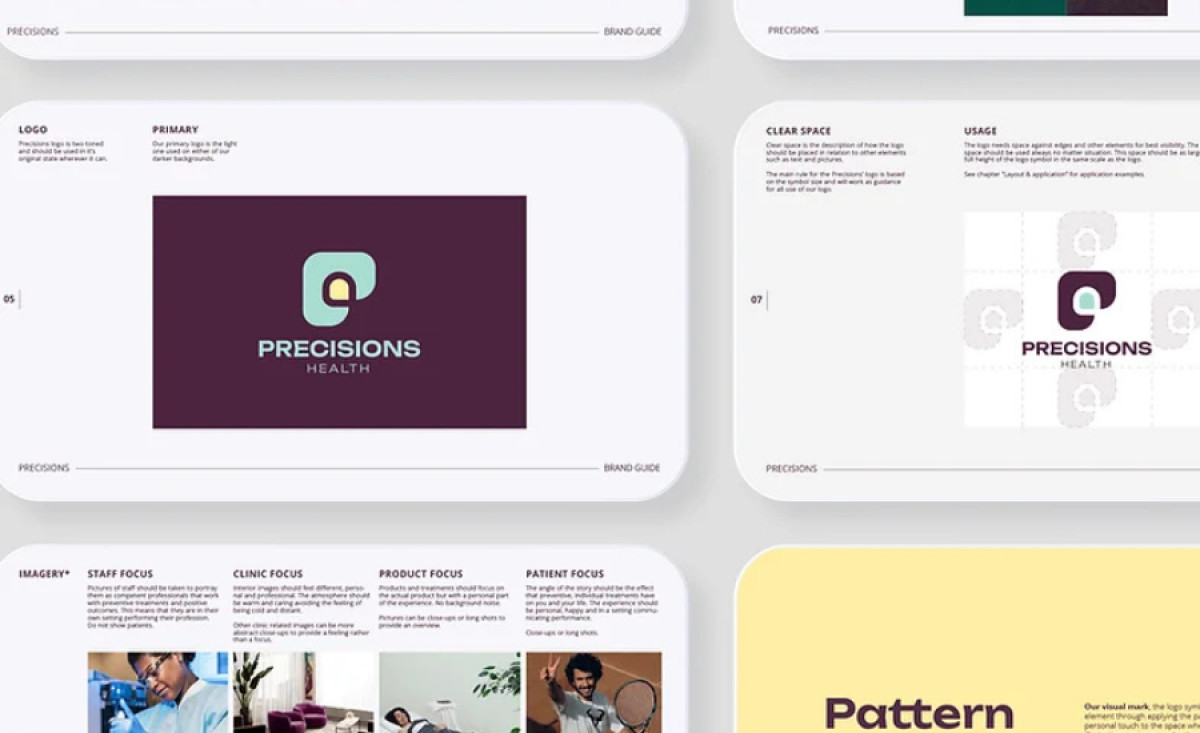
PIMM’s logo design for Precisions Health centers on a clever monogram that subtly intertwines the letters “P” and “H,” creating an inviting and memorable mark. With rounded edges and clean lines, the logo balances simplicity and character, echoing the clinic’s commitment to preventive care with a visual warmth that resonates.
The muted color palette creates a calming and balanced aesthetic. Green is often associated with health, growth, and renewal, which aligns with the brand’s preventive health mission. On the other hand, purple adds an element of sophistication and stability, appealing to the professionalism expected in a healthcare setting.
A defining aspect of Precisions Health’s brand identity is its use of pattern-based visuals derived from the monogram, creating a sense of connection and community. These patterns are used consistently across all media, enhancing brand continuity while keeping the primary logo as the central focus. This ensures each interaction with the brand feels intentional and unified.