Standout Features:
- Minimalistic, strong geometric design
- Modern, trustworthy color palette
- Clear brand identity with subtle symbolism
Proper Land, a leading real estate agency in Attica and other parts of Greece, has established a strong visual identity with a logo designed by OWN Creative and Media Agency. Specializing in property purchase, rental, and management, Proper Land needed a logo that reflected professionalism, reliability, and a connection to the real estate industry.
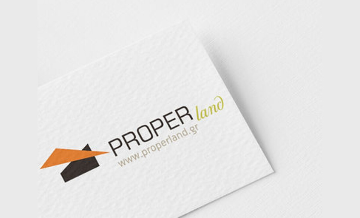
The Proper Land logo uses clean lines and simple shapes to create a strong visual impact. The use of geometric elements, particularly the angular roofline symbol, evokes the idea of buildings and a sense of stability, reinforcing Proper Land’s reputation for reliability and professionalism in property management.
The color palette of the logo features earthy tones, with the primary colors being orange and black. The orange triangle in the logo symbolizes energy, while the black text and dark roofline represent strength. This balanced color scheme not only makes the logo stand out but also invokes feelings of trust and stability, which are key in the real estate sector.
Proper Land’s logo is not only functional but also meaningful. The roofline motif subtly hints at the company’s real estate focus, while the angular lines also represent growth and progress, themes central to its mission. The clever integration of these symbols ensures that the logo communicates the company's services without overwhelming the viewer.
This logo not only enhances Proper Land’s visual presence but also reinforces its commitment to providing transparent and reliable services. For businesses looking to develop a professional logo, learning more about best logo design practices can help elevate your brand’s visual identity.